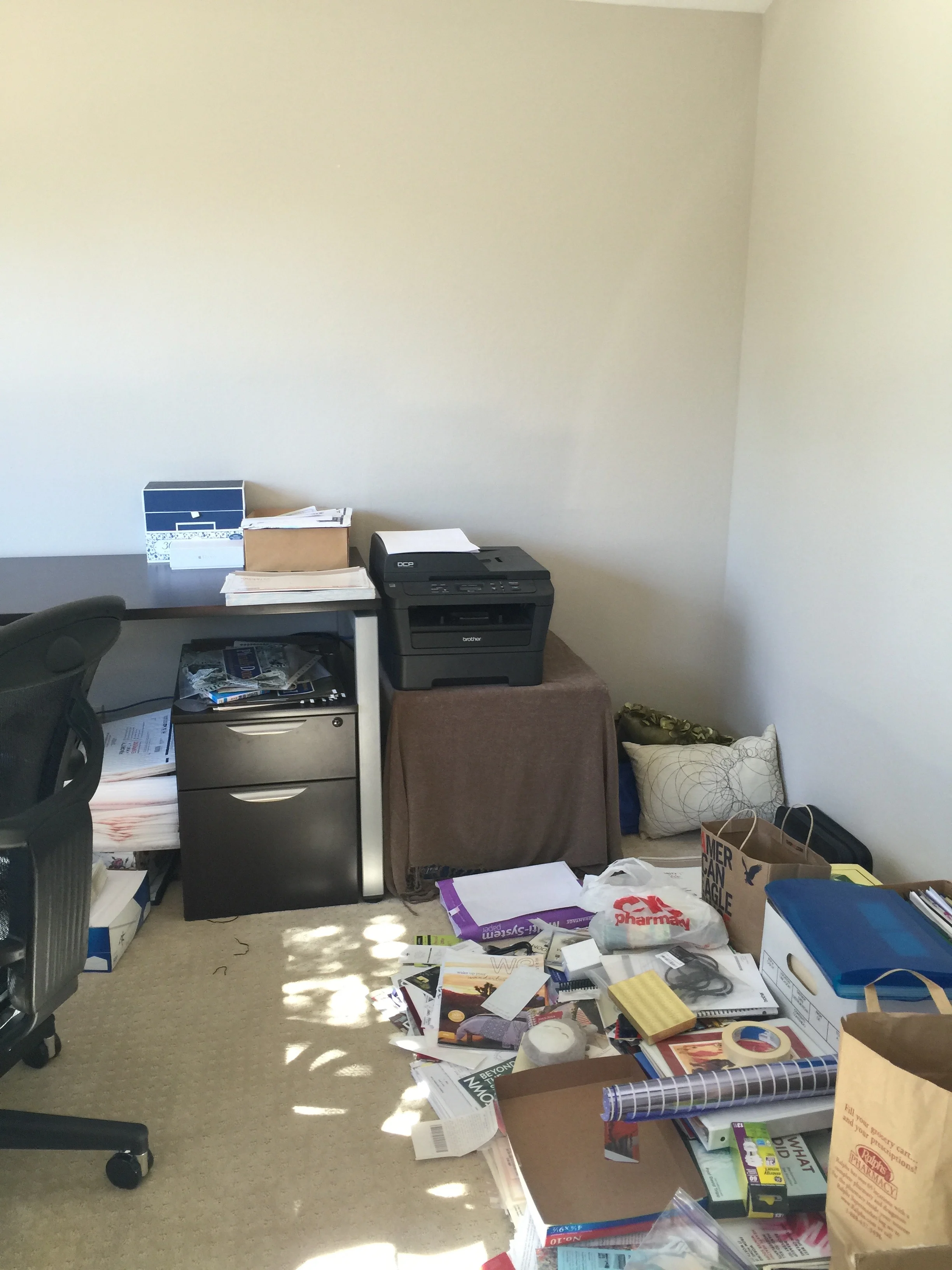
This is a story about a room . . . well, to be more exact, this is a story about two rooms in one. I'll explain more below.
In a house with two busy working parents, it is often the case that the master bedroom becomes neglected. With the impending arrival of a new addition to the family, these clients realized that their master bedroom needed a makeover. In its existing state, the master bedroom would be unable to accommodate a small nursery setup, a necessity until the new baby was old enough to move in with her big sister. I know this is a common problem that confronts many of my clients who live in smaller spaces, especially in San Francisco and New York. I hope this before/after shows you that it can not only be done but done stylishly!
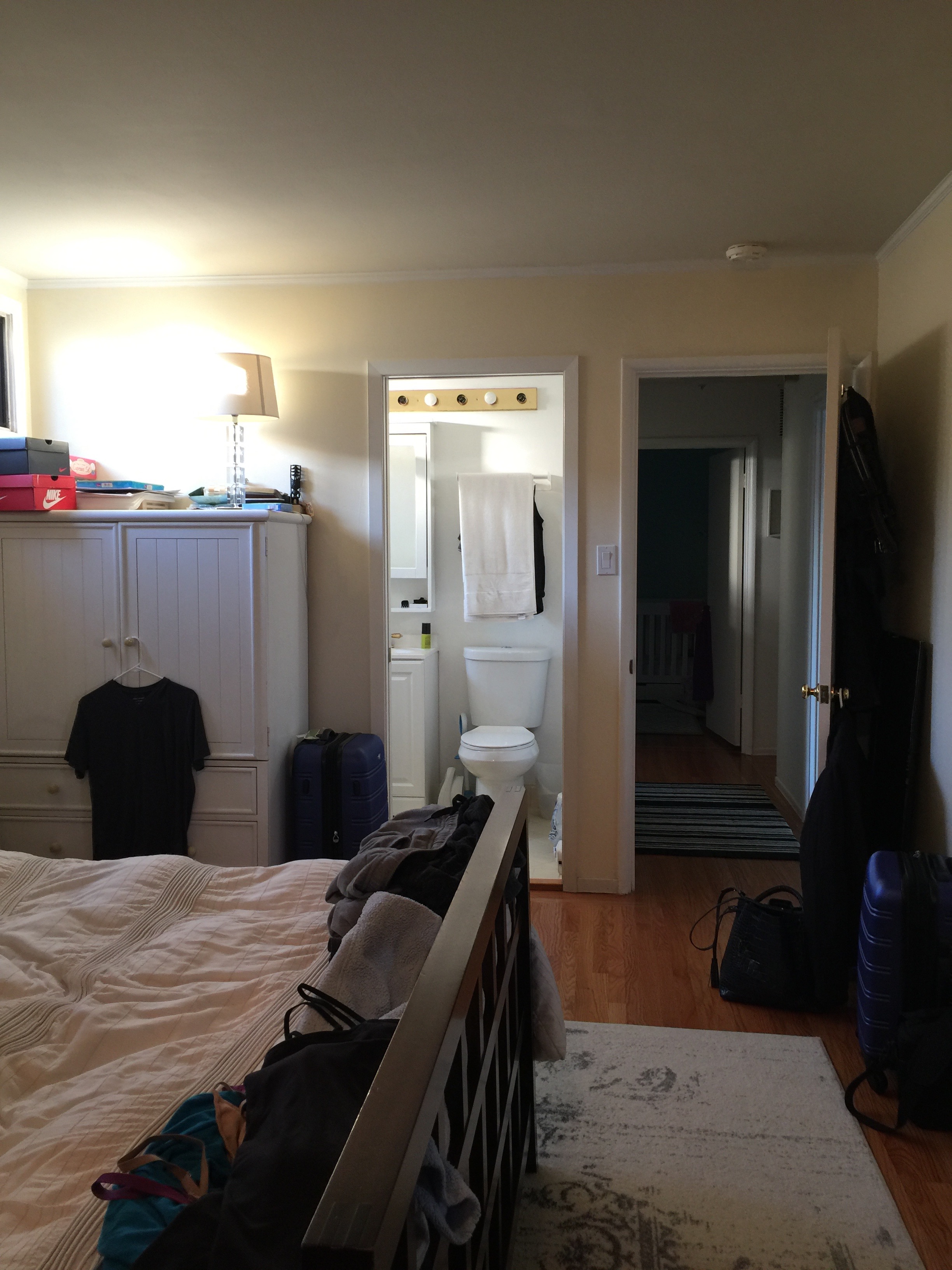
Here are some before photos to give you a sense of the space.
The room isn't small by any means, but it is shaped a bit awkwardly. Directly across the bed is a sliding door which sounds nice in theory. But it made the bedroom visible to the entire rest of the house due to the home's layout, making it necessary for the curtains covering it to remain closed most of the time to preserve privacy. The storage furniture in the room felt a bit oversized and was making the room feel smaller than it was. And somehow I didn't grab a picture of the long row of glass closet doors that covered the entire length of the wall. (Note to self, take better before photos.) The glass closet doors made the entire room feel somewhat dated,. The paint color was an off-white with yellow undertones, which contributed to this dated feeling. We like midcentury, but we want the 2016 version of midcentury if you get my meaning. Here we go!
To bring in modernity, richness and interest in this room, we wallpapered! See below.
An improvement, I would say. Remember I mentioned the glass closet doors that extended through the entire length of the room? We replaced them with these off-white heavy curtains. I was slightly concerned that it might be too much fabric but it turned out so well. Due to the height of this closet, standard closet doors would not fit, and custom doors were outside the budget. This is a great long-term temporary solution.
I work really, really hard to collaborate with my clients and find compromise wherever possible. I also don't push for something unless I feel very strongly about it. This wallpaper was one such suggestion. There was some hesitancy on the clients' part but I knew this blue grasscloth would work so well here and I'm so glad they trusted me. The wallpaper has a sheen and richness that the camera can't truly capture, it adds so much to this otherwise blank canvas of a room.
We replaced the rug with one that was bigger and more appropriately sized to the space. Grounding the space with the right sized rug is a principle that is often overlooked but it's really important in creating the right balance in a room. The warmness of the walnut bedframe and nightstands seriously pops against the wallpaper. And there are touches of gold and brass detail throughout the room including these wall-mounted sconces which allow for more surface space on the nightstands.
Let's move on. This is a very sad corner, secretly dreaming to be brighter and better.
I think we did this corner justice. We tucked the glider in the corner, as can be seen below.
Such a sweet corner. Don't worry, the clients are purchasing a roman shade for that window to make sure the newest addition of the family gets proper shut-eye. The bassinet will be placed between the glider and bed, making things slightly tight for a little while but there is still room to move around.
We just wallpapered the one wall, getting a lot of bang for our buck. We repainted the other walls Grey Owl by Benjamin Moore. It's such a small change but makes such a difference. The cooler tones offset the warm wood floors and create this beautiful contrast.
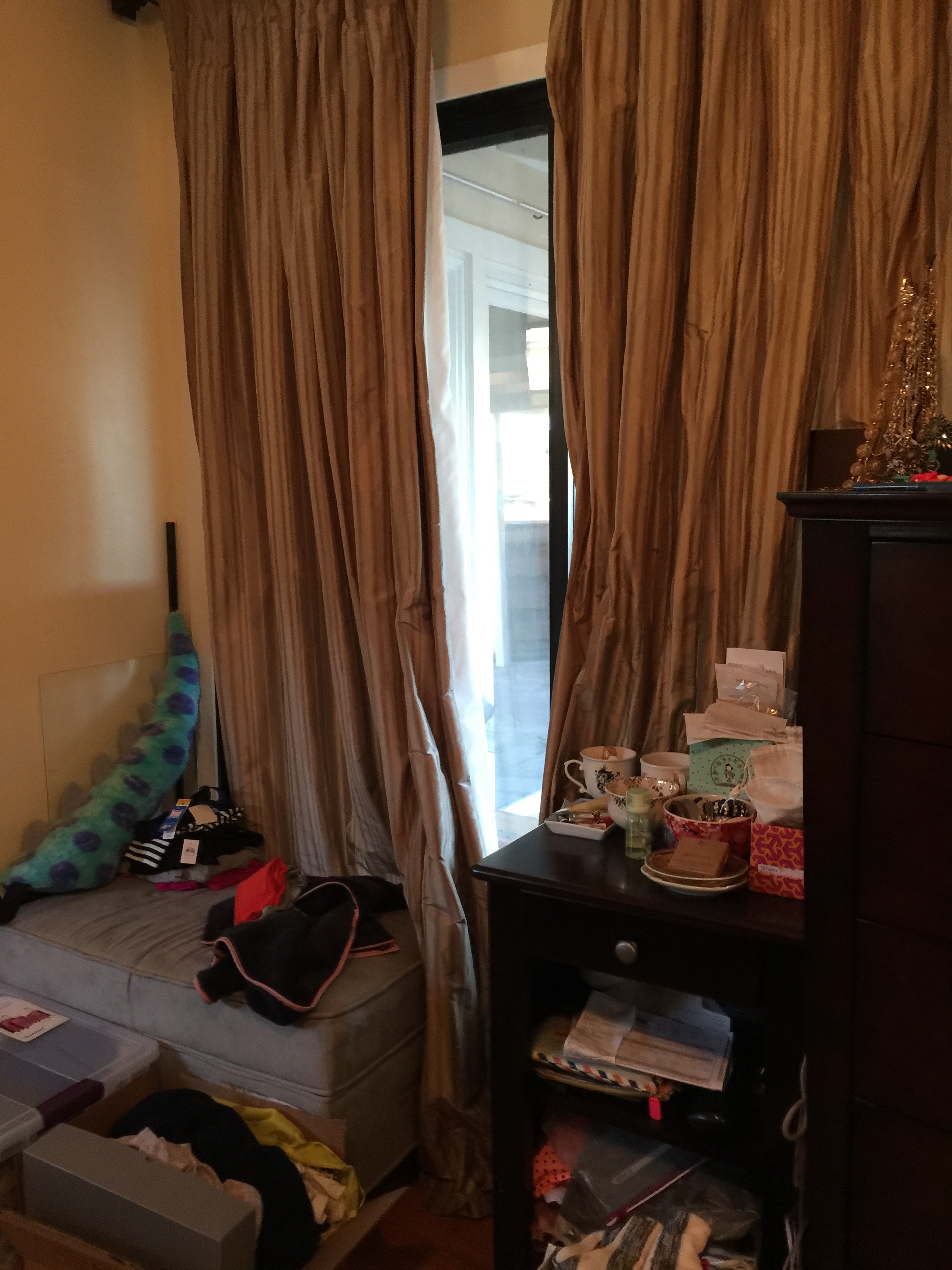
Should we move to the other side of the room? Directly opposite the bed is a slider door as I mentioned above. Here is the before.
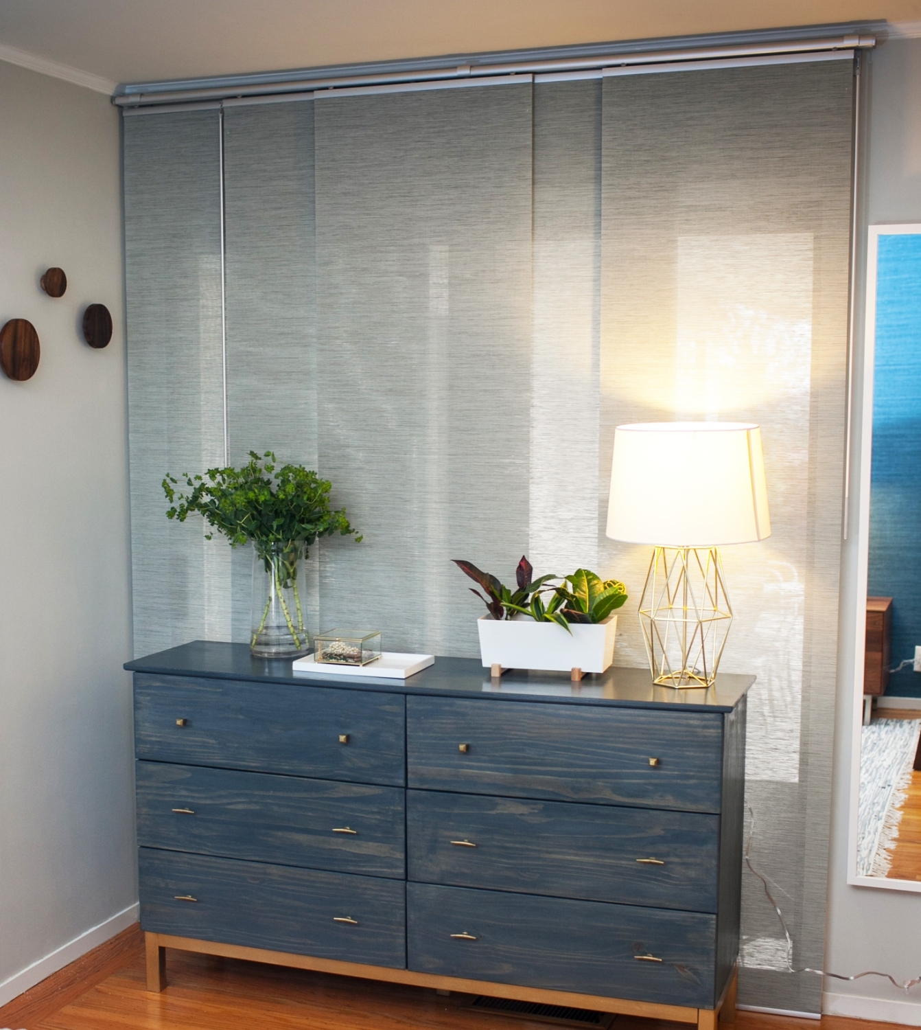
Due to privacy issues, and the fact that the clients never used this sliding door, they placed storage furniture in front of it. I thought the situation could be improved. Below is the after.
Photo by @mrgregma
The existing heavier silk curtains were just not working for the room or the clients. The room felt very dark since these curtains were always closed to maintain privacy. We replaced them with these curtain panels which are the perfect solution. The panels allow some natural light to come in yet preserve a sense of privacy since this area is the primary dressing area. And before you get up in arms about blocking the sliding door, don't worry, this is a temporary floorplan. Once the glider moves out, the dresser can be relocated to that corner.
As I always do, I brought some plants in to bring in some life and energy. Pro tip? I swear that plants from Ikea are hardier than most. Since I knew my clients are insanely busy, juggling their careers and household, watering plants falls to the bottom of the list. Fingers crossed that these survive.
Sconces above your nightstand are so on trend right now and you can see why below. They create the coziest and most inviting bedroom lighting.
Photo by @mrgregma
All you parents out there, I know you're busy and you work really hard. You really deserve to come home to a master bedroom that is truly a retreat. Don't forget to take care of your needs as well as your kids. Even the smallest changes can make a big difference as this before/after demonstrates. Let me know if you're interested in changing your bedroom into a sanctuary you deserve. Thanks for reading!


