Painting? Don't forget your compass!

Paint selection, although not often discussed here, is often a big part of my projects. Painting a room or several rooms is a big decision, but just a reminder, it's just paint! If the color doesn't work, you can switch it out easily and quickly, so don't treat this as a life or death decision, because it's not.  

If you follow me on Instagram, you know that I own a rental unit and I, or more accurately my contractors, did some light renovations on the unit during a turnover in tenants. I thought this would be a great opportunity to show how the right paint color can truly transform a room, and to discuss how to choose the right one. There are a million sources on the internet for the best white paints, best green paints, etc., this post isn't about showcasing the best paints of any color, but just some general considerations and principles I use when helping my clients to choose the right colors for their rooms. 

Here we go! Here is the rental unit before. I believe it was painted in Benjamin Moore's White Dove throughout. Excuse the floors, we just had some old carpet removed, so now you can admire our subfloors. 

Time to use a compass. 

When I walk into a room to help a client decide on a paint color, the first thing I pay attention to is which way the room is facing. If you don't know, now you have an excuse to finally use the compass feature on your phone. The direction that a room's windows face and the resulting natural light can have a strong influence on how any given paint color will look in that room. That paint chip from the paint store can look very different in a south or east facing room versus a north or west facing room. Of course there are caveats - if your south facing room has a large tree that blocks most of the natural light or an extended porch, the general rules regarding paint for south facing rooms won't apply. 

This rental unit is a first floor unit with all windows pointing north. Although it does get great natural light for a north facing unit, the amount of light it receives is somewhat limited. White Dove by Benjamin Moore is a great white color, a go-to for many designers, but in this lighting, it looks a little sad and grey. It's not bringing the best out of this room.  

For my own projects, I have an affinity for white and gray rooms, and often choose those colors in south and east facing rooms that receive an abundance of natural light throughout the day. The challenge for most of my clients that have north or west facing rooms is that they crave the look of the light and bright living areas they see in shelter magazines and blogs, but in practice white can look sad in their space. 

I'm going to depart from the conventional advice given on the internet and elsewhere to go with a darker color or a paint color with yellow tones. Dark colors in a room can work, and can be very lovely, but maybe it's not your cup of tea. Similarly, colors with yellow undertones can quickly look dated. Most of my clients have a more modern bent that yellow-hued paints don't always match.  

If you have a north or west facing room and want a light and bright space, choose a pale neutral color and forgo the white. Just be aware that the light received by a north facing room can be especially cool, so green and blue undertones are magnified. Does that mean you have to give up on your dreams of a gray room? Not at all. A good compromise is greige, a made-up word that describes the color between beige and gray. It has warm undertones derived from the beige, but is still modern in tone from the gray. I painted our unit my favorite greige, Edgecomb Gray by Benjamin Moore. See below!  

Such an improvement! The living room now looks light, bright and modern without resorting to white walls.  I know the new floors, curtains and flowers help, but seriously, the majority of the work is done by the difference on the walls. 

Choosing the right paint finish. 

The finish is often just as important as the paint color.  

For walls I often opt for flat or matte.  Here, we used matte.  The walls are plaster and although their texture is great, a finish in a higher gloss will highlight any imperfections on these 80+ year old walls. The unit was painted in an eggshell finish before, so if you scroll up and look closely at the before photo, you can see a shine on the walls. If you have walls that aren't in the best condition, I would definitely recommend going with a flat or matte finish. For newer homes, with drywall in good condition, I will on occasion recommend eggshell finish in higher traffic areas allowing scuffs to be magic erased off easily. 

For doors and trim, pearl, satin, semi-gloss and high-gloss are recommended.  

And last but not least, for kitchens and bathrooms, I would recommend a higher gloss finish such as matte or eggshell to keep the walls in the best condition possible for as long as possible. 

Go forth and go bold!

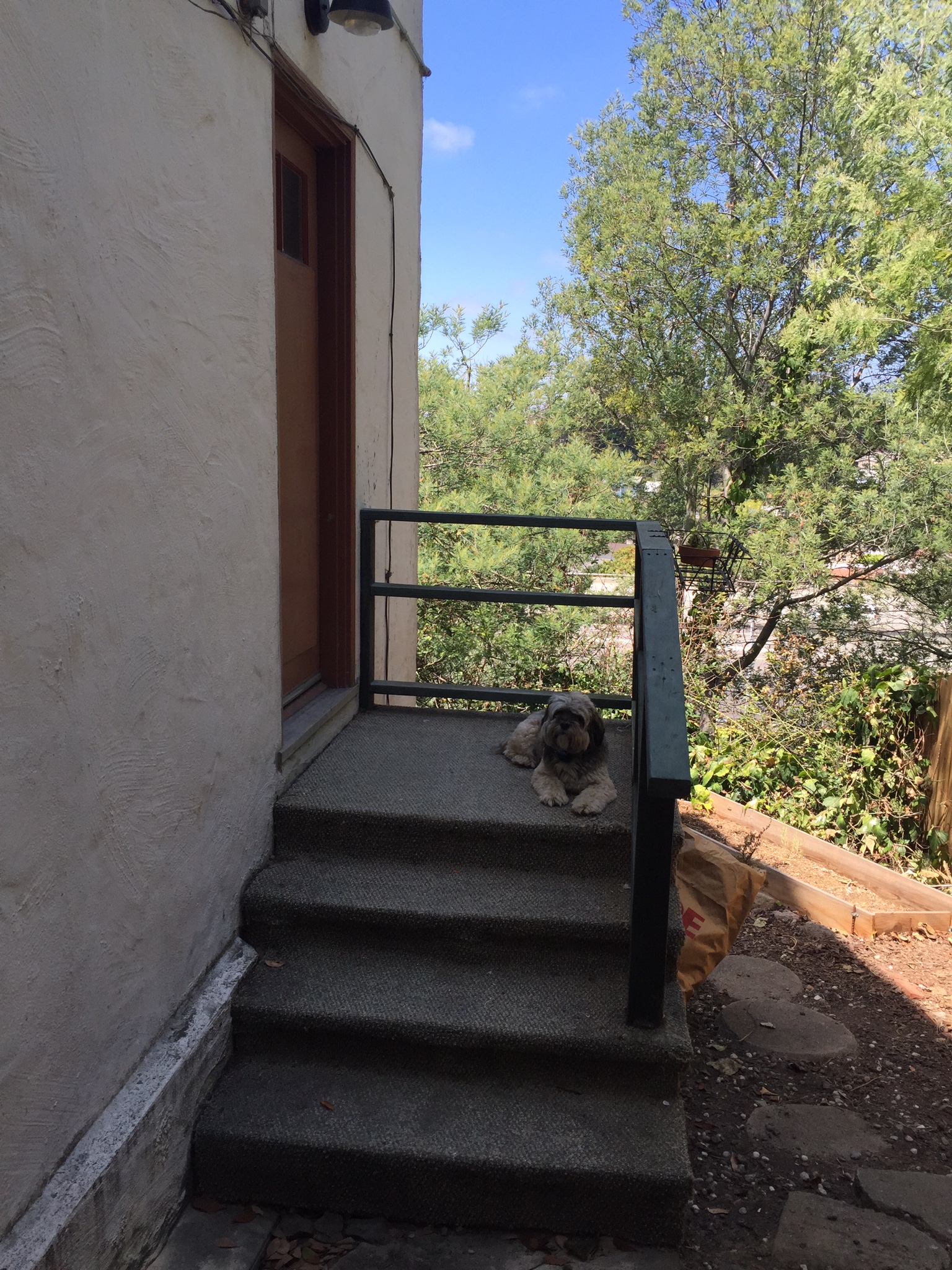
My last piece of advice, don't be afraid to go bold. Here, the front porch for this unit was simply embarrassing. The prior owner, for no reason I can discern, decided to install carpet on an outdoor porch! Unsurprisingly, the carpet didn't age well. Here is the before. 

Even my dog Morgan can't make this sad porch look good.  

I took this as an opportunity to go bold, make a statement and check off an item on my longstanding bucket list to own a home with a blue door. 

It was going to be impossible to match the stairs with the exterior accent color of the door. Instead, I decided to go in a totally different direction, a traditional yet modern blue, Covington Blue. It adds the ideal amount of cheer to a previously drab entry. Try out bolder, more saturated colors in smaller spaces and accent walls, you can take a small risk in a small space and become more confident in your color choices while you do it! 

And just because I couldn't help myself, even knowing it was most likely too twee, I added a rabbit door knocker. Feel free to judge me, I love this bunny.  

I hope this post helps you when you're choosing a new paint color for a room in your home!

Looking Lovely in La La Land

Sometimes a room just needs a very light refresh, a change of throw pillows, some new art, a vase of fresh flowers, and ta-da! Other times more work is necessary to bring a room up to snuff. When you start with well-worn blue carpet and older oversized furniture, you might have to roll your sleeves up and put in a bit more effort. Kind of like a bang trim versus an entirely new haircut. I may have said this before, but this time it's true, this was one of the most extreme before and afters ever.  

A little background, the client and her husband moved into her parents' house after they moved out. This is the house she grew up in, and hadn't changed much when she moved back in as adult. Having grown up in the home, the client was finding it difficult to imprint her own personality into the space. She contacted me for advice and guidance, and I was more than happy to help. 

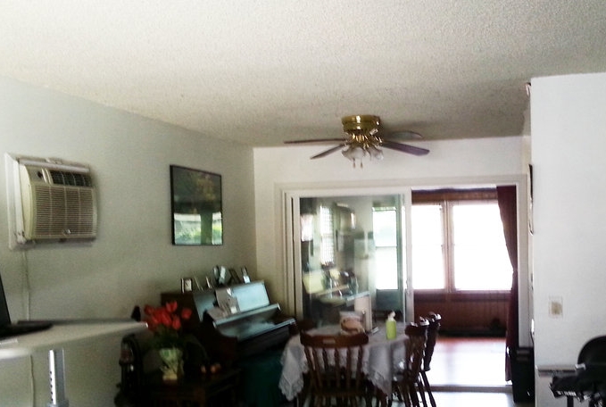
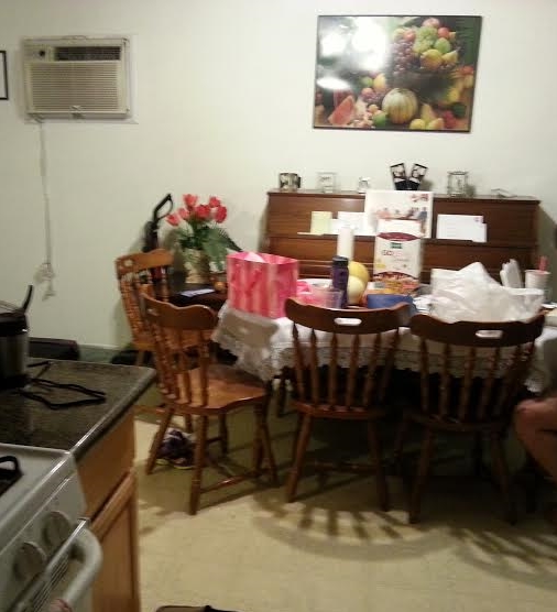
The first order of business, replacing the carpet with ceramic wood tile flooring.  It has the look of wood, but is much more durable and perfect for dining and kitchen spaces. Also, it immediately updated the space and feel great under bare feet for the warm Los Angeles climate. Here is the before of the dining room. 

It's a little difficult to view in the photo, but the flooring is beige vinyl that was very prevalent in the 80s. It would be difficult to update the space with only furniture and keep the floor as is. Since the client will be living in this home long term, it was important to spend money on important features such as flooring and saving money on furniture which can easily be upgraded in the future. 

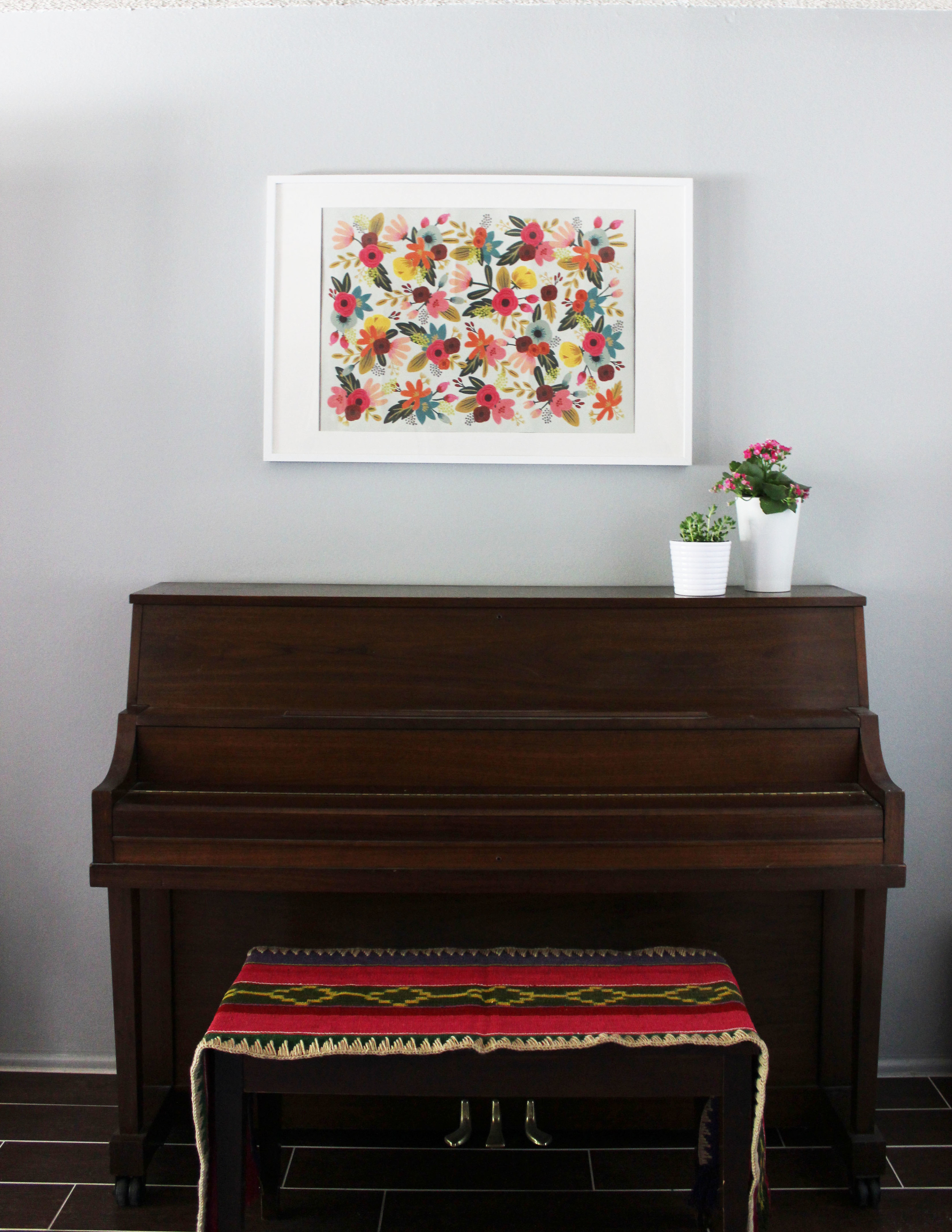
The piano would be staying for sentimental reasons, but nothing else was off limits, so I went to work. See below for the after! 

The walls were originally painted an off-white color with yellow undertones which wasn't really making the walls, room or me happy. We picked Edgecomb Gray by Benjamin Moore to bring coolness and modernity in. I removed the clutter from the piano, and upgraded the artwork to something more fresh and young.  Can you spot the ceramic wood tiles?  They're great right? I chose a grout in a contrasting color, again, to bring in some modern touches in an older home. Here is a photo of the new dining room in its entirety.   

The dining table has drawers, both useful and stylish. It was clear the existing fan light had met its end date. The upgraded simple glass pendant provides the ideal mood lighting for dining and entertaining but carries no visual weight. What is that bookcase you say? Borrowing a hack first seen on Apartment Therapy, we used an Ikea bookcase to cleverly hide the A/C unit when not in use while also providing additional storage for her fun collection of board games. On the other side of the dining room is a sun room that is currently being used for extra storage and gym equipment. I installed a curtain rod and curtains to hide the clutter from the common spaces of the home. It was important to choose curtains made from a lighter cotton to allow in diffused natural light, mission accomplished. One last picture below to truly appreciate the Cinderella like transformation. 

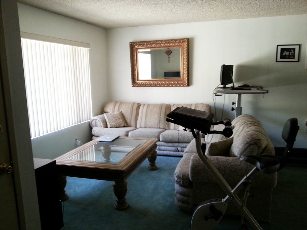
Follow me to the adjacent living room. As I mentioned earlier, all the furniture was inherited with the house and it needed to be updated. Even though we had spent most of our budget on the floors, it was important to devote an appropriate amount of the remaining funds to a sturdy new couch, so the client wouldn't need to replace sagging cushions in the next 3 years. Here is the before. 

So yeah...the blue carpet...there's not too much to say, but it definitely needed to go. We continued the wood ceramic tile flooring here, replaced all the furniture that was more in my client's style. And here is the after!

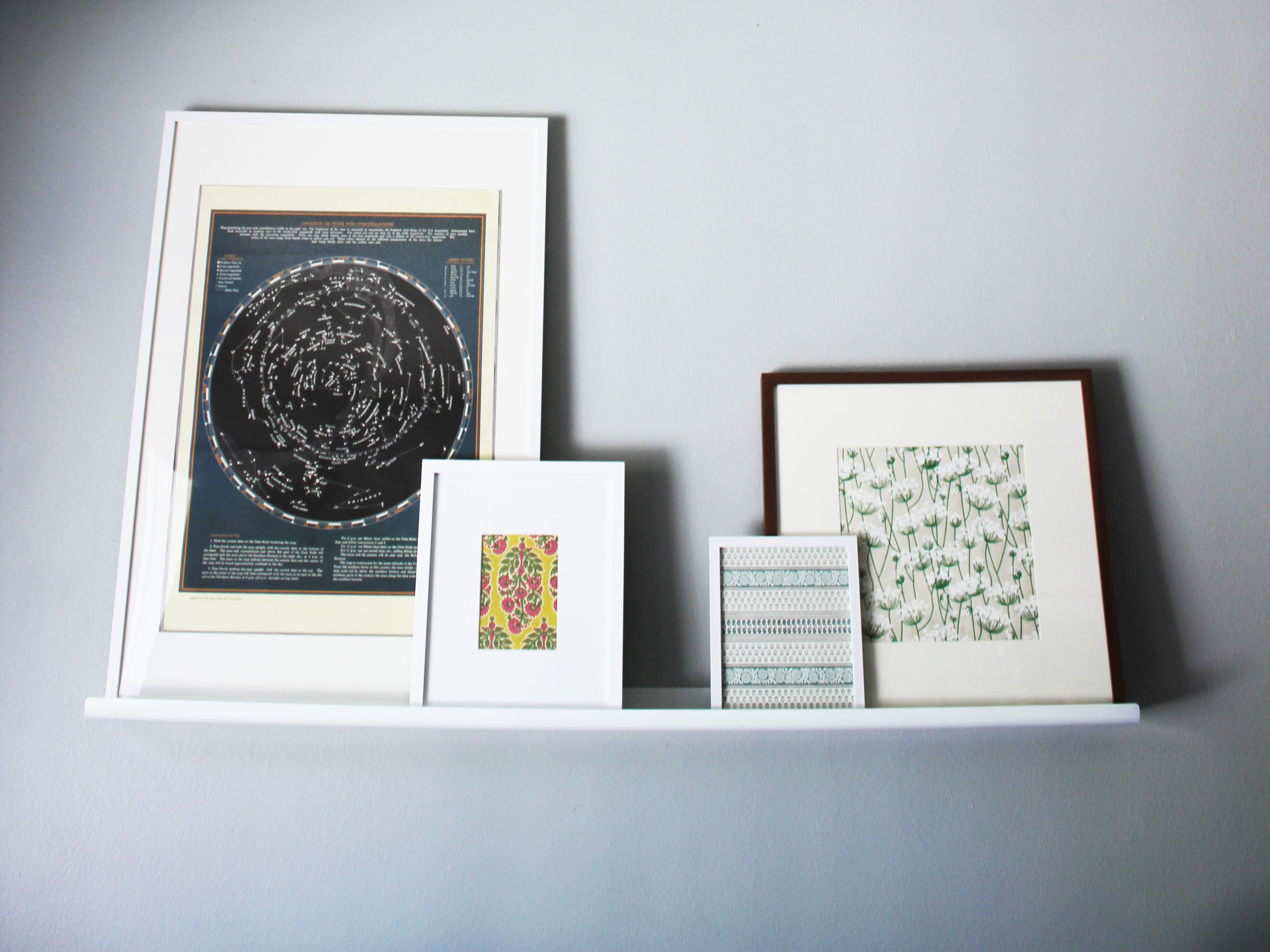
A very dramatic makeover, wouldn't you say? The new living room just feels so fresh, young, and dare I say cool? The woven ottomans add extra seating in a pinch and texture to the room. I'm in love with the feather throw pillow, it's so soft and fluffy, a perfect thing to hug at the end of a long day from work. This client is still building up her art collection, so as a temporary solution I picked up and framed beautiful but inexpensive gift wrap. This will give her time to be selective in looking for artwork she will treasure. The picture ledge is also a great way of having artwork and rotating it without having to commit to a specific arrangement or print. 

I loved working on this project. Smaller projects with some light touches are always nice, since you can see how small changes on a limited budget can make an immediate impact. But sometimes, a room needs more of an overhaul as was the case here. There's nothing better than a head to toe makeover! I hope you loved the new spaces as much as my client did!

Thanks for reading. 

One SF Lawyer's Modern Lair

Initial disclaimer. If you work at one of those fancy start-ups, this before and after might not be so impressive. I know, I've visited a few of these companies, and the interiors and amenities are unbelievable. However, if you work in a normal office without a Blue Bottle kiosk or a lego room, this post might be right up your alley. 

I was asked to spruce up an office for an attorney. I used to work in an office similar to this one, though the view from mine wasn't half as good. Just to set the stage, the office here is as good as it gets even before I got my hands on it. This client keeps his office in impeccable shape, and I love it. I'm so glad no one ever will see the way my office looked when I used to practice. It wasn't uncommon for me to have 20 or so document boxes with many, many large binders against the wall - it was a hot mess. 

I was happy that my client wanted to invest the money and time in making his office feel warmer and cozier. We spend so much time at work, often more than at home. I strongly believe you should put a high value on how you want to feel in your surroundings at both work and home. With a high value item, it only makes sense that you make an effort to improve and maintain it.  Your surroundings don't define who you are, but they can certainly help you with your productivity and well being. Spending money on your workspace is just an investment in your overall happiness! Okay, enough of the preaching, here we go. 

First order of business, this view. It's hard to make anything in this office look bad with a classic - even when foggy - amazing San Francisco view like this. 

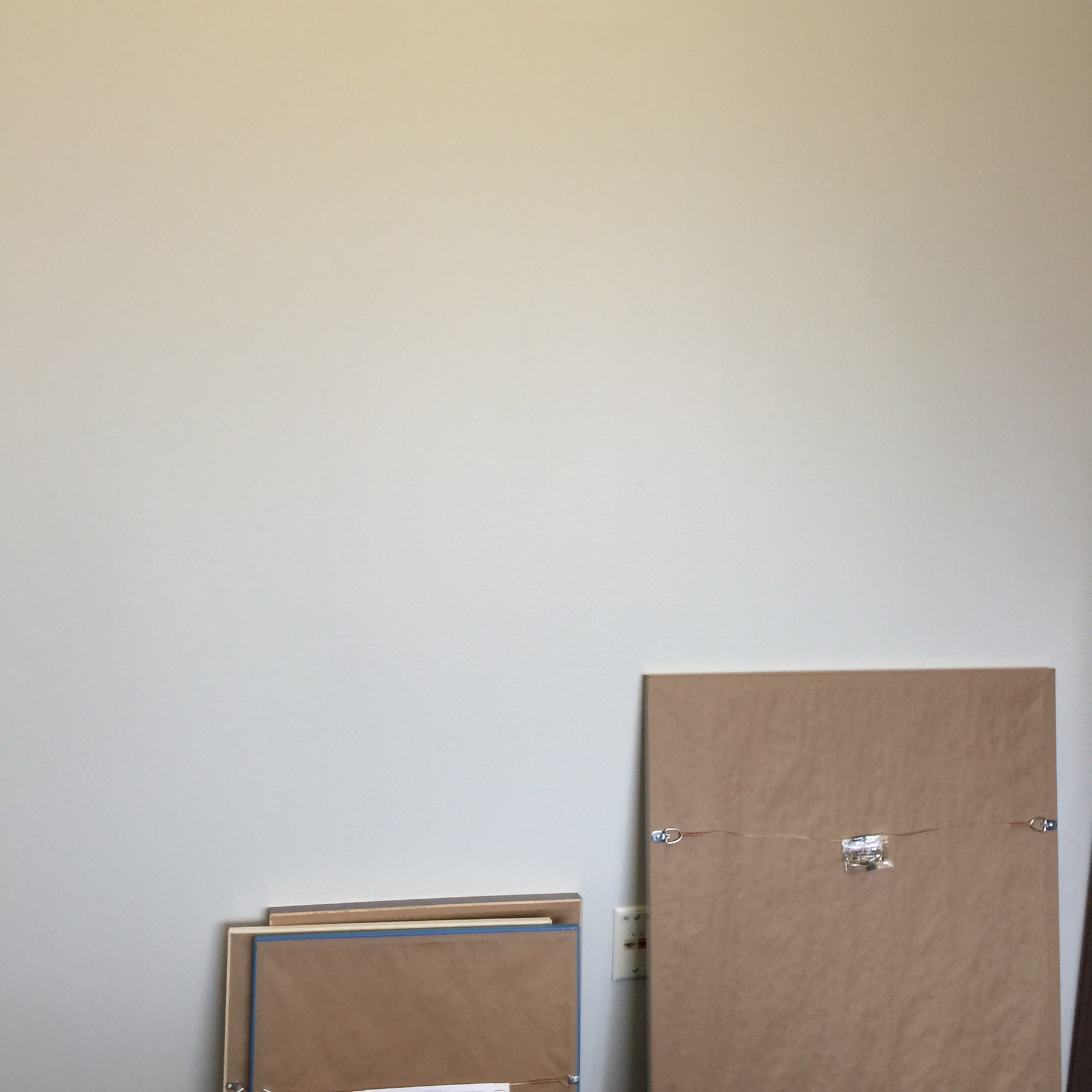
I can't turn away from that view...but we must, Here we go, down to the nitty gritty. With a few small and subtle changes, the overall look of the office was transformed. Here is the before of just an empty wall just begging for some art. 

So we gave in, and put up some color and personality! 

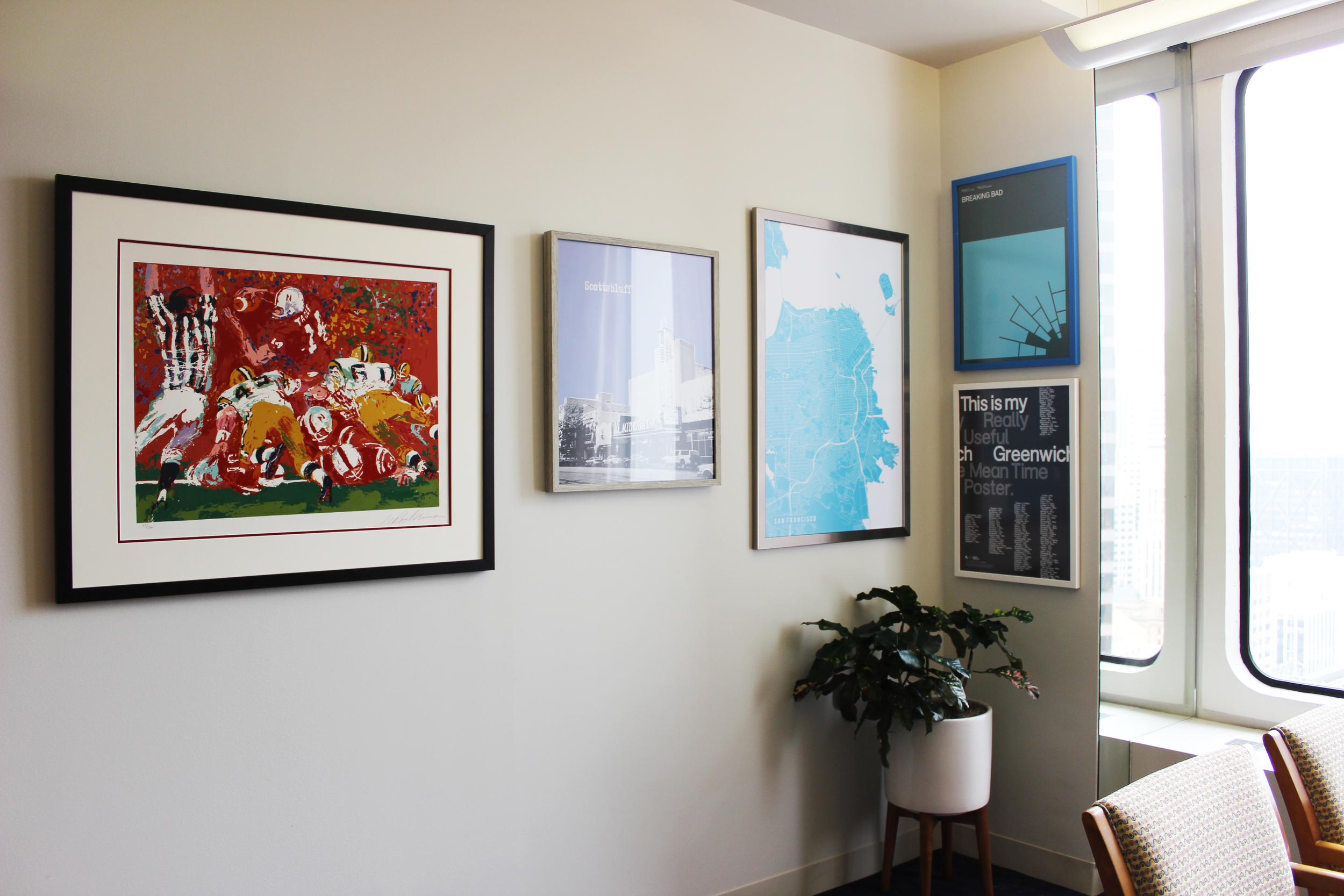
An improvement. No objections right? It's amazing what a gallery wall can do for a space. I brought a plant stand in to give some interest and modernity into the office. Since we were stuck with the existing office furniture, bringing something a little more current helped update the space overall. Ready for the next wall? Here is the before. 

And here is the after. 

There's movement, fun and interest all in this one wall. The client requested a dry erase board. I was a little hesitant to install one, purely for my own selfish reasons. They're usually not beautiful and they are very difficult to hide. Solution? I found this glass dry erase board. Doesn't it look amazing? And when it's not in use, you can say it's a part of the gallery wall! 

On to the bookcase. This is not a home office, it's an actual office at a firm, so you want to keep things clean and professional. However, that shouldn't mean that you can't have anything on your shelves other than law school books that you haven't touched...since law school. I added just three items to this bookcase: marble tray, ceramic vase, and wire squares (my favorite). Again the additions were few, and changes were small, but the impact was big.  Side note: five points for all you lawyers if you can spot the Chemerinsky!

Let's move on to where all the action happens.  Here is a before of the desk. 

IMG_1575 copy.jpg

Just your standard office fare. You can't really improve the look of a printer or monitor, but you can make changes elsewhere.  See below for the after! 

I changed things where I could to create a more cohesive and updated look, I replaced the black wire vertical/horizontal file storage with acrylic ones, switched out the tape dispensers and stapler with more modern ones, even updated the push pins - the plastic rainbow colored ones are just so sad. I gave the kleenex box a cover which sits adjacent to a similar white acrylic tray to keep things altogether visually.

The client specifically requested a retro table fan for air circulation. It was difficult finding one that was smaller so it was to scale, but my persistence paid off, and this one looks and works beautifully. My personal favorite additions are the wooden orbs. It's visual art in the midst of all these work accessories. Here is one last photo of the overall space. 

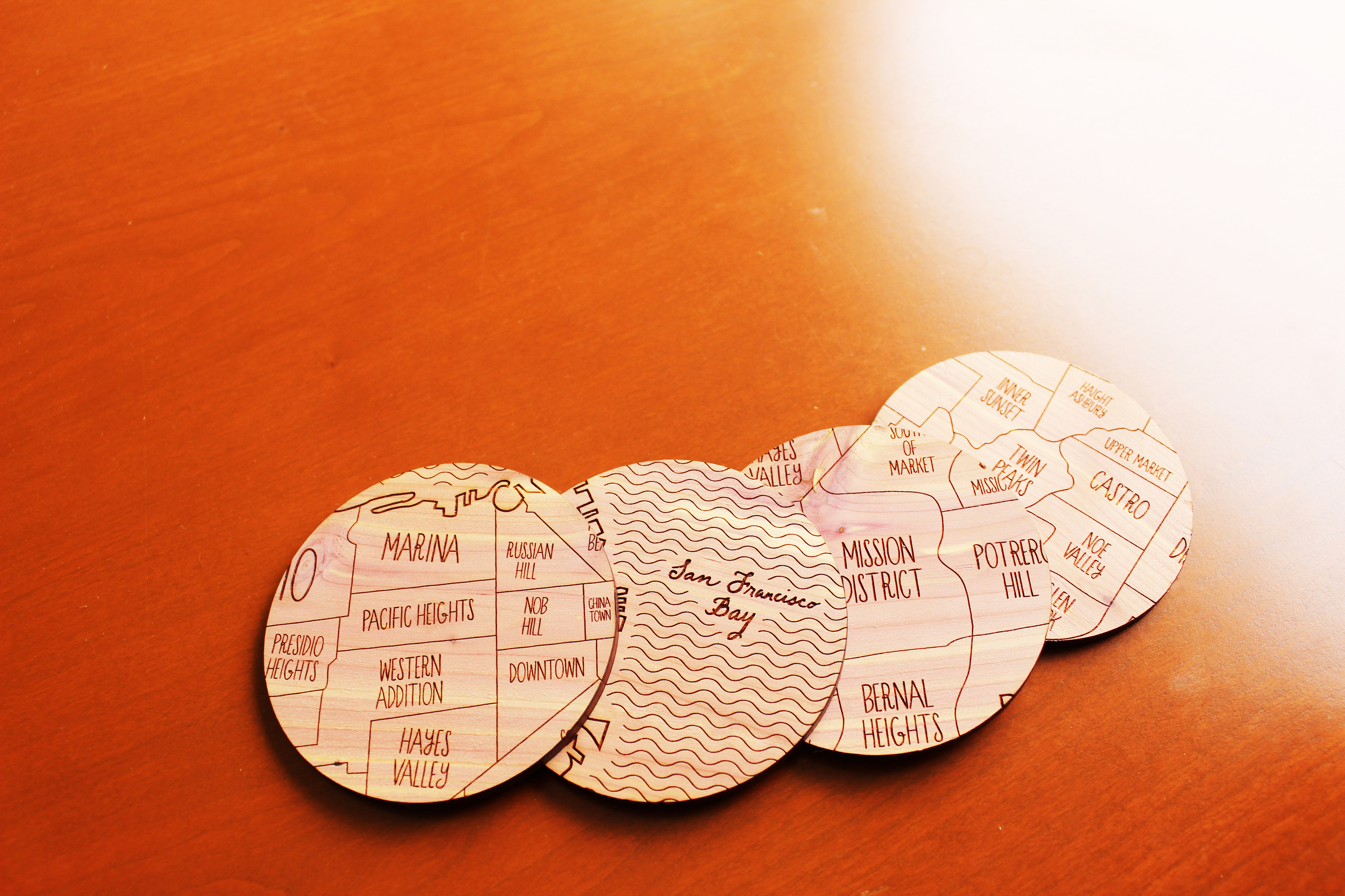
And no detail is too small, love these coasters I sourced for the client. 

I hope after reading this post, you leave with the desire to make your own office more enjoyable and pleasant. You deserve it! Even if you don't call on me for my help, you will find that a few small but impactful changes will boost your mood and productivity!