Sometimes a room just needs a very light refresh, a change of throw pillows, some new art, a vase of fresh flowers, and ta-da! Other times more work is necessary to bring a room up to snuff. When you start with well-worn blue carpet and older oversized furniture, you might have to roll your sleeves up and put in a bit more effort. Kind of like a bang trim versus an entirely new haircut. I may have said this before, but this time it's true, this was one of the most extreme before and afters ever.
A little background, the client and her husband moved into her parents' house after they moved out. This is the house she grew up in, and hadn't changed much when she moved back in as adult. Having grown up in the home, the client was finding it difficult to imprint her own personality into the space. She contacted me for advice and guidance, and I was more than happy to help.
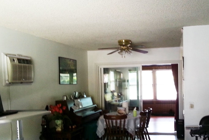
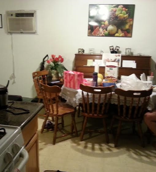
The first order of business, replacing the carpet with ceramic wood tile flooring. It has the look of wood, but is much more durable and perfect for dining and kitchen spaces. Also, it immediately updated the space and feel great under bare feet for the warm Los Angeles climate. Here is the before of the dining room.
It's a little difficult to view in the photo, but the flooring is beige vinyl that was very prevalent in the 80s. It would be difficult to update the space with only furniture and keep the floor as is. Since the client will be living in this home long term, it was important to spend money on important features such as flooring and saving money on furniture which can easily be upgraded in the future.
The piano would be staying for sentimental reasons, but nothing else was off limits, so I went to work. See below for the after!
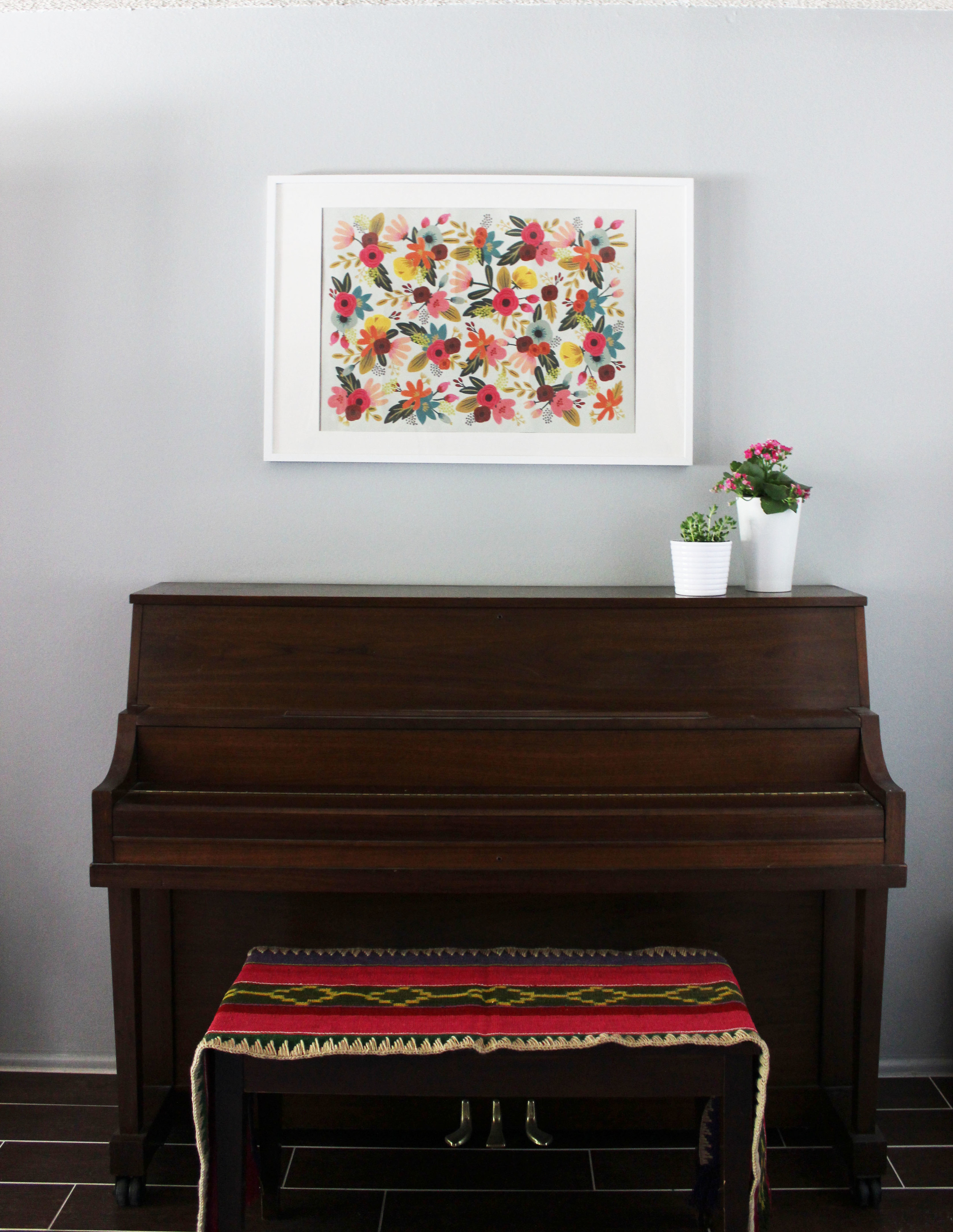
The walls were originally painted an off-white color with yellow undertones which wasn't really making the walls, room or me happy. We picked Edgecomb Gray by Benjamin Moore to bring coolness and modernity in. I removed the clutter from the piano, and upgraded the artwork to something more fresh and young. Can you spot the ceramic wood tiles? They're great right? I chose a grout in a contrasting color, again, to bring in some modern touches in an older home. Here is a photo of the new dining room in its entirety.
The dining table has drawers, both useful and stylish. It was clear the existing fan light had met its end date. The upgraded simple glass pendant provides the ideal mood lighting for dining and entertaining but carries no visual weight. What is that bookcase you say? Borrowing a hack first seen on Apartment Therapy, we used an Ikea bookcase to cleverly hide the A/C unit when not in use while also providing additional storage for her fun collection of board games. On the other side of the dining room is a sun room that is currently being used for extra storage and gym equipment. I installed a curtain rod and curtains to hide the clutter from the common spaces of the home. It was important to choose curtains made from a lighter cotton to allow in diffused natural light, mission accomplished. One last picture below to truly appreciate the Cinderella like transformation.
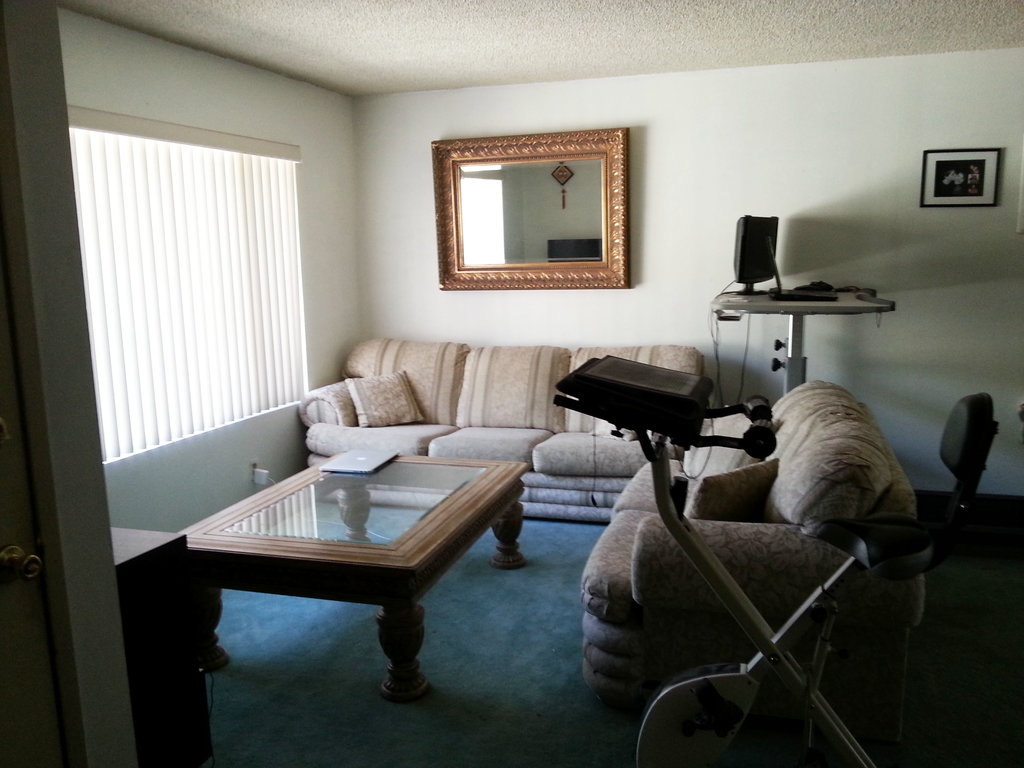
Follow me to the adjacent living room. As I mentioned earlier, all the furniture was inherited with the house and it needed to be updated. Even though we had spent most of our budget on the floors, it was important to devote an appropriate amount of the remaining funds to a sturdy new couch, so the client wouldn't need to replace sagging cushions in the next 3 years. Here is the before.
So yeah...the blue carpet...there's not too much to say, but it definitely needed to go. We continued the wood ceramic tile flooring here, replaced all the furniture that was more in my client's style. And here is the after!
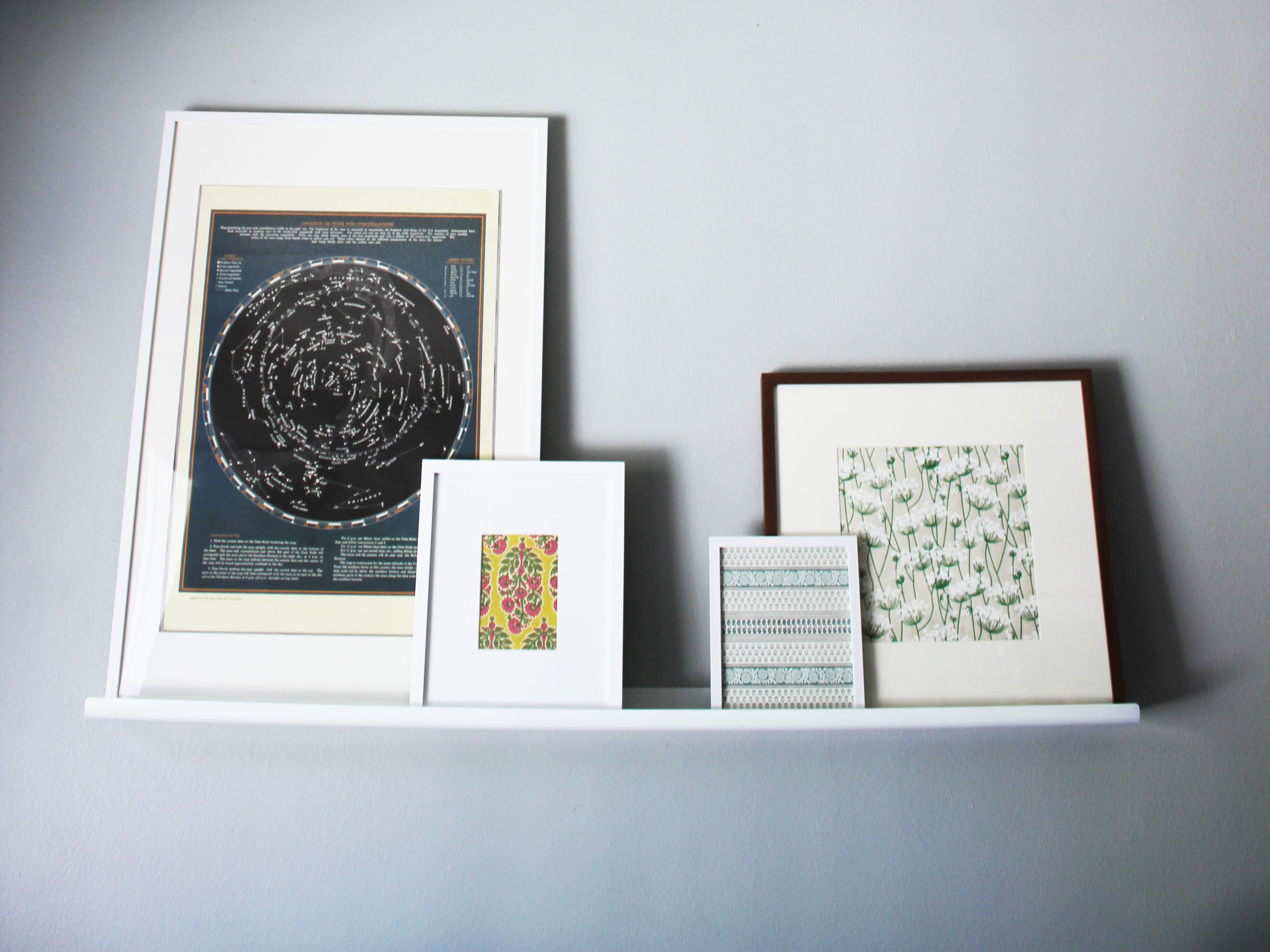
A very dramatic makeover, wouldn't you say? The new living room just feels so fresh, young, and dare I say cool? The woven ottomans add extra seating in a pinch and texture to the room. I'm in love with the feather throw pillow, it's so soft and fluffy, a perfect thing to hug at the end of a long day from work. This client is still building up her art collection, so as a temporary solution I picked up and framed beautiful but inexpensive gift wrap. This will give her time to be selective in looking for artwork she will treasure. The picture ledge is also a great way of having artwork and rotating it without having to commit to a specific arrangement or print.
I loved working on this project. Smaller projects with some light touches are always nice, since you can see how small changes on a limited budget can make an immediate impact. But sometimes, a room needs more of an overhaul as was the case here. There's nothing better than a head to toe makeover! I hope you loved the new spaces as much as my client did!
Thanks for reading.

