Shall we continue? if you've been following my posts, you know the details: crazy big house in Las Vegas, furnish in two months, and surprise a new mom who also happens to be one of my closest friends with a fully furnished new home. And if you're like, "what? I'm lost," please rewind, read Part 1 and come back!
On to the most used areas of the home: family room, kitchen dining area and kitchen. These areas are the heart of every home, and in most modern homes or renovated homes, they are the areas where families spend 90% of their time. These spaces need to be warm and functional, but should still be stylish. If you're going to spend most of the time in one area of the house, it should be a pleasant experience. Don't you agree?
Here is the before of the family room and kitchen eating area.
I know there are moving boxes but that doesn't take any shine and sparkle from that brand new kitchen and appliances. I love old houses. I'm lucky to live in one that was built in the 1930's, and the charm can't be replicated, but I have to say, an absolutely never used kitchen?! Amazing. I've even cooked in this kitchen and it's so much fun.
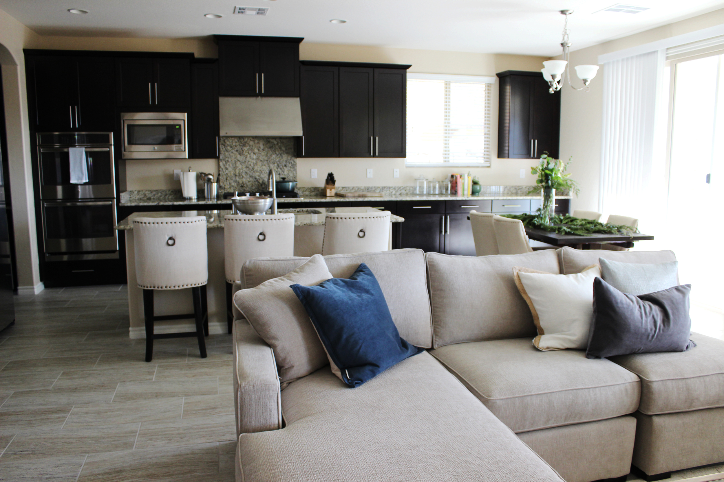
Here is the new kitchen dining area!
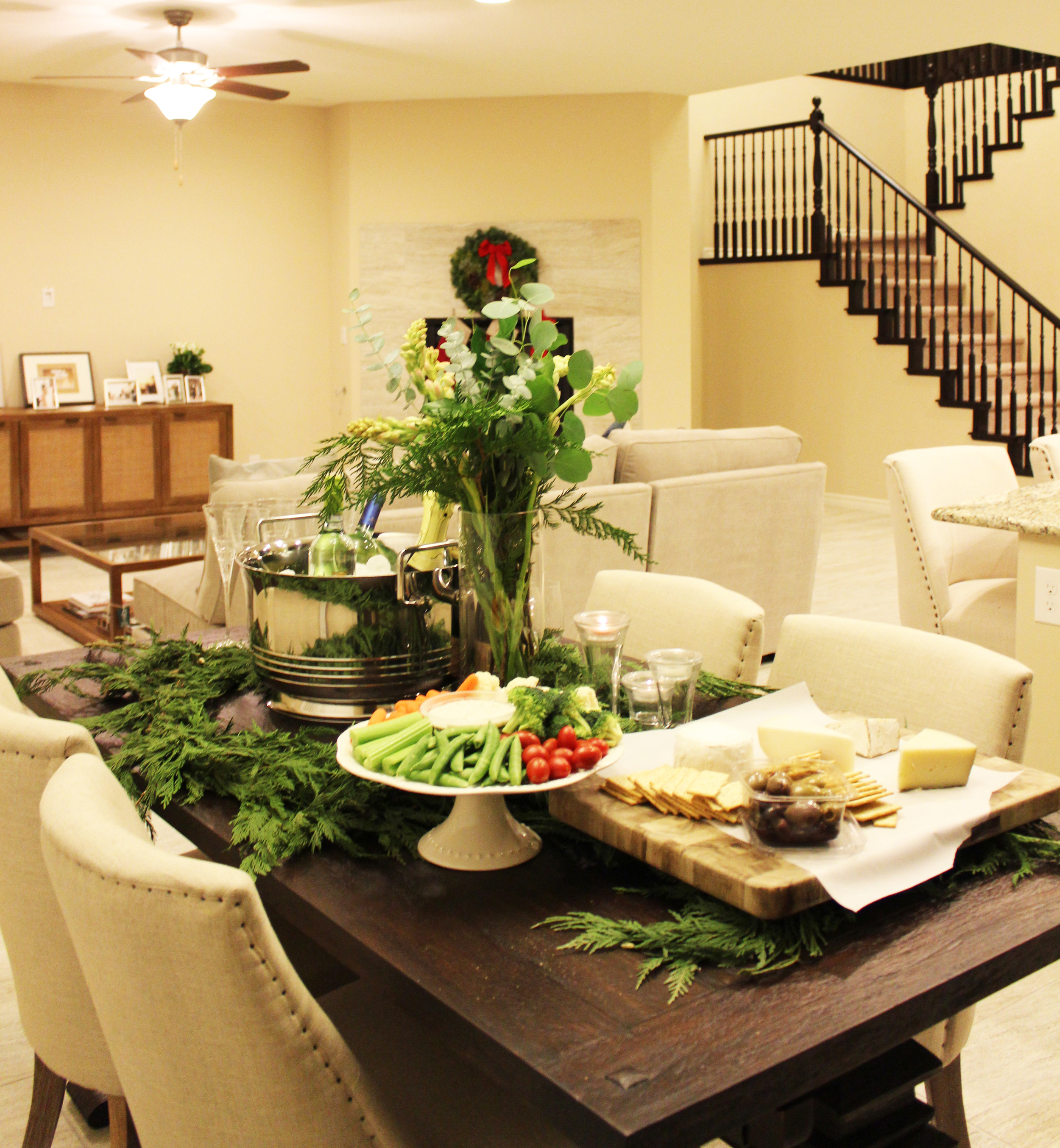
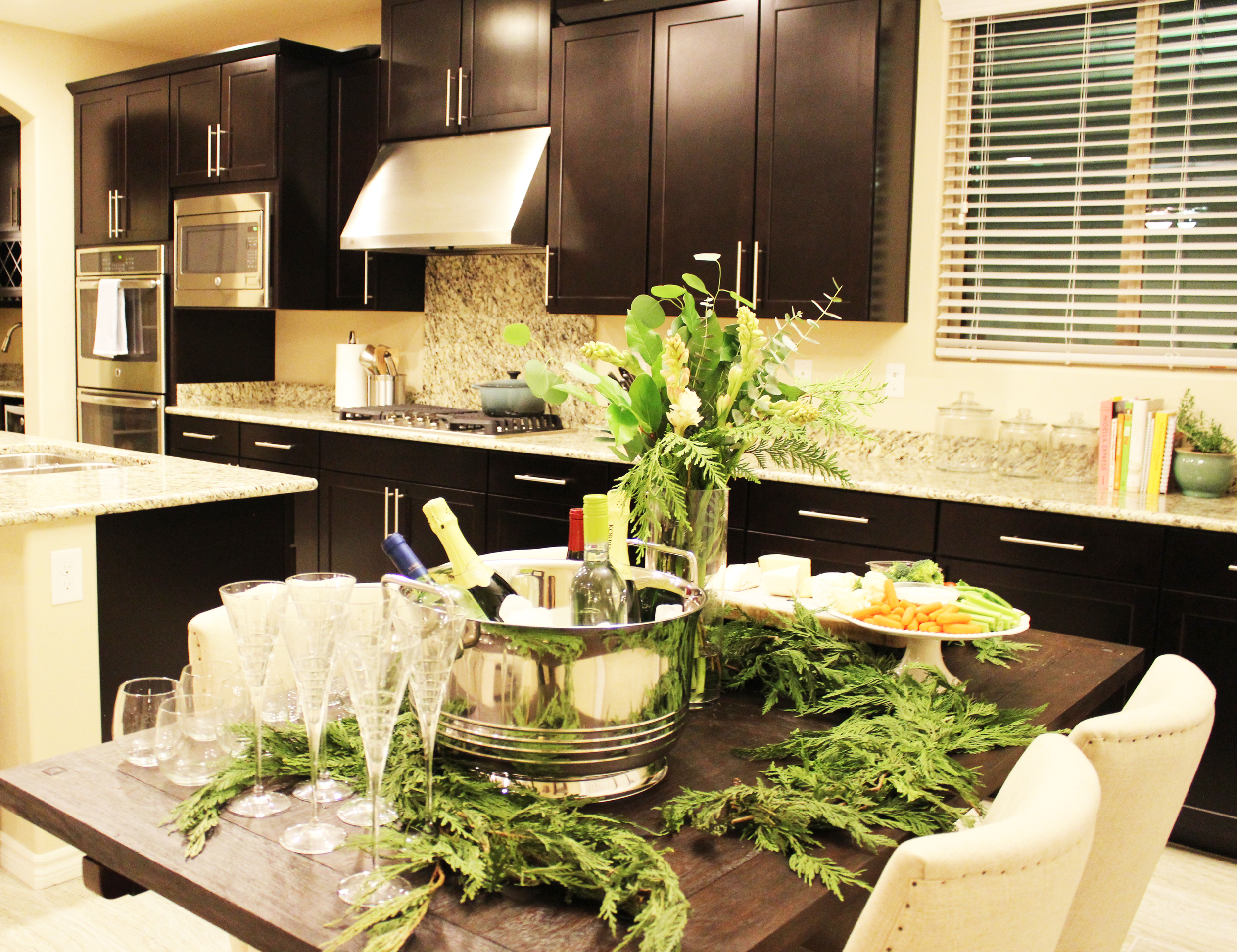
You can see how even the sun loves this new arrangement as it casts some sunbeams on this beautiful trestle table. I knew the clients had a strong preference for white coastal-style furniture. However, since the kitchen cabinets were so dark, I thought bringing anything too stark white would look slightly odd. Instead, I chose a dark wood trestle table to match the kitchen cabinets while opting for a ivory linen chairs to bring some lightness in. This table is not only beautiful but durable and the perfect height for a high chair on either end. The evergreen garland was leftover from the night before when I arranged some snacks for the mini surprise party. See below!
Quick Tip - Do you see the cake stand being used as a veggie platter? Great way to use your cake stand more than once a year and not purchase additional serve ware. And how does this relate to being more organized? Less stuff = less clutter!
Marching onwards to the adjacent family room. Here is the before.
Beautiful foundation to work with. It's a blank slate. The clients love watching college sports, so I knew the seating in this room had to be comfortable, but since the rest of the house was furnished a touch on the more formal side, I didn't want the family room to deviate too far from that. Objective achieved I think.
It's cozy but classy. The throw pillows add color but can be quickly changed out if the clients want to go in a different direction. Since this was a surprise and I had no client input, I went safe with whites, grays and blues for the accent pillows. Having different sizes and textures brings a curated look to the room.
The coffee table is the perfect size and the glass top brings the visual lightness you need here because of all the furniture in this room. The clients just had a baby so for future childproofing purposes, I recommended that they either temporarily store the table for a while when the baby becomes a toddler and starts walking or use these nifty things called corner bumpers which will protect their adorable baby boy from those sharper corners.
And you're thinking, wait, Clara, isn't there a piece missing in the sectional? Good eye. Due to the time constraints, the corner piece did not arrive in time, but the clients generously forwarded me a photo of the completed sectional. See below!
Sectionals are hard. They are so comfortable, but it's often difficult to find one that looks tailored and streamlined. I love this one. It's modern but not too much so and would work in a number of different type of styles. And it's really, really comfortable. Promise.
Wait, don't forget the kitchen counter stools. You can kind of spot the kitchen counter stools in the above photos but here is a closer look.
The counter stools echo the look of the kitchen dining room chairs but are not identical. No one likes being their furniture too matchy. So instead, we have sister chairs here, which provides a cohesive look throughout the entire space.
And my favorite part of this area of the house? The walk-in kitchen pantry. Truth. I see them on House Hunters and I'm always thinking if I had a walk in pantry the things I could do! I don't foresee one in my future, but it was fun pretending this was my pantry while I shopped to fill it up for the clients.
It's like having your own general store. So much space. I just can't get over it. The baskets with chalkboard labels are great for labeling and corralling the smaller items to keep things organized. And the large airtight glass canisters are perfect for storing dry goods you use often so you don't have to deal with the mess associated with opening and closing paper bags of flour, sugar, and salt.
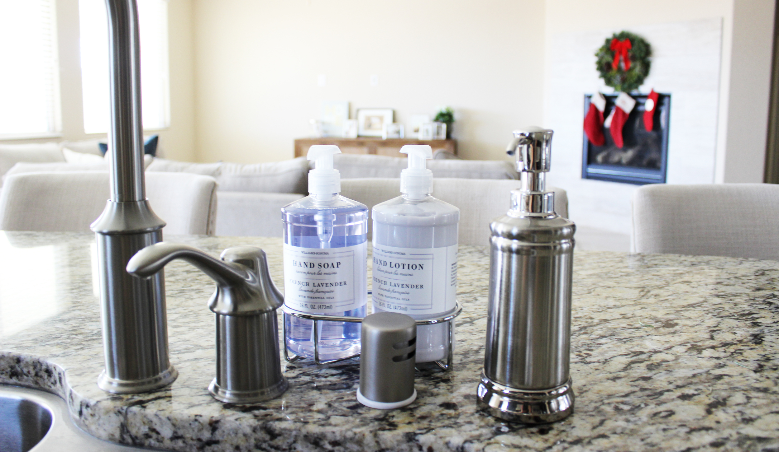
Last tip? Dish soap advice. Yup, you heard right. Pour and use your dish soap using a bathroom soap dispenser as seen below. First, it's practical, it's easier than picking up your dish soap with every use to apply to your sponge. You can now apply soap with one hand! Second, yes, it's prettier. Please don't downplay this second benefit. I am a firm believer that when things are arranged in an aesthetically pleasing way, there's more of an incentive to maintain better organization in the house. Every little bit counts, and no detail should be too small. And this is something that takes almost no effort!
And that's it folks. I hope you enjoyed this second installation. This family room/kitchen area has the perfect balance of sophistication and comfort, a solid foundation for both entertaining and everyday living. Stay tuned for the final installation which will be published next week!


