This is one of the very first projects I was hired to do when I decided to pursue interior design full-time. A friend had recently moved back to the Bay Area after several years in the East Coast and entrusted me to transform her new San Francisco apartment into her home. The client wasn't just changing her zip code, she'd also recently quit the law to pursue writing full-time. Since she was going to be working from home, finding a functional work area in this work space was a priority.
The apartment gets great natural light most of the day, has high ceilings, and beautiful wood floors. However, fitting everything in was going to be like playing Tetris. It is a studio apartment and the original kitchen had little to no storage space. Because she was downsizing, finding a place for everything was going to be a challenge.
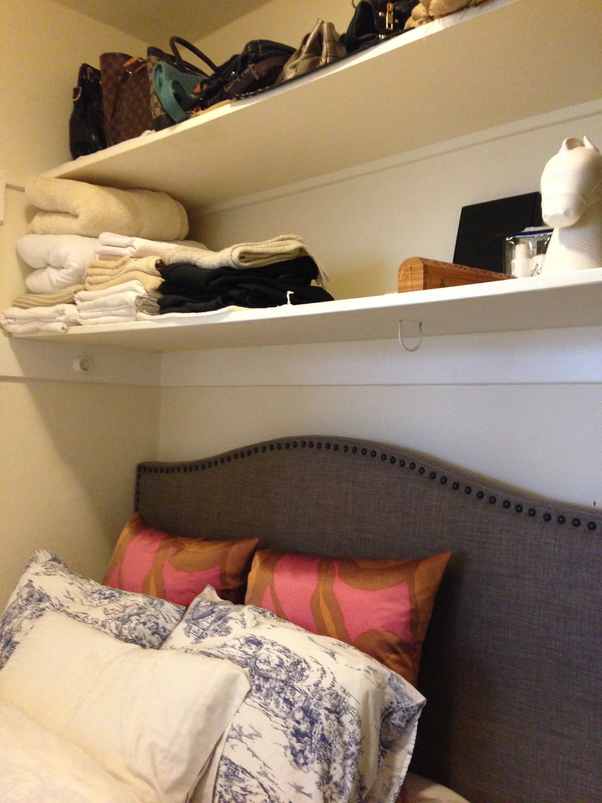
Shall we begin? Many of the tenants in this mostly studio apartment building have decided to convert the huge walk-in closet into a bedroom to create more living space, and we did the same here. FYI, there is another hall closet which is large enough to be used as her regular closet.
The shelves were being used for storage for accessories and linens (soft items, because, yes, earthquakes happen in California). For such a small space, you can't turn down any usable space. But I thought there had to be a way to make the bedroom feel more like a bedroom and not so much like a closet. So we installed a rod, created curtains for this space by flipping traditional window curtains horizontally and adding tabs to them. I'm going to have to pat myself on the back for this idea, pretty ingenious wouldn't you agree? See below!
A vast improvement. The shelves are still usable for storage and readily accessible, the bedroom doesn't scream "closet", but more "romantic bedroom nook." By repurposing normal window curtains to create a privacy screen, we were able to save a lot of money. Purchasing fabric and having a seamstress create curtains can increase the cost fairly quickly.
On to the kitchen. Not only is this client a writer, but she is an amazing cook. I can attest to her great culinary abilities from personal experience. So we were faced with the hurdle of storing a lot of cooking tools, serving ware, and cookbooks in a very quaint and tiny kitchen. See below.
Maybe I'm biased, but I actually prefer not to store things in really high places. I know storage space is at a premium here, but in terms of aesthetics, I thought the wire baskets above the cabinets and the microwave/ricecooker about the fridge added to the visual clutter. As a solution, I decided we needed to take advantage of the underutilized dining room by adding a large bookshelf.
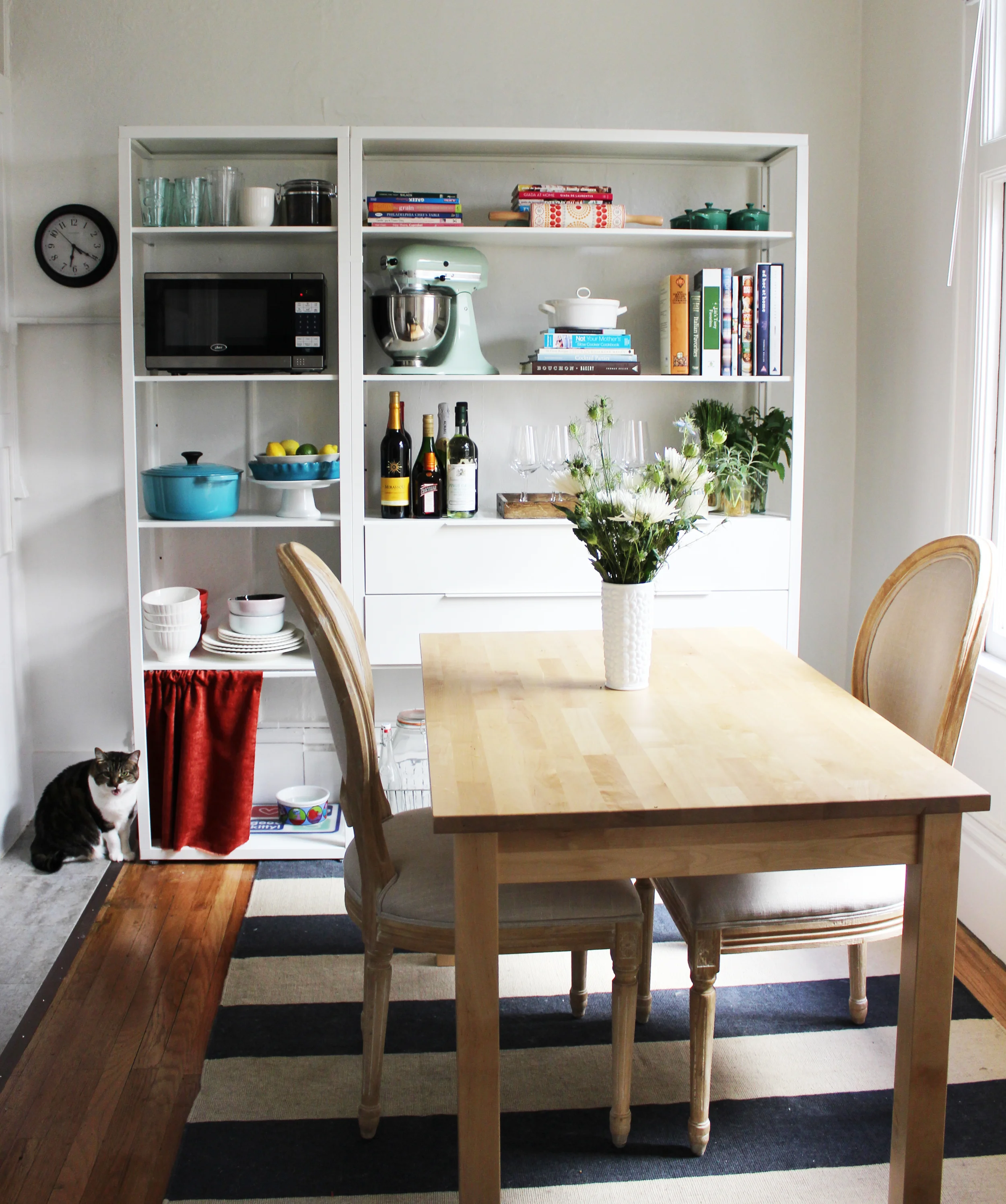
Drumroll please, take a look at the after below.
One of my favorite room transformations. On the very lowest shelf, we placed all the wire baskets that were stored atop the kitchen cabinets and other items such as the rice cooker. Now, all these items are within arm's reach and are out of the line of sight. We also placed the microwave here, so it kind of blends in, it was really serendipitous that there happened to be an outlet that high up. We gathered all the other gadgets, books, serve ware, etc., that were being stored in the kitchen and living room and placed them all one in this one bookcase. The bar area is enticing, is it not?
We also needed to create space for my client's cat (and cat accessories). Even when we love our pets, we don't necessarily love all the stuff they require. I created a private dining room for Tigger which is convenient for when guests come over so my client can easily close the curtain.
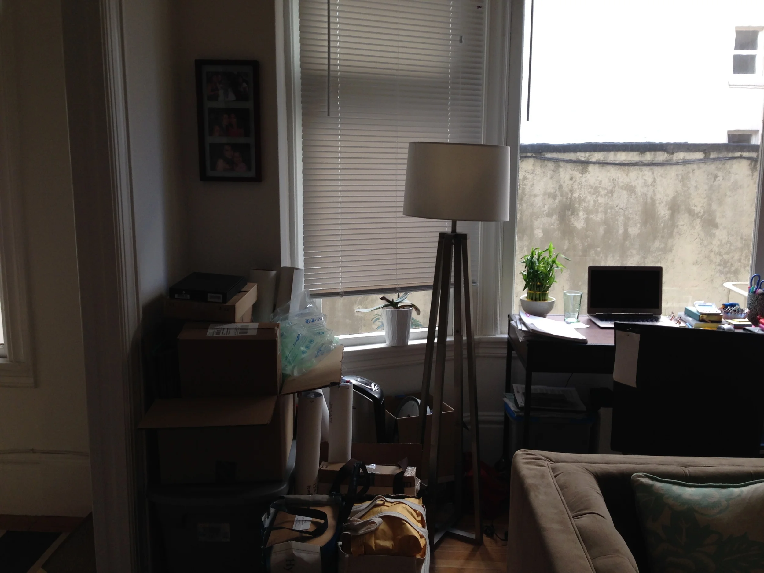
Next up? The living room and workspace. It just needed some sprucing up and organization. Moving a lot of the kitchenware out of the living room and into the dining space created more storage for my client's work materials. Here is the before.
It was clear that the boxes weren't doing an adequate job for storage. I'm always hesitant to add additional furniture into a small space, but I thought that would be the best solution especially if we could get something that would be unobtrusive. We were able to find the perfect bookshelf as you can see below.
A bright, cheerful and well organized work space. Do you spot the Ikea roller units? Put two together and you have a printer stand with additional storage for office supplies. It's a great inexpensive alternative to an actual printer stand, which tend to be fairly pricey for a reason I can't quite figure out.
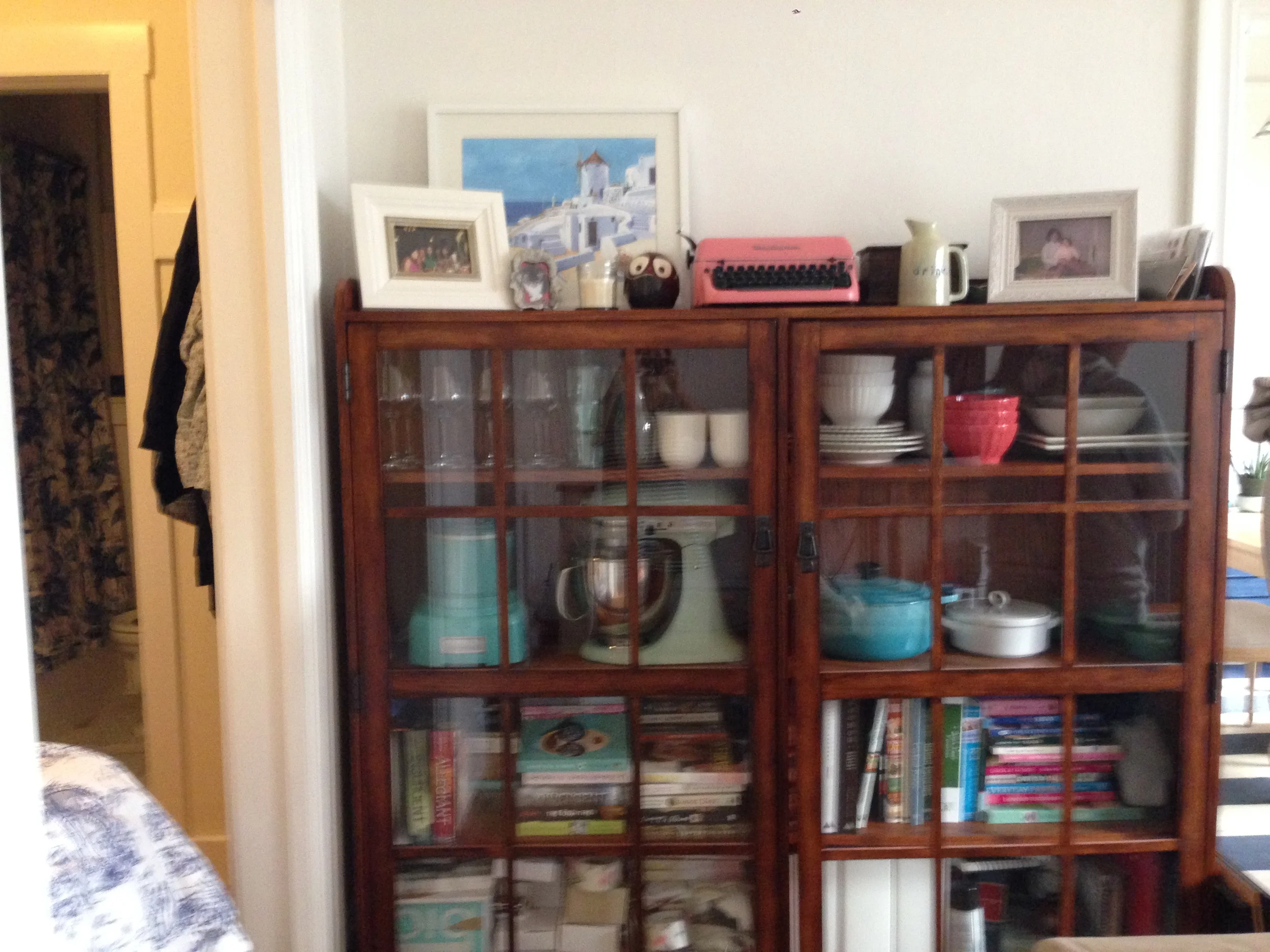
Moving onto the other side of the living room, we have a large hutch that originally stored mostly kitchen gadgets and serve ware as you can see below. The dining room became their new home after installing the dining room bookcase and we celebrated at the idea of additional storage in the living room.
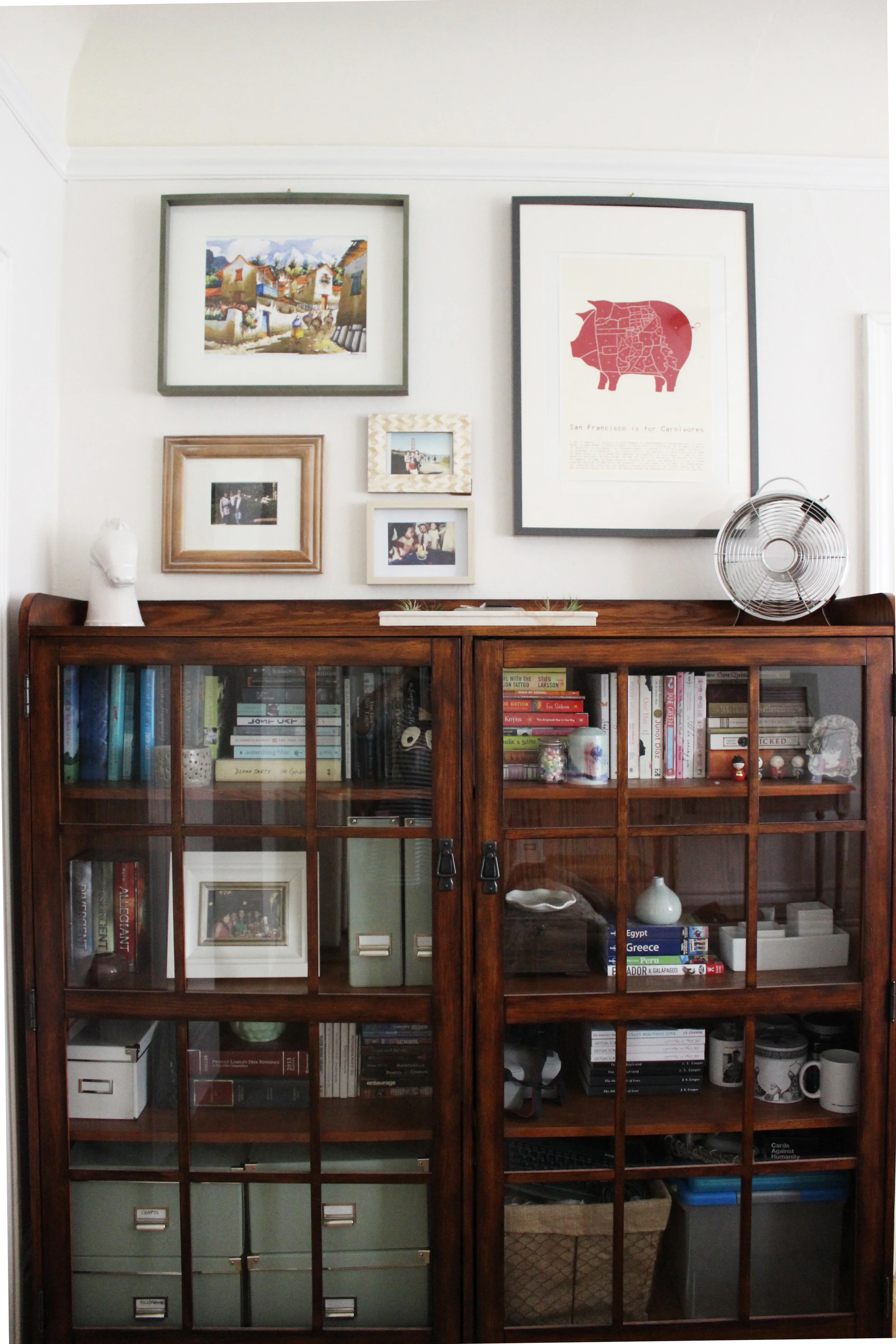
We decided to make this hutch an extension of her office and use it for much needed long term storage for necessary, but not often used office supplies and miscellaneous items. Since the hutch has clear glass doors, it was important to keep things looking neat and tidy. We did this by purchasing a bunch of coordinating storage boxes. To reduce the clutter and take advantage of the tall ceilings, hanging art and photos instead of leaning them made a world of difference. Please see below for the after!
A breath of fresh air. It was such a quick fix, but all these tiny changes made a world of difference in this little corner.
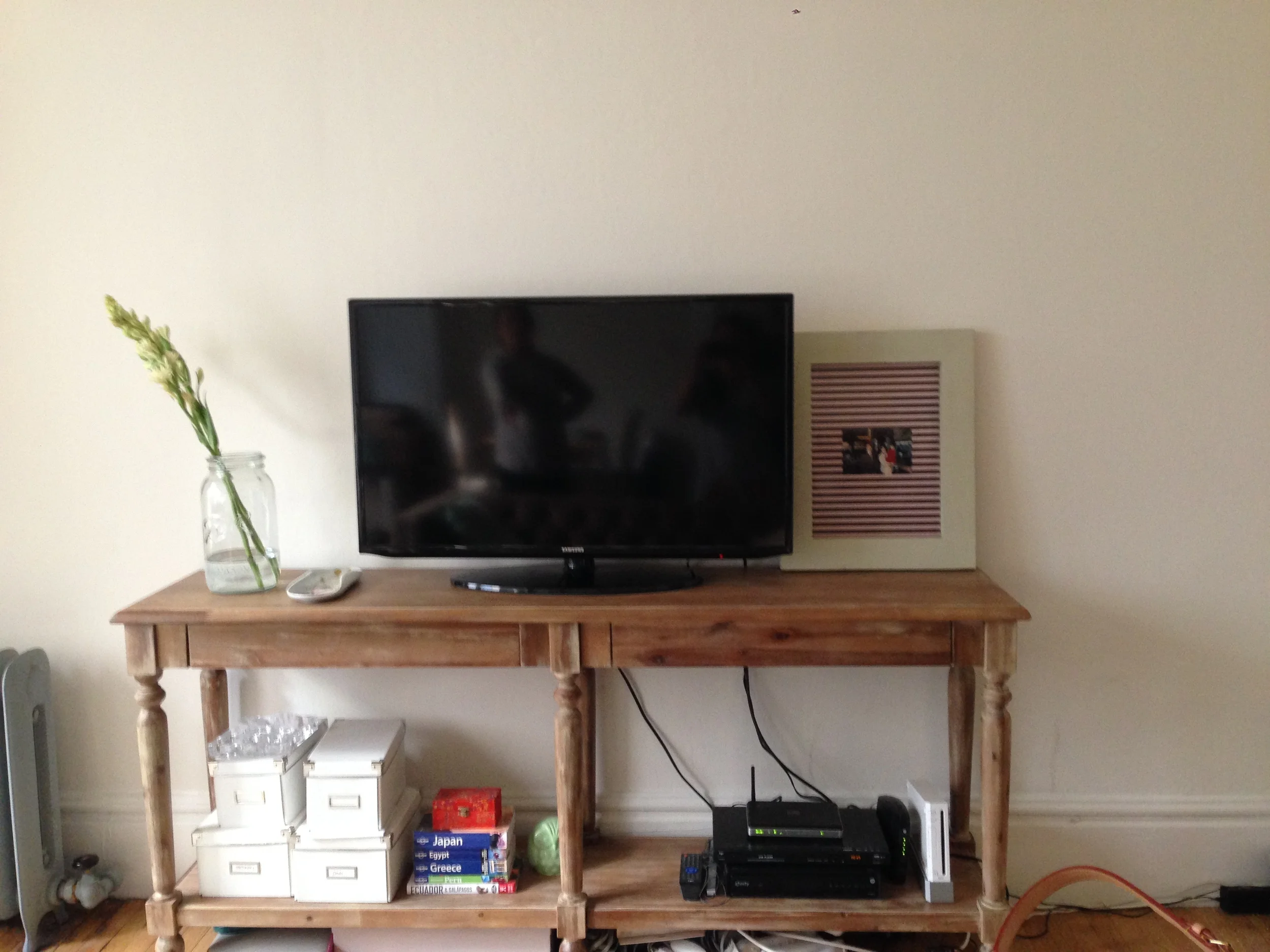
And last but not least, the media area. I think I can safely say that most of us don't live in new home where it's easy to wall mount your TV and to hide your cords behind the wall. So for the majority of us, we have to find creative yet practical solutions to hide the technology ball of cable and internet that is oh so necessary but really, really unattractive. Here is the before.
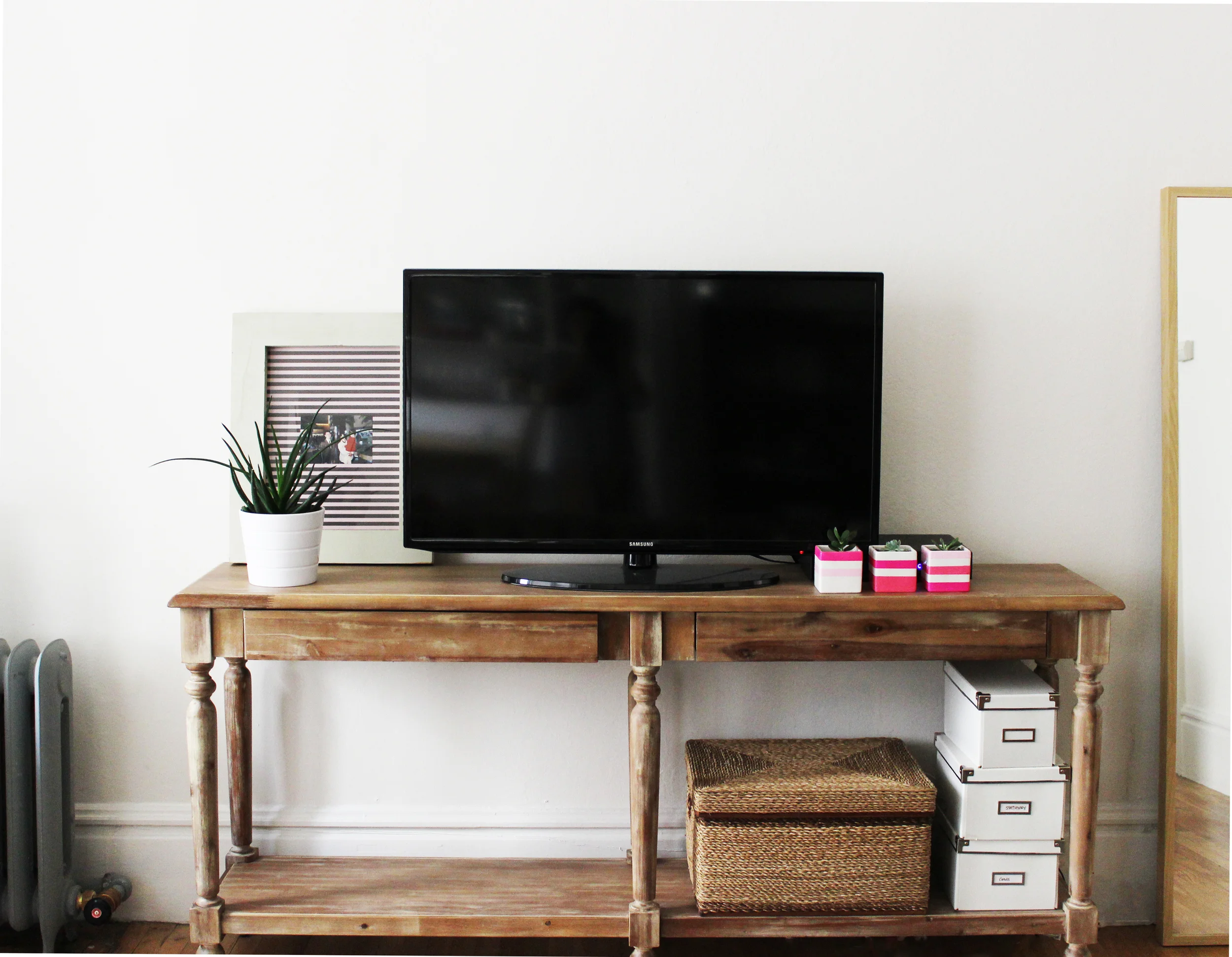
And after a small sprinkling of fairy dust...here is the after!
Clutter-free and beautiful. We placed the internet and cable gadgets inside that nifty basket, almost as if the TV works by magic without any cables or cords.
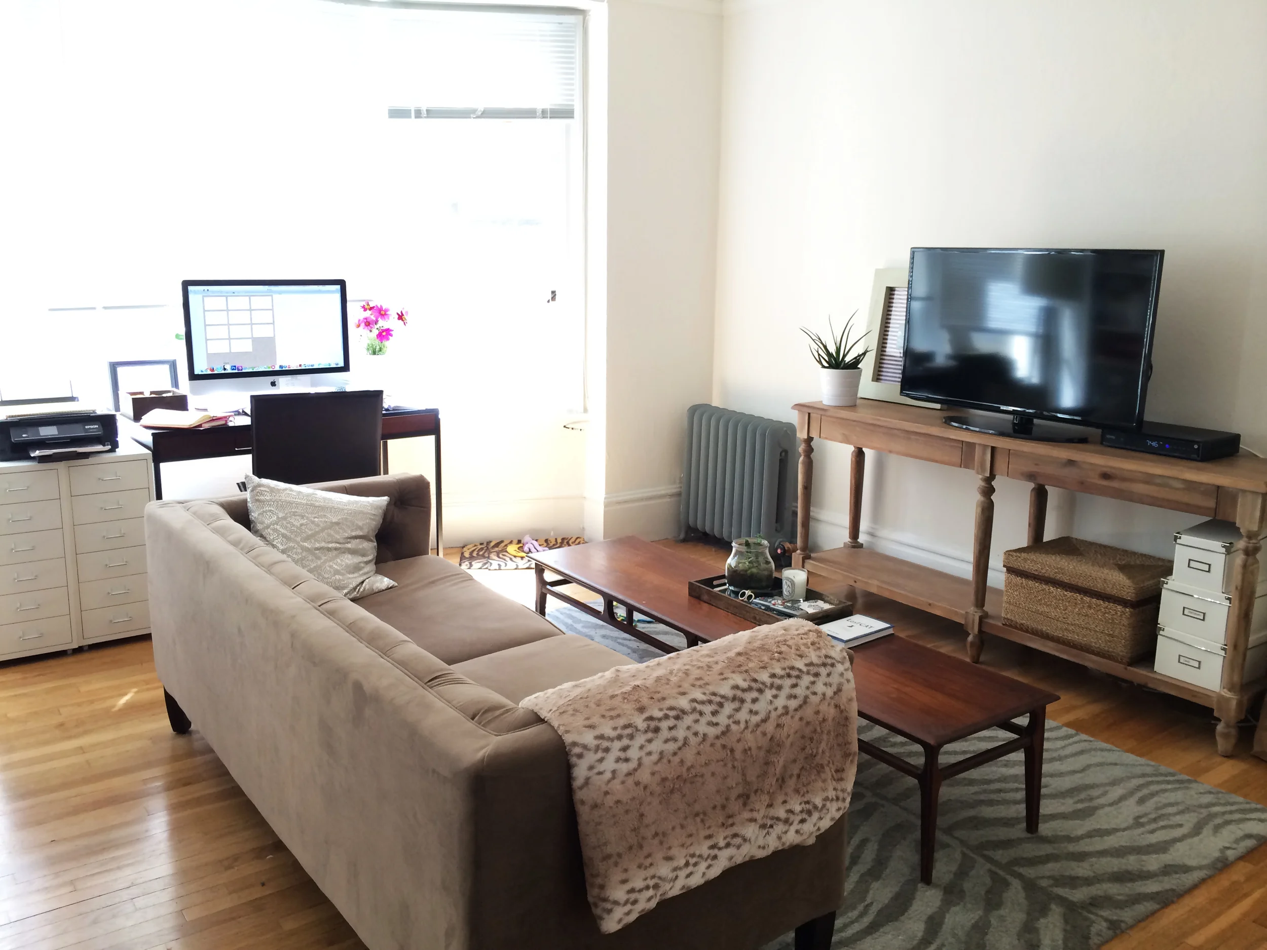
And when I started writing this post, I realized that I never got a photo of the entire living room so the reader can visualize it better. I asked my client to forward me a photo and she graciously answered my request.
I just love San Francisco apartments and their bay windows. Rent in San Francisco is high, very high, but you are often compensated with an abundance of character and natural light. The transformation of this charming and cozy apartment shows that there is a lot you can do even if your home has a smaller footprint than most.

