One of things I love about my job? Working on different projects with different clients allows me to flex my creative muscles. I often have clients with styles different from my own and that's completely fine. Part of my job is to distill, edit and implement my client's design vision no matter the style or space. But when I come across a client whose style is so closely aligned with my own, the collaboration process is absolutely effortless. That is what happened here.
This client lives with her family in a lovely Victorian in Noe Valley. She needed some help revamping two small spaces in her home. I used to live in a Victorian in Hayes Valley so I'm familiar with (and fond of) the quirky layouts that are commonplace in older San Francisco homes.
The first room to tackle was an office that was being used as more as a gathering place for odds and ends that didn't fit anywhere else in the room. We dubbed this room the "Pink Room" for obvious reasons. The goal was to create a reading room for Mom, a place for her meditate, relax and read after a long day of work.
The second room on the roster was a passageway between mini-me's bedroom and the kitchen. Since mini-me's bedroom was on the smaller side, we thought we could utilize this passageway for her, an extension of her bedroom. Previously, it was being used for storage, laundry, etc. The priority was finding seating in this teeny tiny space, around 55 square feet. We anointed this room the "Reading Nook."
Below are the before photos for the Pink Room.
At around 320 square feet this room seemed massive compared to the Reading Nook but by no means is it large. Two things were apparent to me. First, there was too much furniture in this room. Second, we needed more closed storage. No matter how much you kondo your home, you're going to have things. Things need a place, preferably out of sight is my motto.
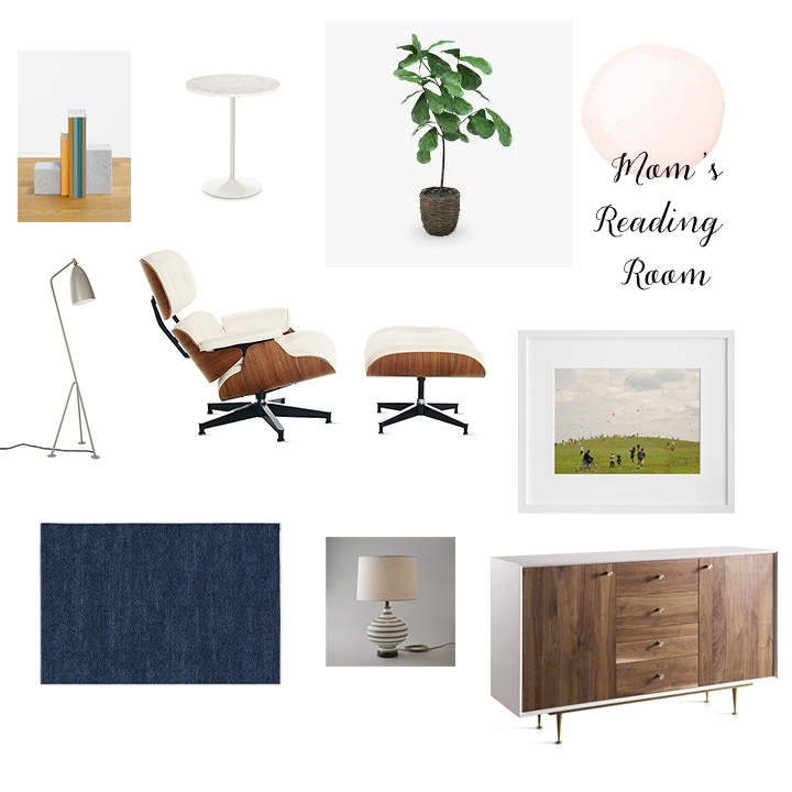
I came up with a design plan which included a large credenza to tuck the majority of the office and personal items out of sight. I know the client wanted to keep things minimalist and airy, a retreat from all the craziness of life. So I limited the amount of furniture to the bare necessities.
The white Eames chair!!! It was sitting unused in the client's master bedroom with the chair and ottoman stored separately because there was no room. What a sad state of affairs, right? Of course we had to make sure it took center stage in this reading room. See below for the after.
The chair is haloed by natural light probably loving its new queen spot in this sanctuary. We rounded out this ideal spot with a Saarinen marble side table to rest books and glasses. A proper reading room needs proper lighting, do you spy that gray beauty? I've been coveting the Grasshopper Floor Lamp forever so it makes my husband happy that I can live vicariously through my clients. Last but not least, no Banner Day room would be complete without some plants. The Little Fig tree is one of my new favorites, I've added it to my rotation.
Let's turn to the other side of the room. Below is the before.
Although this corner was set up as a home office, the client didn't really use this space for work. After bouncing a couple of ideas, we thought perhaps a better idea was to install seating in the opposite corner of this room, as can be seen from the above photos, and place additional closed storage here.
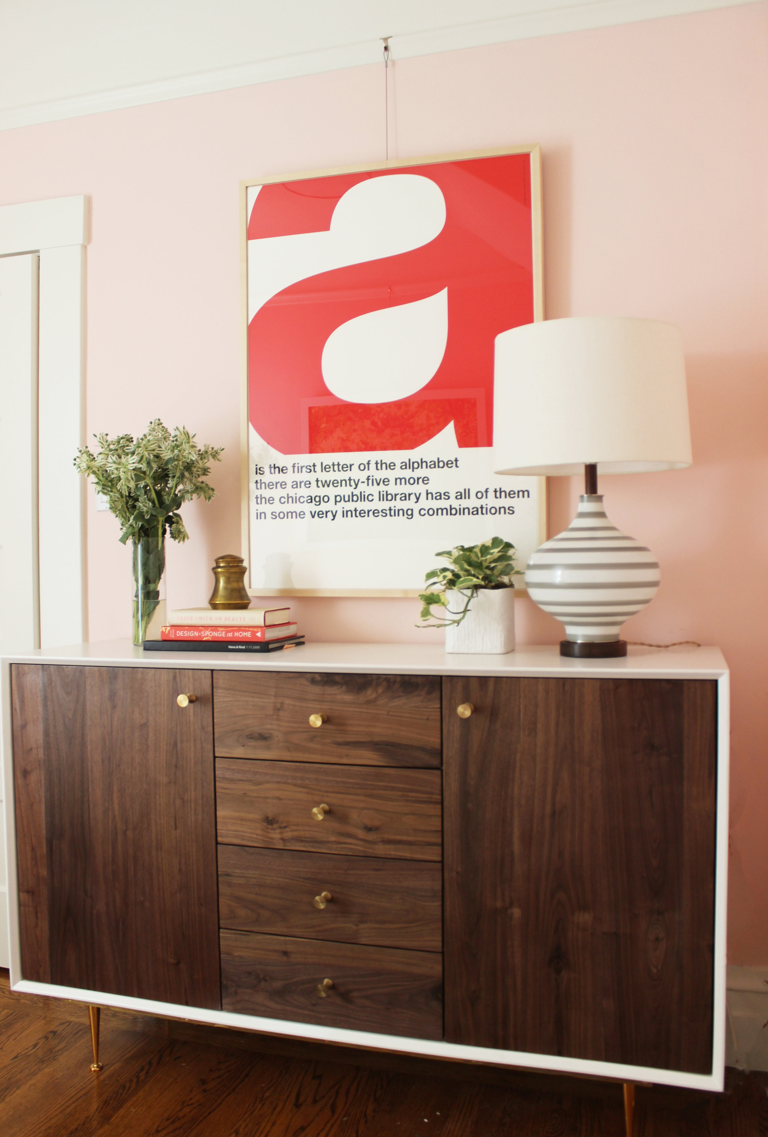
What a beauty. So everything you saw in the office corner is now tucked in this glorious credenza. Out of sight, out of mind. The striped table lamp provides additional lighting, the surface of the credenza can be used for books, plants and perhaps even a small bar in the future!
Now that Mom's been taken care of, let's turn to mini-me. This space was a challenge as I stated above. The biggest hurdle was finding the appropriate seating. The door from the kitchen to this nook swung open into this room, meaning that we had to make sure the settee allowed sufficient clearance and was also petite enough to fit against the only wall without a door or window.
Here are some before photos.
The goal for this room was very simple: provide a dedicated reading and play space for mini-me. We had a ton of books so storage was a priority. Since this nook would primarily be a kid space, I wanted to make sure it was whimsical and fun. Below is the design I came up with.
It's so rare to find the right place and time to install a curvy, green settee. Luckily, we found the ideal home for one. Lighting was a big concern since natural light didn't reach most of the room. Sconce lighting with gold accents are the perfect solution for when you need additional lighting and there is little to no floor space to spare. All in all, a charm filled room. See the transformation for yourself below.
This room just makes me happy . . . and seriously makes me want to crawl into this settee to read. The client will add to the gallery wall, taking the artwork all the way up to the ceilings. The shaggy rug is soft so you can play games on the floor and the pattern will hide any minor stains. Let's move on to the opposite corner. See the before below.
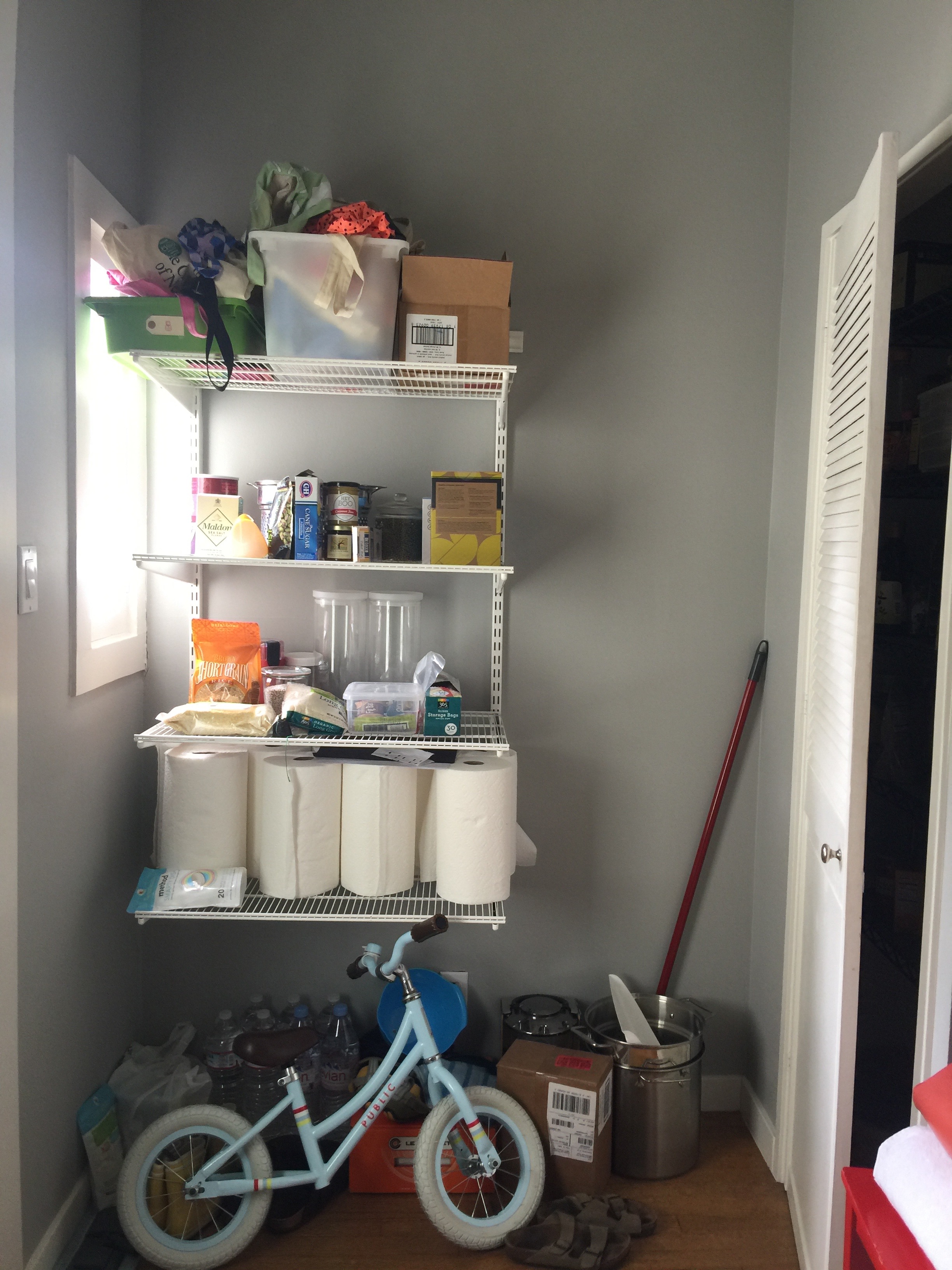
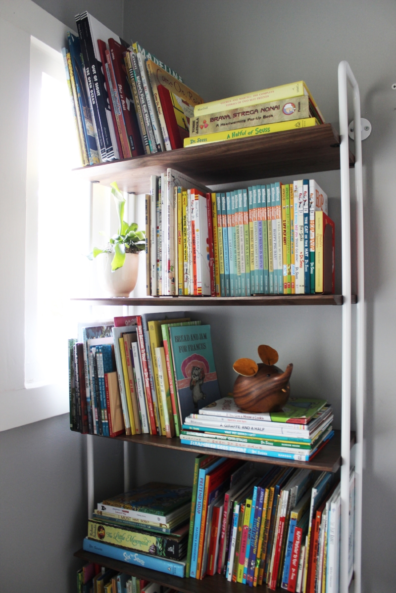
The pantry closet is to the right and as you can see, the open shelving is overflow. After purging and consolidating, the client was able to clear this open shelving out entirely. We were able to install a bookcase for mini-me.
A girl after my own heart. Look at all those books! I purposely installed the bookcase flush against that wall. I understand that there is a window there but it looks out to a shared staircase with not much of a view. Also, easy access to the pantry was a must and I wanted to make sure the pantry door was able to swing wide open.
What are your thoughts? Does this inspire you to change up that neglected corner/room in your own house? I hope so. These rooms show that even with the smallest square footage, with a little work and creativity, you can make every inch of your home work for you.
Thanks for reading!


