A Dreamy Denver Project. A Progress Report

It's been a bit quiet on the blog, but that doesn't mean that I haven't been busy, it's more of a sign that I've been too busy. But I'm happy to be busy when it's with things like the Dreamy Denver Project. 

I'm so unbelievably excited to share this project with you. The lowdown, these clients bought their new home last fall. Prior to purchasing this home, they made do with furniture that was past its prime. These clients decided that moving into this new home meant it was time to invest in furniture that they loved. 

We've already ordered the majority of the furniture. And because I'm always candid here and about the process, the first four deliveries from different vendors arrived damaged! Proof that the before/after posts you see on this and many other blogs don't convey how long and stressful a redesign process can be. It looks like magic online, but trust me, it doesn't always work that way. I've been told that it must be easy to be a designer since I'm neither spending money that is mine nor designing for a space that is mine. This couldn't be further from the truth. For my own home, I'm happy to let mistakes happen, and it's actually a place where I can try out new ideas. For my clients, I know that my services are often a luxury and I try to make sure I deliver a perfect product down to the coaster. Sometimes to get there, this means a ton of phone calls, emails and negotiations with vendors/contractors, but at the end of the day I'm happy to say it's usually worth it. And I'm grateful for patient and understanding clients! 

I plan to go to Denver in late February for the final install and to apply finishing touches and styling. For now, here is a brief rundown of the design scheme for each room. Here is the exterior of the home. 

I mean talk about curb appeal. How beautiful is this home? Clearly, no improvements need to be made here. Step inside with me to the living room. 

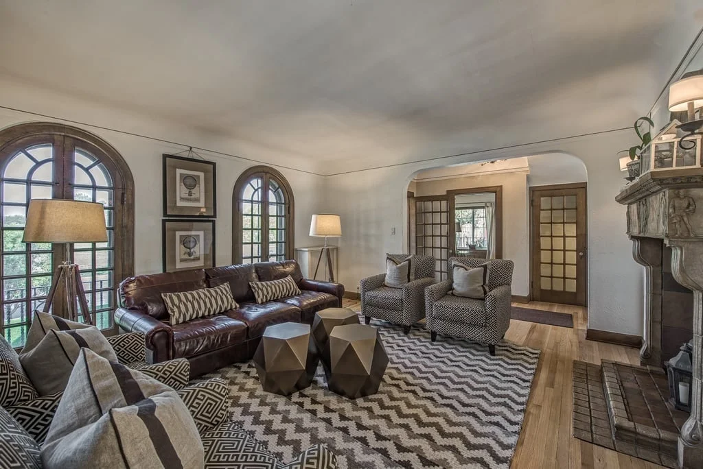
This living room is big and open. Right off the foyer, it's the first room to greet guests. The furniture pictured in this room and the other rooms were most likely done by a staging company. Staging companies have a challenging job, they need to furnish a home in a way with the broadest appeal with their own inventory. But as you can, the room suffers from too much brown and other muted tones. It definitely needs some color and life. Below is the living room board and the design plan I created for my clients. 

There have been a few edits to this board, but largely the general feel of the room feels the same, a neutral palette with saturated pops of color in navy blue and hints of yellow. I have yet to install this room, but I'm already in love. The marble coffee table offers some texture diversity. The linen colored sofa along with the gray side chairs are cohesive and collected but doesn't feel too matchy. 

On to the dining room. 

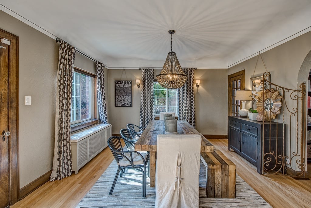
Similar to the living room, the furniture in the room pictured above brings out the wrong tones. With the greige paint, there needs to be more contrast, and the rattan chairs are far much too casual for this elegant dining room. Although the chandelier is perfectly fine, I think this room would benefit from a light fixture that would bring in more sparkle and shine. Below is the board for the new dining room! 

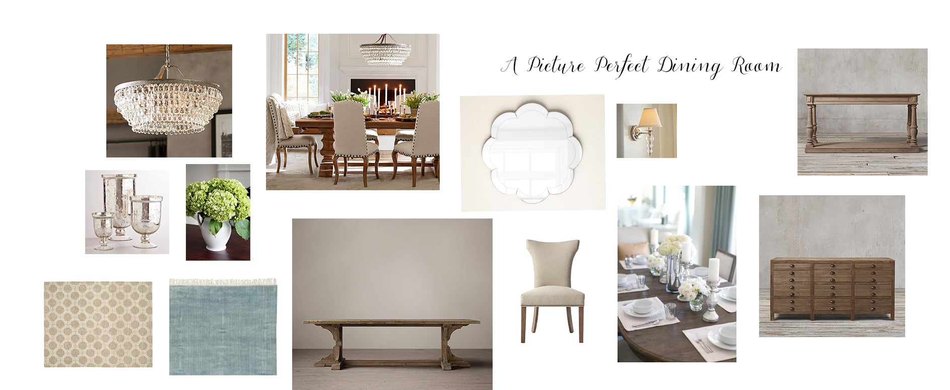
The dining room adheres to the clients' preference for an updated classic look throughout the house. However, I've updated the look a bit with a more modern chandelier, dining room chairs with a curved silhouette, and a blue rug that should help offset the dominant brown tones in the wood molding and walls. Since this room is slightly more formal, we opted to go with all chairs instead of using a dining bench. The scalloped wall mirror adds a touch of whimsy and will help the light bounce off the new chandelier. 

Last but certainly not least, the master bedroom. 

Again, like the living and dining rooms, this room also suffers from furniture that is a bit dreary. The furniture also feels a bit dated. With such a large wonderful space, I'm excited to see the final outcome. 

So serene right? Like the furniture pictured in the master bedroom photo, the board shows a design scheme that relies on a neutral palette, but you can see/feel the difference between the two right? The furniture I have chosen although neutral utilizes more whites, especially in the rug, allowing for some brightness to seep in. Also, the gray and blue throw pillows will help change the look and feel of the room, providing great contrast between the walls and the furniture. 

Fingers crossed that the rest of the deliveries arrive safe and sound. I love that this house looks and feels so different from the homes I usually do and although long distance projects are often challenging, they are often the most rewarding. I can't wait to install this project in person!

Thanks for reading!

Breathing Life into a Brooklyn Loft

For various reasons, projects have different timelines and completion dates. This one took a bit longer than most. But, like so many things in life, the wait was so worth it. 

The quick rundown. This adorable family of three has lived in their Brooklyn loft for several years. The loft was already in great shape - no outdated fixtures, bad flooring, wrong paint colors, etc. - but it needed an injection of something! The clients hired me to help with a light redesign, to bring some liveliness and whimsy into the space.  Of course, I was happy to help!

Below is the before of the foyer. 

Foyer Before

The loft is new construction, so the walls were in impeccable condition, if a bit bare. This wall was begging for something fun to greet guests, so we gave in by adding the most beautiful wallpaper.  See below. 

This might be my favorite foyer ever.  Wallpaper and installation can get expensive, but it makes such a big impact, and can really be worth the cost in the right space.  We put most of the budget towards the wallpaper, and saved money by being more budget conscious with the furniture and accessories. Another photo below, because just showing you one would be unfair. 

Foyer2.jpg

The real challenge for this space was that there are only 2 windows in the entire loft. The foyer received almost no natural light and we needed to supplement the existing overhead lighting. I knew this area really needed a table lamp, but there was no outlet! I have no idea what the developer was thinking. My clients came to the rescue, they found these table lamps that are charged by a reusable battery. One full charge will last for about 18 hours. Definitely keeping this lamp on my short list for future problem areas. Since the foyer only requires sporadic lighting, this battery powered lamp was the perfect solution.

Why pay for all this wallpaper and then hide it?! That's why I decided on this acrylic console table, giving the feeling that everything on it is floating.  It's difficult to tell in the photo, but the stool is a walnut wood which brings in a different texture and color to the space. The marble key box and the white mail letter dish completes this ideal drop zone. 

How can it get better than this foyer? Trust me, follow me into the living/dining area. See below for the before of the living space in this loft. 

I know some of you are thinking, what would you possibly want to change?  It's great as is! Perhaps. But, after living in a space for a while, many of us can appreciate a new perspective and new surroundings. The clients had already picked out a sectional prior to hiring me and just asked for my opinion. After seeing it, I was happy to approve. I brought in the accessories and rugs, adhering to the clients' more minimalistic aesthetics. 

Living Room1.jpg

I know I convinced the client, but have I convinced you that this is a welcome upgrade? I hope so. The steel gray sectional will be a keeper for years to come.  The silhouette is clean and the color is timeless. The dark green throw pillows add some color, but the palette of the entire room is still very light and sophisticated. The rug with the geometric pattern is great, adding subtle pattern. Yes, no coffee table. The clients have a young son and he likes to play with his toys on the floor. A coffee table can easily be added later when he gets a little older.  

To give adults a place to put down their beverages, we purchased a console table to place behind the sectional. Double bonus?  Looking at a wall of gray fabric from the kitchen is not so fun. The console table helps break up the long wall of gray, providing a more attractive view. 

Another perspective of the living room below. 

You saw a glimpse of the dining room above, but it deserves a closer inspection. Below is the before. 

And here is the after. 

What a difference art and plants can make in any room! We kept all the dining room furniture. We installed the pendant light which gives the most amazing halo at night. I know similar lights are on the market, but what sets this one apart is that the bulbs are made of crackled glass, diffusing the light into a soft glow.

And the art? Just like the wallpaper, a testament to the idea that investing in just a very few pieces can change a room. As for plants, I added a collection to the sill, including the Staghorn Fern which is a living sculpture in my opinion. Plants should be in all your rooms in your house if possible, they clean the air, and every room should have something living in it. 

And of course I couldn't help myself, I had to style the bookcases in the hallway while I was there!


One of my favorite pieces is a discovery I made while sourcing for accessories in Brooklyn. A ceramic artist in upstate New York makes these breathtakingly beautiful vessels, and then imprints each and every one with his thumb.  See below. 


Plant2.jpg

I often like to group things by type or collection, such as books or even the plants on the sill. This is a great way to display things since it enables you to keep everything out without making things look cluttered. But once in a while, just one thing can be very beautiful in its simplicity all by itself, just like this vessel with its shamrocks. 

The loft now feels like a gust of wind swept through, and it's still there, swirling around, keeping things breezy, calm and beautiful.