Mill Valley Project: Chapter 1

Have you tried furnishing a home in around 30 days? My advice: don't try it if it can be helped. But if not, below you'll find some before/after photos of how we did it and some tips if you're in a similar situation.. 

My former clients called me and said they had just closed on a house. They absolutely needed to move in 30 days because the newest addition to the family was expected in about 50 days. In addition to the short turnaround, there were other challenges. The current sellers were still living in the house (so we had to schedule furniture deliveries and visits carefully), and we needed to buy a ton of furniture since their square footage had tripled in size.  As you might guess my first reaction was like....I need to take a seat. But since I had done something similar before (story here). I felt more than up to the challenge. Thankfully Mill Valley is much closer than Las Vegas!

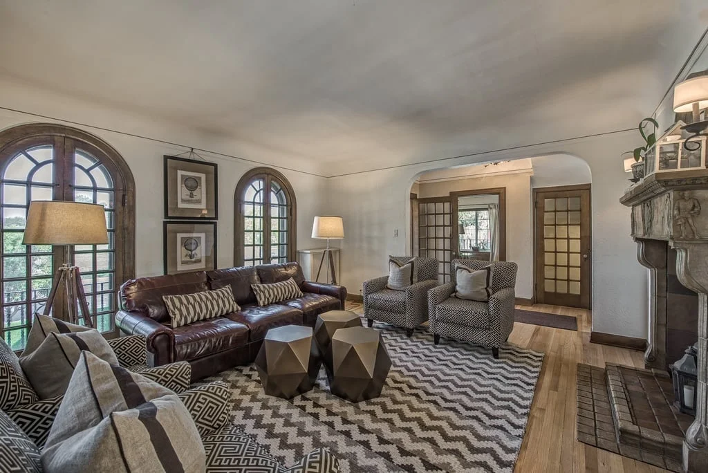
Because of the tight timeline and numerous logistical challenges, I decided we would try to order as much furniture as we could, have the house move-in ready as possible and then refine the design in September. As such, this project is still ongoing. We're filling out some of the spaces and waiting for some final deliveries, but there are a couple of finished rooms I can't wait to share with you. The main living area is a lovely open space. First up, the formal living room. Below is a before photo with the furniture from the stagers. 

The floor plan essentially remained the same and we used all the furniture my clients had in their prior living room which I helped them decorate a couple years ago. 

To me, this room is so very Mill Valley to me - classic, clean and inviting.  Moving on from the living room, we head directly into my favorite room, the dining room. 

Yup, I want a closer look too but before we do, here is the obligatory before photo. 

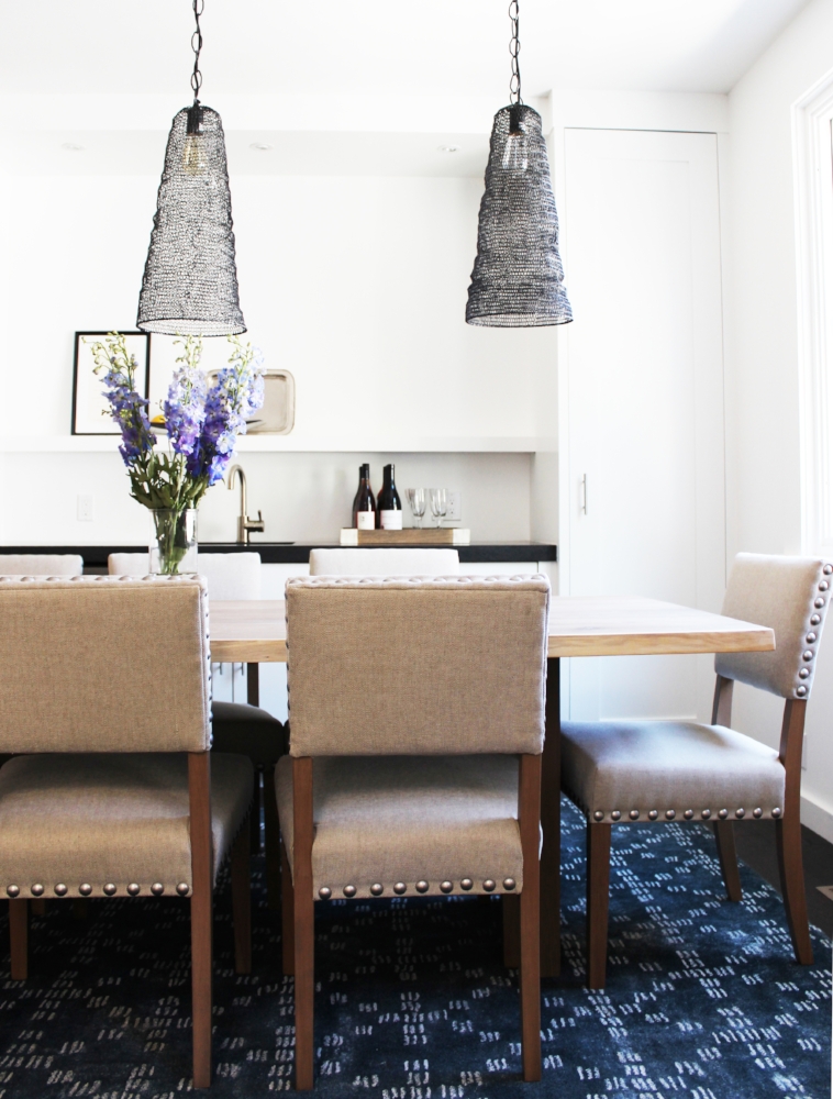
The clients decided to leave their old dining set behind.  They were ready for a change, a mix of style with a modern bent, my speciality.  And below is the after! 

Stunning. The blue bohemian rug adds that unexpected element and the tension it creates against the more traditional table and chairs is ideal. The built-in bar saves spaces and pares down the furniture in the room, letting the table take center stage. A closer look below. 

Follow me over to the kitchen which needed just a bit of styling. Again, here is the before. 

IMG_7837.jpg

Just some small changes and decluttering to leave the clients with a kitchen that will make anyone envious. 

Can I move in? The island is perfect for entertaining and some quick meals. The reclaimed wood accents throughout warm up the space and brings in the cozy.  Right next to the kitchen is the kitchen nook.  Below is the before. 

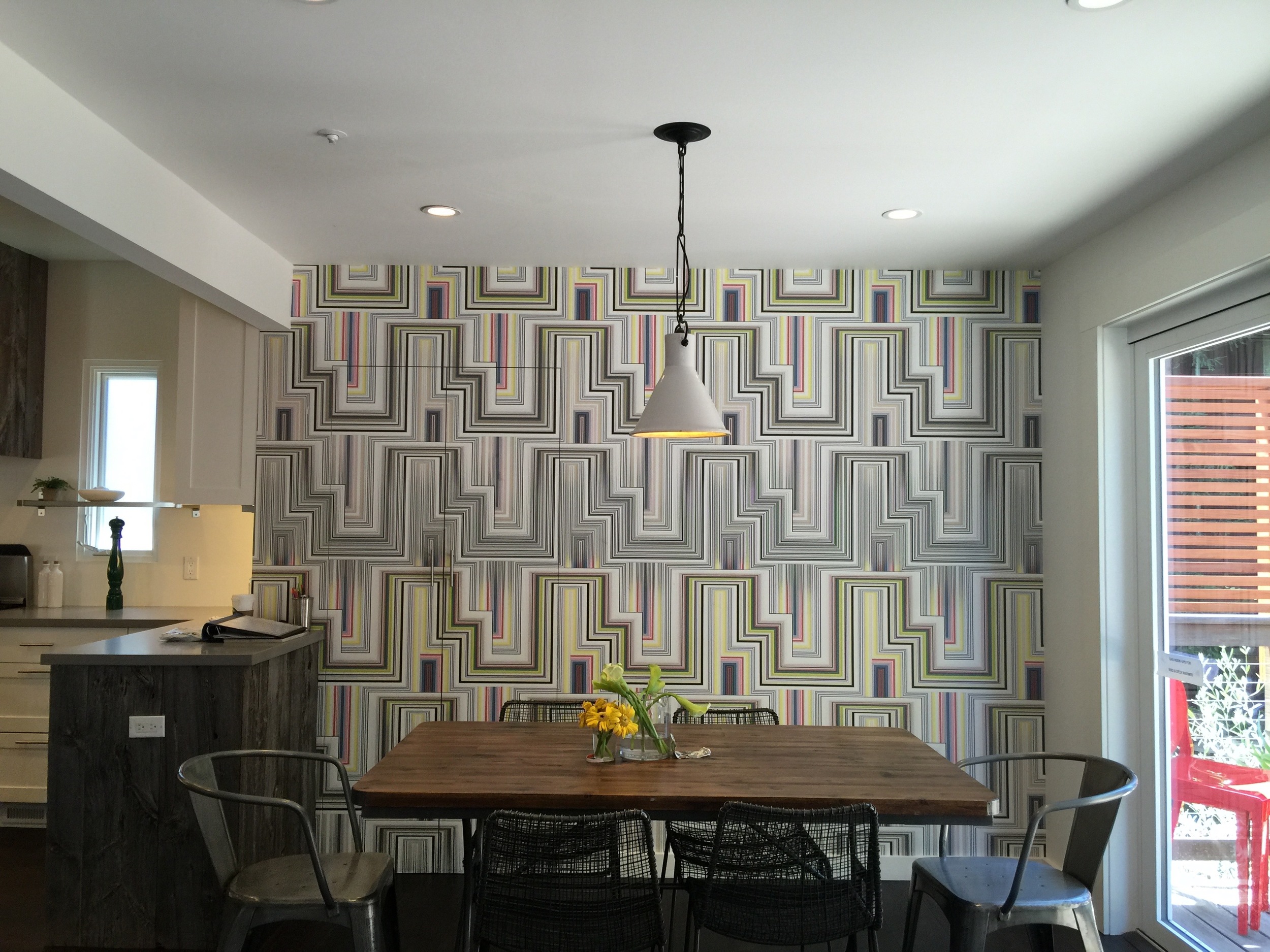
The previous wallpaper was in good condition but didn't really go with my clients' style and was a bit too contemporary compared to the rest of the furniture in the house. We changed it up and chose dining furniture that was more aligned with the style of the kitchen. See below for the after! 

This kitchen nook before/after is a great lesson in how wallpaper and furniture can literally transform the style of a space completely. Where the before photo shows a more contemporary industrial nook, the after space exudes a sense of classic modern living at its best. Last room? The adjacent family room. Below is the before photo with the staging furniture. 

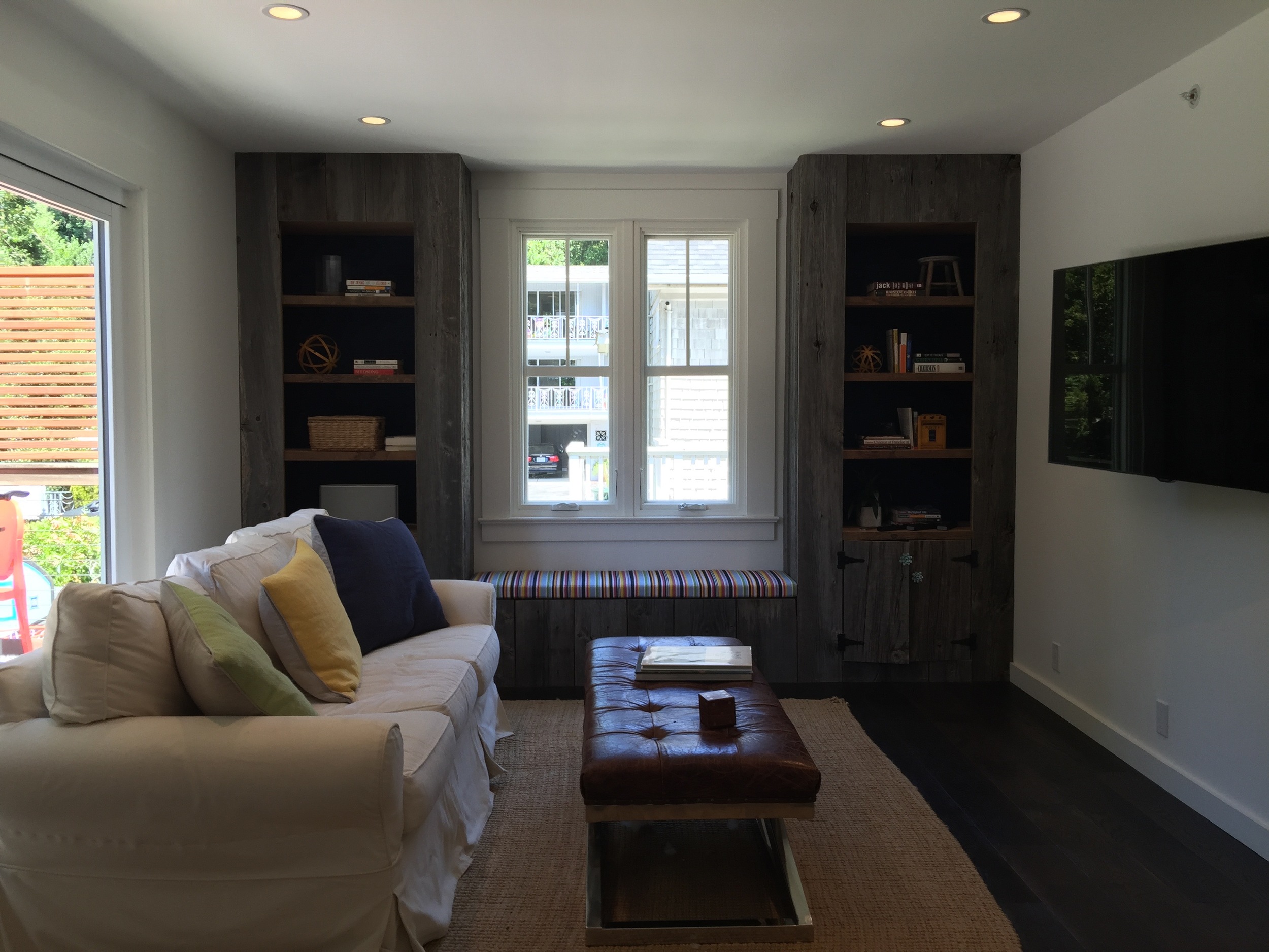
This room is still in progress. We're still waiting for the delivery of the sectional, but here is a sneak peek of how it looks now.  

A child-friendly room that invites you to lounge, relax and kick your heels back. Can't wait for the sectional to get delivered, which is expected at the end of this month.

All of the furniture in the dining room, kitchen nook and various other pieces throughout the rest of the house were ordered and delivered in around 30 days, all from different vendors. If you've ordered furniture recently, you will know that 30 days is an incredibly short lead time. For upholstered pieces, 6 to 8 weeks is often the minimum.  Even tables, rugs, etc. can take close to two months depending on inventory and shipping speed.  If you're under a tight deadline and need to have a home furnished asap, here are some tips:

- Look for quick ship options, especially for upholstered items.

- Check the inventory of items prior to purchasing. 

- Ask detailed questions re shipping timelines. 

- Stay flexible and if possible consider ordering as many items as you can from one vendor to reduce delivery appointments and further logistical challenges. 

- Try to schedule all your deliveries on one day if possible to keep you sane. 

- Be nice but relentless with customer service, they can often bump up your delivery appointments if you press. I had West Elm on speed dial. 

I'm doing a second smaller install mid-September since we're still waiting for deliveries for the guest room, master bedroom, nursery and TV room. So keep your eyes out for the next installment of this amazing project. 


An Oakland Dining Room

Thanks to the internet and technology, there is no doubt that today we have greater access to a wider variety of budget friendly furniture. I truly believe it's now easier than ever to furnish your home at a lower price point and still make it look wonderfully curated and unique. Everyone likes a good deal, raise your hand if you don't. The challenge is to make sure that your wallet-friendly purchases don't look budget, am I right? This dining room is a perfect example of how to make smart choices and create an entire room for a relatively small amount of money. Here we go! 

This client recently moved into a new home with her significant other. They were combining their respective furniture and personal items for the rest of the home but decided to start fresh with the dining room. Below is the before. 

Generally, I'm not a huge fan of dining room sets that are counter-height. It often feels awkward, a bit too far from the ground to allow guests to linger at the table after dinner for conversation. As you can also see, the dining room space is actually quite large but it wasn't really being optimized for entertaining. I was consulting and purchasing for other areas in the home. but this was the one room that we were starting completely fresh. With a fairly tight budget, I knew I had to be cognizant of price points without compromising on aesthetics or quality. 

Below is the design plan. 

Table ($449)/Dining Chair ($119)/Rug ($150)/Buffet ($1,099)

Table ($449)/Dining Chair ($119)/Rug ($150)/Buffet ($1,099)

We ended up purchasing the bookcase and accent chair for the living room.  Everything else on the board we purchased for the dining room, as reflected in the after photos below.  

The majority of the money went towards the buffet, which was one of the pieces for which I wanted to focus on quality. To reflect the beautiful natural light from the skylight, I chose this affordable glass dining table. The glass table alongside the mirror creates the most awesome halo of light for this room. And for color, we chose this flat weave rug with lovely movement and texture. 

Boom! So bright and beautiful. I know some of you may be thinking, a dining room for under $2,500 still sounds a bit steep. And It's true that I can definitely whip up a dining room design plan for under $1k or even less than $750. But keep in mind that there is a fine line between saving money in the near term versus saving money overall. You may end up needing to replace cheaper but less well-made pieces every couple of years, resulting in a recurring expense over time. On the other hand, you may pay more for a higher-quality piece, but that could be a one-time expense for an item that you can take with you to each new home over a longer period of time. 

Just remember to make smart choices.  If necessary, invest in one single piece and fill out the rest with more affordable choices until you replenish your furniture budget.  Bookmark furniture for most of us is a necessary fact of life. If you're thinking about redoing a room on a budget, know that it's possible to do so and still make it your own! 

A Dreamy Denver Project. A Progress Report

It's been a bit quiet on the blog, but that doesn't mean that I haven't been busy, it's more of a sign that I've been too busy. But I'm happy to be busy when it's with things like the Dreamy Denver Project. 

I'm so unbelievably excited to share this project with you. The lowdown, these clients bought their new home last fall. Prior to purchasing this home, they made do with furniture that was past its prime. These clients decided that moving into this new home meant it was time to invest in furniture that they loved. 

We've already ordered the majority of the furniture. And because I'm always candid here and about the process, the first four deliveries from different vendors arrived damaged! Proof that the before/after posts you see on this and many other blogs don't convey how long and stressful a redesign process can be. It looks like magic online, but trust me, it doesn't always work that way. I've been told that it must be easy to be a designer since I'm neither spending money that is mine nor designing for a space that is mine. This couldn't be further from the truth. For my own home, I'm happy to let mistakes happen, and it's actually a place where I can try out new ideas. For my clients, I know that my services are often a luxury and I try to make sure I deliver a perfect product down to the coaster. Sometimes to get there, this means a ton of phone calls, emails and negotiations with vendors/contractors, but at the end of the day I'm happy to say it's usually worth it. And I'm grateful for patient and understanding clients! 

I plan to go to Denver in late February for the final install and to apply finishing touches and styling. For now, here is a brief rundown of the design scheme for each room. Here is the exterior of the home. 

I mean talk about curb appeal. How beautiful is this home? Clearly, no improvements need to be made here. Step inside with me to the living room. 

This living room is big and open. Right off the foyer, it's the first room to greet guests. The furniture pictured in this room and the other rooms were most likely done by a staging company. Staging companies have a challenging job, they need to furnish a home in a way with the broadest appeal with their own inventory. But as you can, the room suffers from too much brown and other muted tones. It definitely needs some color and life. Below is the living room board and the design plan I created for my clients. 

There have been a few edits to this board, but largely the general feel of the room feels the same, a neutral palette with saturated pops of color in navy blue and hints of yellow. I have yet to install this room, but I'm already in love. The marble coffee table offers some texture diversity. The linen colored sofa along with the gray side chairs are cohesive and collected but doesn't feel too matchy. 

On to the dining room. 

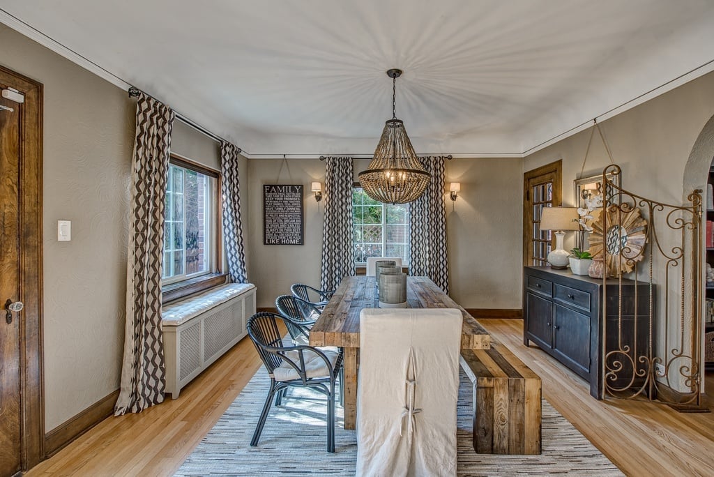
Similar to the living room, the furniture in the room pictured above brings out the wrong tones. With the greige paint, there needs to be more contrast, and the rattan chairs are far much too casual for this elegant dining room. Although the chandelier is perfectly fine, I think this room would benefit from a light fixture that would bring in more sparkle and shine. Below is the board for the new dining room! 

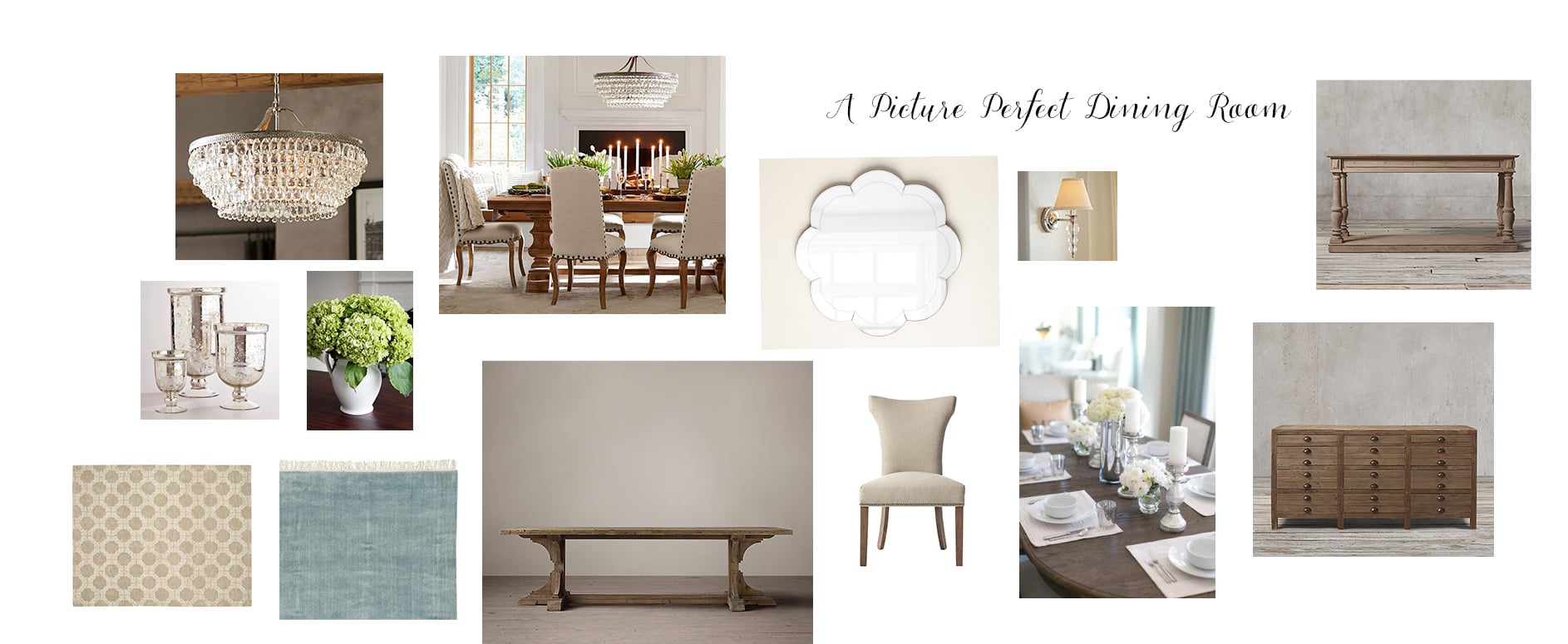
The dining room adheres to the clients' preference for an updated classic look throughout the house. However, I've updated the look a bit with a more modern chandelier, dining room chairs with a curved silhouette, and a blue rug that should help offset the dominant brown tones in the wood molding and walls. Since this room is slightly more formal, we opted to go with all chairs instead of using a dining bench. The scalloped wall mirror adds a touch of whimsy and will help the light bounce off the new chandelier. 

Last but certainly not least, the master bedroom. 

Again, like the living and dining rooms, this room also suffers from furniture that is a bit dreary. The furniture also feels a bit dated. With such a large wonderful space, I'm excited to see the final outcome. 

So serene right? Like the furniture pictured in the master bedroom photo, the board shows a design scheme that relies on a neutral palette, but you can see/feel the difference between the two right? The furniture I have chosen although neutral utilizes more whites, especially in the rug, allowing for some brightness to seep in. Also, the gray and blue throw pillows will help change the look and feel of the room, providing great contrast between the walls and the furniture. 

Fingers crossed that the rest of the deliveries arrive safe and sound. I love that this house looks and feels so different from the homes I usually do and although long distance projects are often challenging, they are often the most rewarding. I can't wait to install this project in person!

Thanks for reading!