I had mixed feelings about offering eDesign services. On one hand, a number of industries are moving towards offering remote services these days, and more and more design startups are at least offering eDesign as an option. On the other hand, I was skeptical. For me, standing in a space that's waiting to be designed invokes a visceral feeling that inspires me and helps me execute the client's needs and desires within the room in full context of the rest of the house. No room stands in a vacuum and when designing, I always want to make sure that the room fits and flows with the rest of the house. My biggest concern was that it's difficult to create, implement and style a room without ever visiting the home!
With some resistance, I finally decided to try it out. This client in Brooklyn Heights was one of my first eDesign clients, and by all accounts it's been a success! A bit of background, as a first time homeowner she was confronted with a combined living/dining area with a small footprint. She also had a number of inherited pieces from her family that she wanted to integrate with some new mid-century pieces. And as an avid hostess, she needed plenty of room for entertaining.
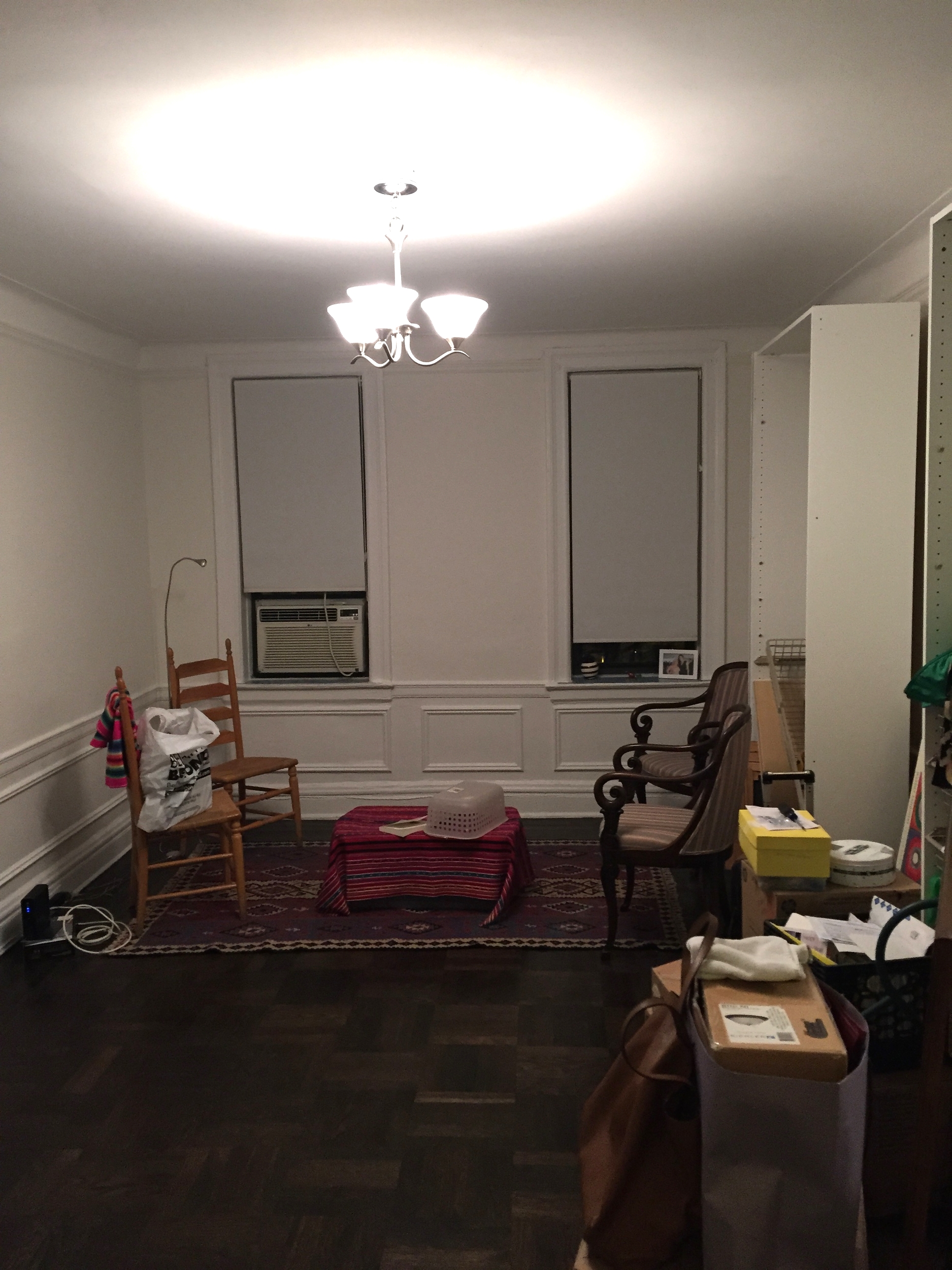
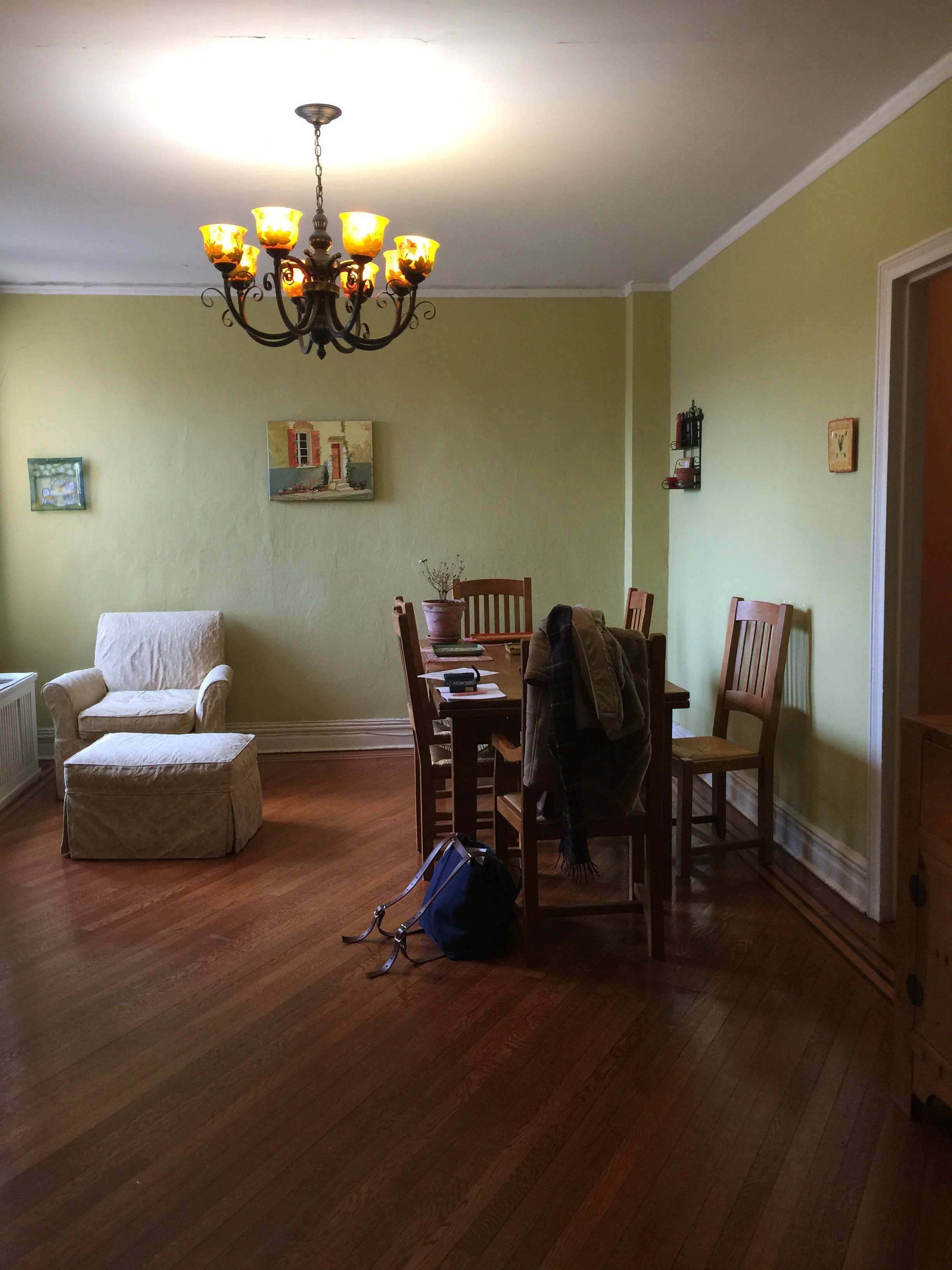
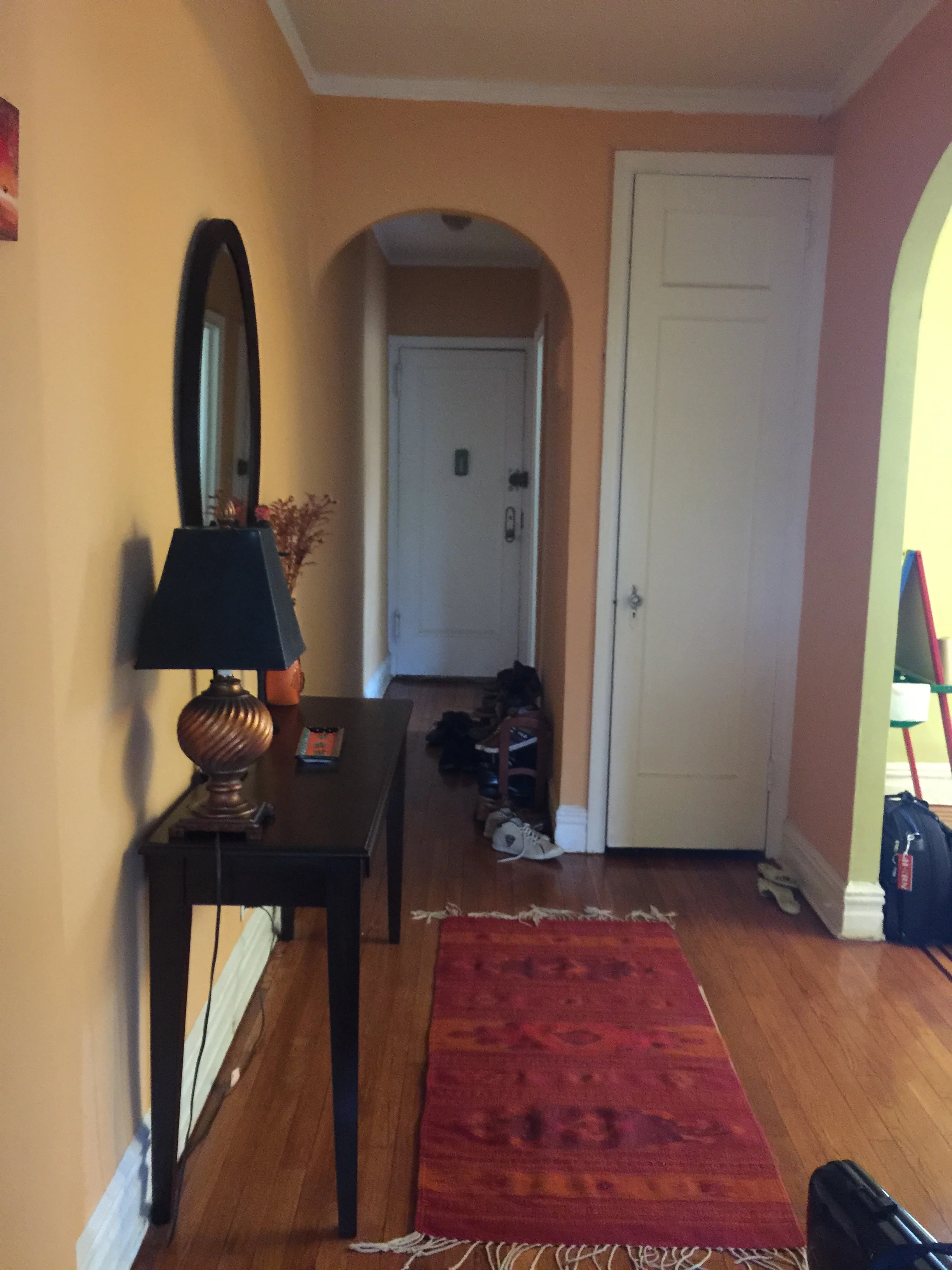
This home is located in a pre-war building. The prior owners went a little too modern with the decor. We wanted to bring back the old world charm of this home while infusing it with the client's eclectic sensibilities. So here we go. The below is the before of the space, right after the client moved in. As you can see we were starting from scratch.
There is a short hallway on your left that leads to the bedroom and bathroom. To the immediate left is the kitchen that constitutes one wall. So this room you're seeing now had to be everything else: a room for lounging, TV watching, entertaining, dining, etc. The room is on the smaller side, although large by New York standards. My client was gracious enough to send me photos of the finished space, see below for the after!
Cozy, warm and comfortable! The living area is centered around a vibrant oil painting done by the client's grandmother. The neutral walls are the perfect background for this colorful piece. The two armchairs are also inherited pieces from the client's grandmother and they are ideal pieces for rounding out the conversation area. Look at the scrollwork on those arm chairs, truly beautiful.
The light gray mid-century couch will last for a very long time and never go out of style. The glass coffee table gives visual lightness to a fairly tight space, and it really works here. Doesn't it almost look like the vase and books are floating atop the coffee table? To provide some storage, I suggested a long open shelf bookcase which works wonderfully well here.
The client did all the styling and I have to say, I don't know if I could have done a better job! We added the small pedestal table between the two chairs to bring some color and modernity into the space. The juxtaposition of the two traditional armchairs with the modern side table is just right. This small side table also mimics the shape of the dining table we purchased! See below.
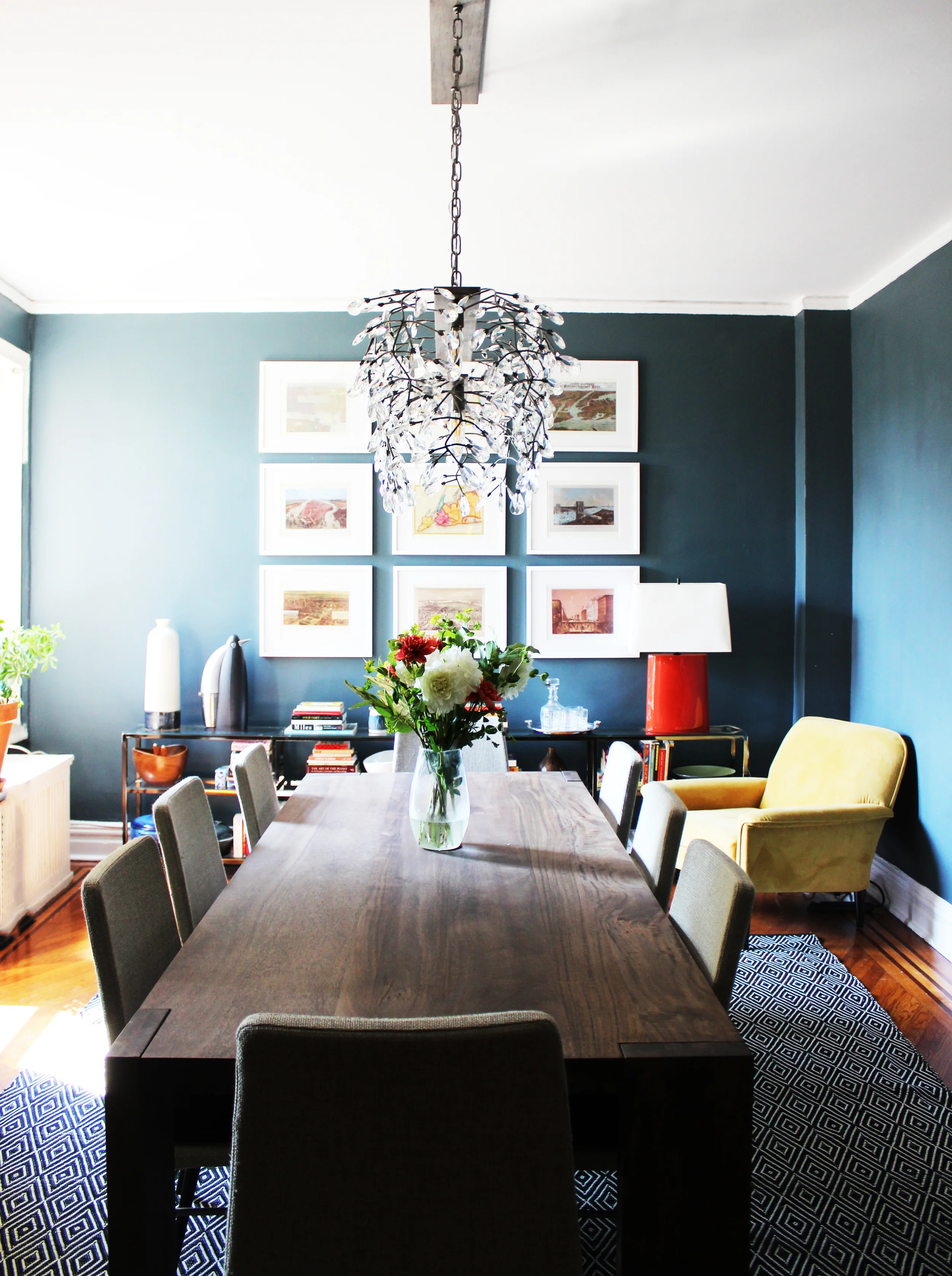
The Saarinen tulip table was a definite splurge but a classic piece that the client can keep forever. The current dining chairs are temporary - we had been waiting for the ones we chose to go on sale, and they finally did! I believe they are currently in transit. The client was also on the search for the perfect artwork to go over the table, and she just found one. All in all, a perfect dining area to entertain and dine to complete this charming home.
EDesign has its own challenges, but it's totally doable and fun. Having done this process several more times since this project, I'm a convert. I would say that for eDesign to be truly successful, a one size fits all formula doesn't often work, it's a nuanced process and even if it is eDesign, everything should be tailored to a client's specific needs and desires. So if you're looking for some Claraficiation on a budget but don't live in the Bay Area, you can now do so!

