Looking Lovely in La La Land. Part Deux.

If you have been following for a while, you may remember I finished Looking Lovely in La La Land (Part 1) almost a year ago. Thrilled with the final product, the clients kept me on to start work on the bedrooms and the guest bathroom. I was happy to oblige. 

What is the big takeaway from this project? Bringing character into any space can be done even if you're on a budget and even if your home isn't blessed with the many architectural details we often lust after. This home was built in the 1970's ranch style, complete with popcorn ceilings. The bedrooms are white boxes that were dying for some personality. 

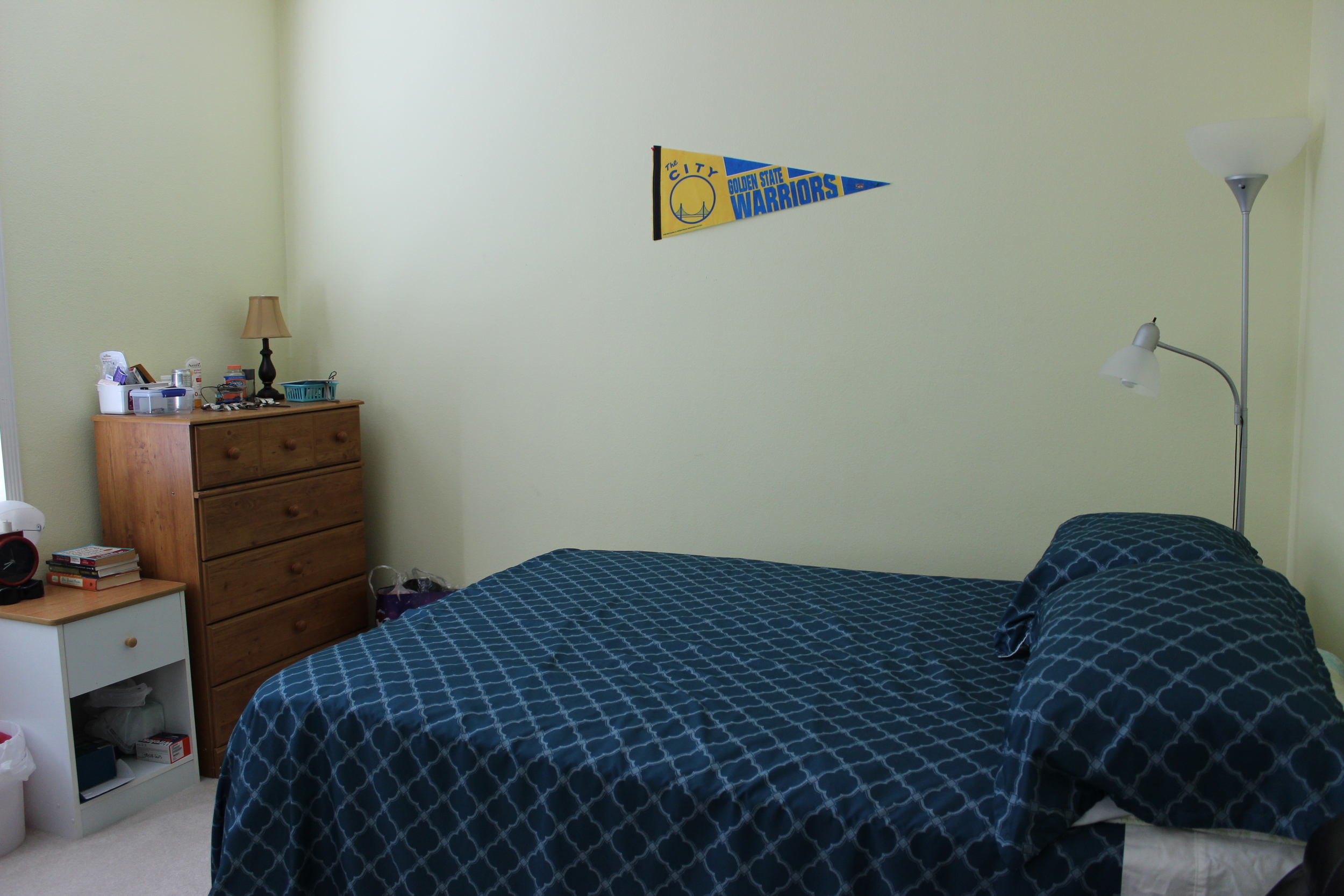
Let's start with the guest room. Here are some before photos sent by my clients. 

Before.jpg

As you can see, the guest room was being used as an office. It was also a catch-all for leftover furniture throughout the rest of the house. In a smaller space, there was a ton of furniture in here. But I could see the potential. We removed the blue carpet for something more neutral and also removed the popcorn ceiling. 

Photo by Clara Jung

Photo by Clara Jung

The clients are considering renting out this room periodically so I kept that in mind when drafting the design concept for this room. I absolutely adore this tomato soup colored headboard. Everything else in the room is soft and serene, I wanted to put something in this room that made it memorable and fun so guests would want to return!  After the removal of the popcorn ceiling we painted it a very light blue to add another subtle but distinctive touch. 

There is a petite workspace that is functional and inviting. Since the window has a less-than-optimal driveway view, I installed this vibrant cactus print as an alternative. Also, because we had to squeeze in a work area and a queen size bed, there was little room left for a nightstand. It's true, a nightstand isn't a need to have item but it's definitely nice to have. This "nightstand" may only hold a glass of water and/or your phone but gets the job done. 

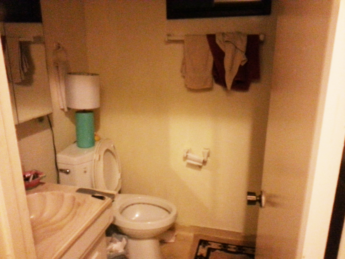
And for any guests who are lucky to stay in this room, also have the continued good luck to have the use of a renovated guest bath. Below is the before. 

A pretty drastic transformation. The clients really miss their seashell shaped sink . . . nope, that's not even remotely true. The freshly-painted blue walls capture the essence of what every bathroom should be, a serene and clean environment. We painted which made the biggest impact but we also replaced the vanity, lighting and fixtures which only helped. 

Moving on to the Sailor Moon room.  

20150303_205648.jpg

If you can look closely you can see at least three Sailor moon posters strewn throughout the walls. Many a girl growing up in the 90's can appreciate the power of Sailor Moon. And although I was sad to bring these posters down, they had seen better days.  This room was now going to be a game room for the hubby. A retreat for him to play board and video games with his friends. 

Playful and colorful, this room strikes the right tone for some long game nights with perhaps a finger of whiskey. Creating a design that was very "man cave" yet appealing to everyone was my primary focus. Do you spy the homage to some classic video games?  When I found those I was over the moon. These prints are simultaneously artistic and encapsulate the entire theme and purpose of the room. 

Last but certainly not least the master bedroom. Here are some before photos. 

There were some challenges to this space. The biggest one being the burgundy colored carpet. The clients had just installed it so weren't replacing it but coming up with a design scheme that downplayed the redness in the carpet took some creative thinking. Below is the Cinderella like makeover. 

Master Bedroom.jpg
Photo by Clara Jung

Photo by Clara Jung

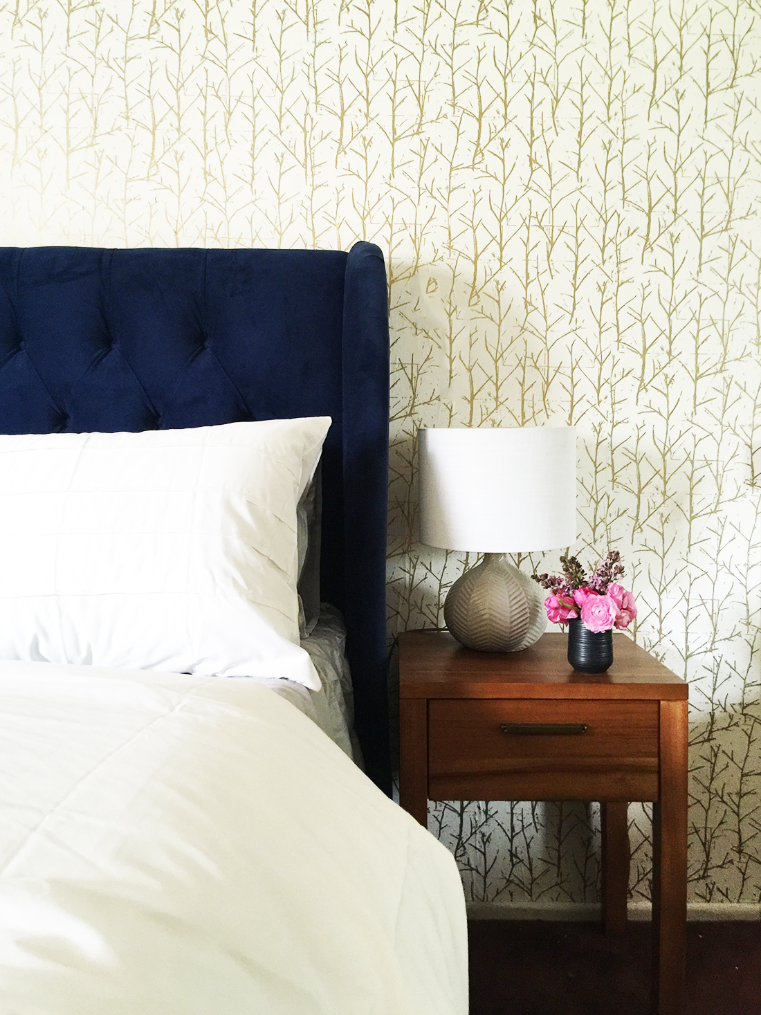
Like all the other rooms in this project, this master bedroom was also a straightforward blank box with no details that immediately jumped out. To bring in character and charm, we used wallpaper with a subtle shimmer to bring in that bit of oomph every room needs. 

The natural jute rug breaks up that burgundy carpet a bit, softening it so it's not terribly obvious or dominant. The blue bedframe juxtaposed to the gold wallpaper is a classic color combination. The simple mid-century nightstands contribute to this sophisticated and curated feel.

When you're confronted with a room that has very little to say in terms of its architecture, take that as an opportunity to be a bit more adventurous than you normally would. Spin it, there are no historical details holding you back, it's literally a blank canvas and like some things in life, the bolder the better. 

Photography by Jen Sosa unless otherwise noted.

The Map House (Part 1)

If you've been following me on Instagram, you've seen some sneak peeks of a long term project I've been working on for the past year, the Map House Project! I'm really excited to share the final product with you. A little bit of background: the clients purchased a second home to be closer to their first grandchild. If you're lucky enough to have a second home - first, I'm jealous. Second, you can take some liberties with the decor since you're not using the home full time.  

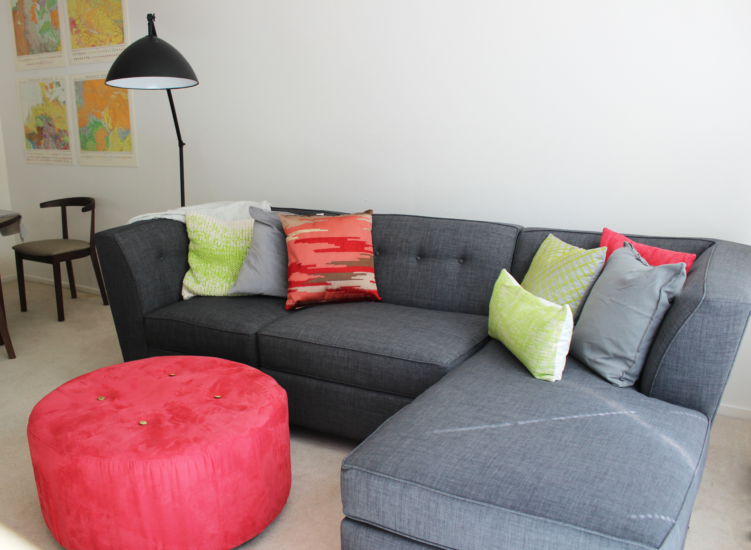
The clients are serious DIYers and have a strong sense of style, which I really appreciated. My role here was more advisory, sourcing and editing, which I was happy to do. The inspiration for the entire house was these simply amazing vintage maps my clients picked up at the Alameda Flea Market. We placed them throughout the home to create a theme for the house.

There were a couple of challenges. The townhouse, though in good condition, was a little bit stuck in the 90's, and updating the home on a budget was going to be difficult. Also, since this was a second home, there would be no preexisting furniture - the townhome would start as a completely empty space. Furnishing a three bedroom condo from scratch is no small feat! Thankfully, decisive clients and the internet are great tools to speed the process along. Below are the maps that served as the creative inspiration!

First up, the foyer.  Here is the before with the prior occupant's furnishings. 

If you've read about any of my projects before, you know I love a well styled foyer. It's the first space to greet guests, the gatekeeper for everything you bring into your home, and in some instances the place where you remove your shoes before entering a home. Foyers are important!

Below is the after. 

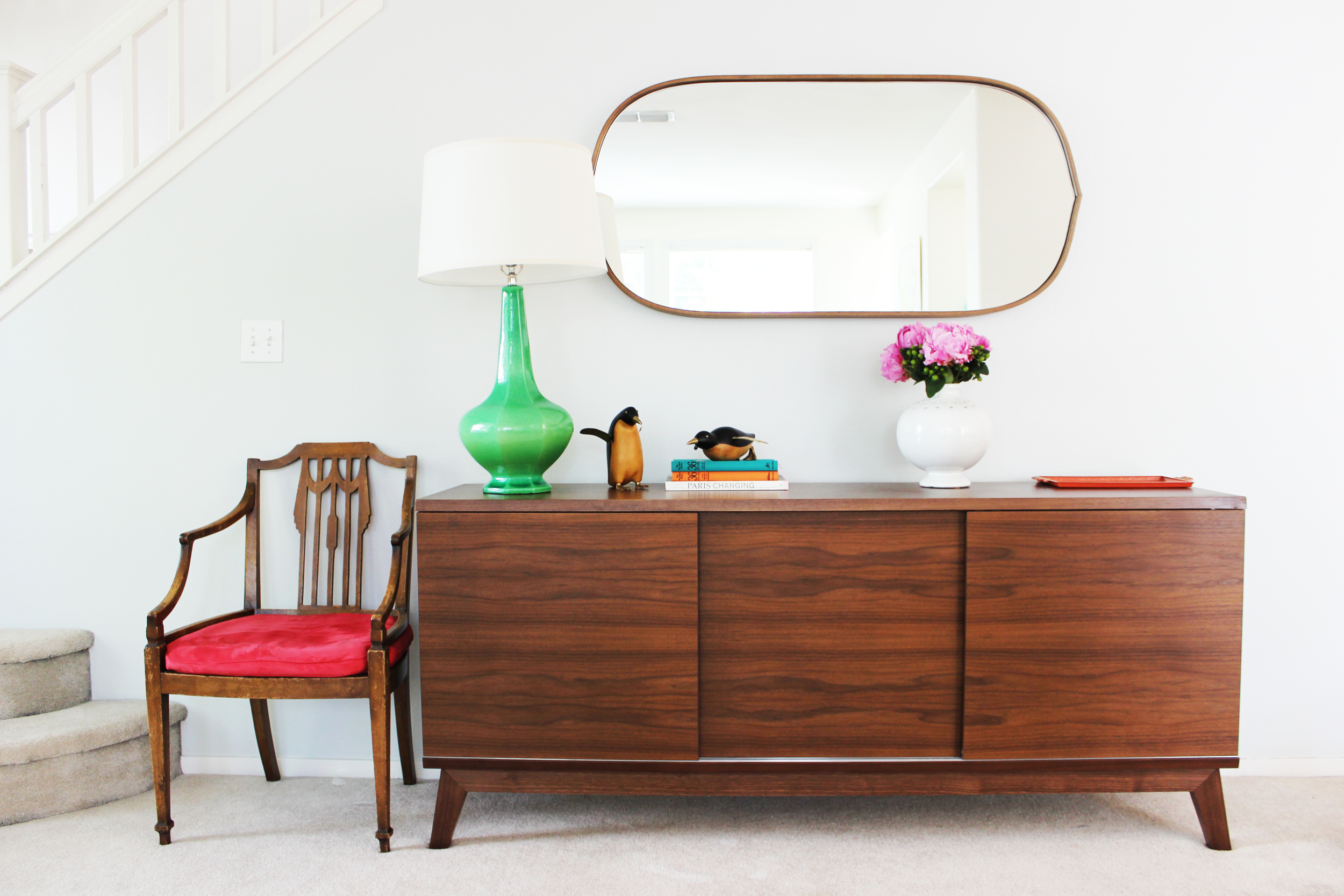
Such a cheerful space right? The detail on the vintage armchair is everything. After some searching, we finally found the perfect table lamp to give height and additional lighting.  Since the foyer is adjacent to the dining room, the credenza can store additional serveware, dishware and miscellaneous items.

On to the living room, which I like to call the adult sitting room.  A room meant for relaxing and reading.  Here is the before. 

And the after!

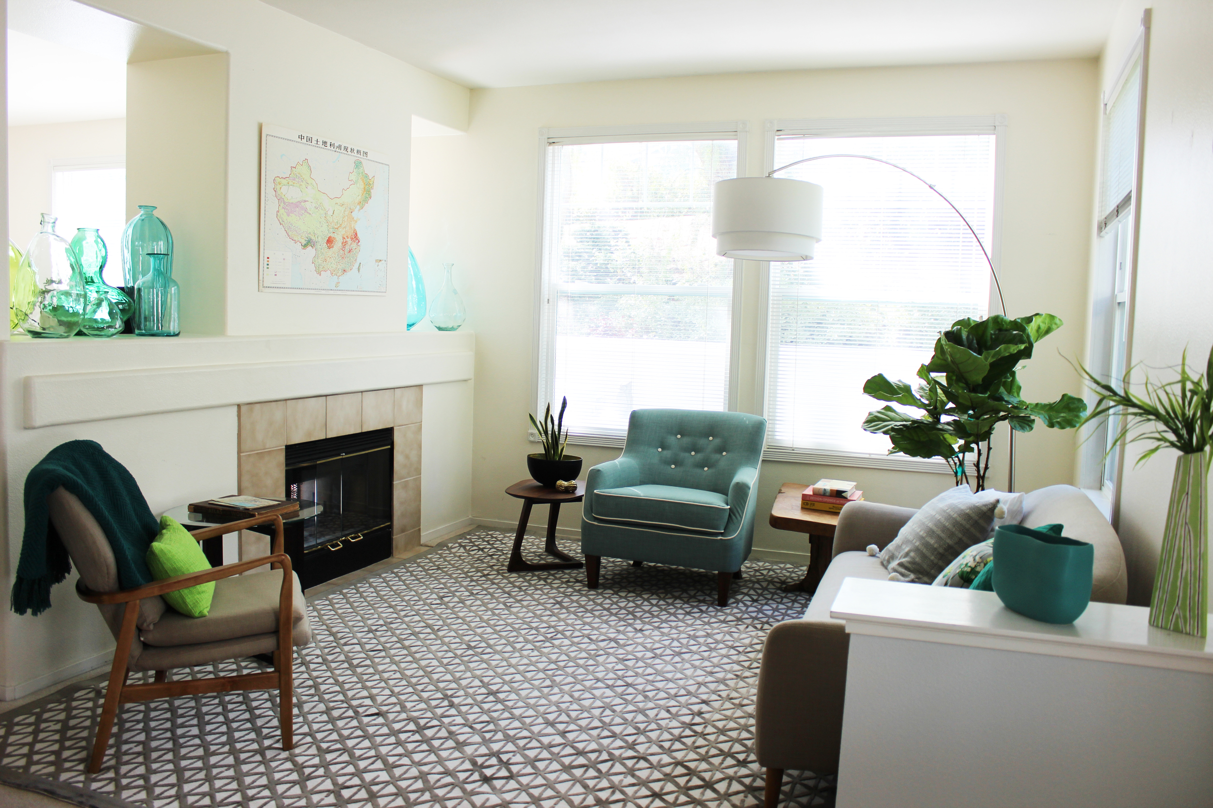
An improvement? A resounding yes. The vintage map of China hangs over the mantle. We pulled shades of green, blue and neutrals from this map to style this room. Those weird cutouts above the fireplace are such a blast from the past. We think they were originally constructed for TVs when they were thicker than a few inches. Remember when? I decided that a collection of larger glass jars would be the perfect way to fill in such an awkward space, it retains visual separation of the two rooms but keeps it light.  

LR1.jpg

Yes, that's a Fiddle Leaf Fig tree AGAIN. Guilty. I love them, they add so much greenery to a room with those large lush leaves.  And I agree, sometimes things are too trendy, and we should all take a break. For example, it's going to be a very long time until I can embrace chevron again.  But sometimes things are trendy because they are so great, retaining their longevity, and I think Fiddle Leaf Fig trees fall into this latter category.

The arc floor lamp really works here because the ceilings are so high and the space is very airy. Another tip? When purchasing an arc lamp, buy one that has a shaded bottom so no one feels like they're on a spotlight when sitting down. And, as in many of the other houses I've done, no coffee table so the baby and adults can roam freely without worry. The side tables should be sufficient for the occasional beverage or book. 

Follow me to the other side of the fireplace wall where the TV room is located.  Here is the before. 
And here is the after. 

Comfort is the priority for any room made for some serious TV watching. I think we've achieved that goal here. My talented clients actually made most of the throw pillows, and covered that ottoman. Yes, you heard right. I'm not much of a DIYer, nine times out of ten I prefer to purchase versus making something myself. So they surprised me a thousand times throughout this collaboration when I would send a product suggestion and they would respond by saying we can totally make/sew/build that. 

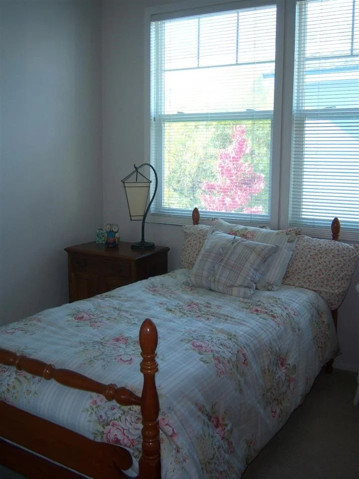
Come follow me upstairs to the guest room/nursery. Here is the before. 

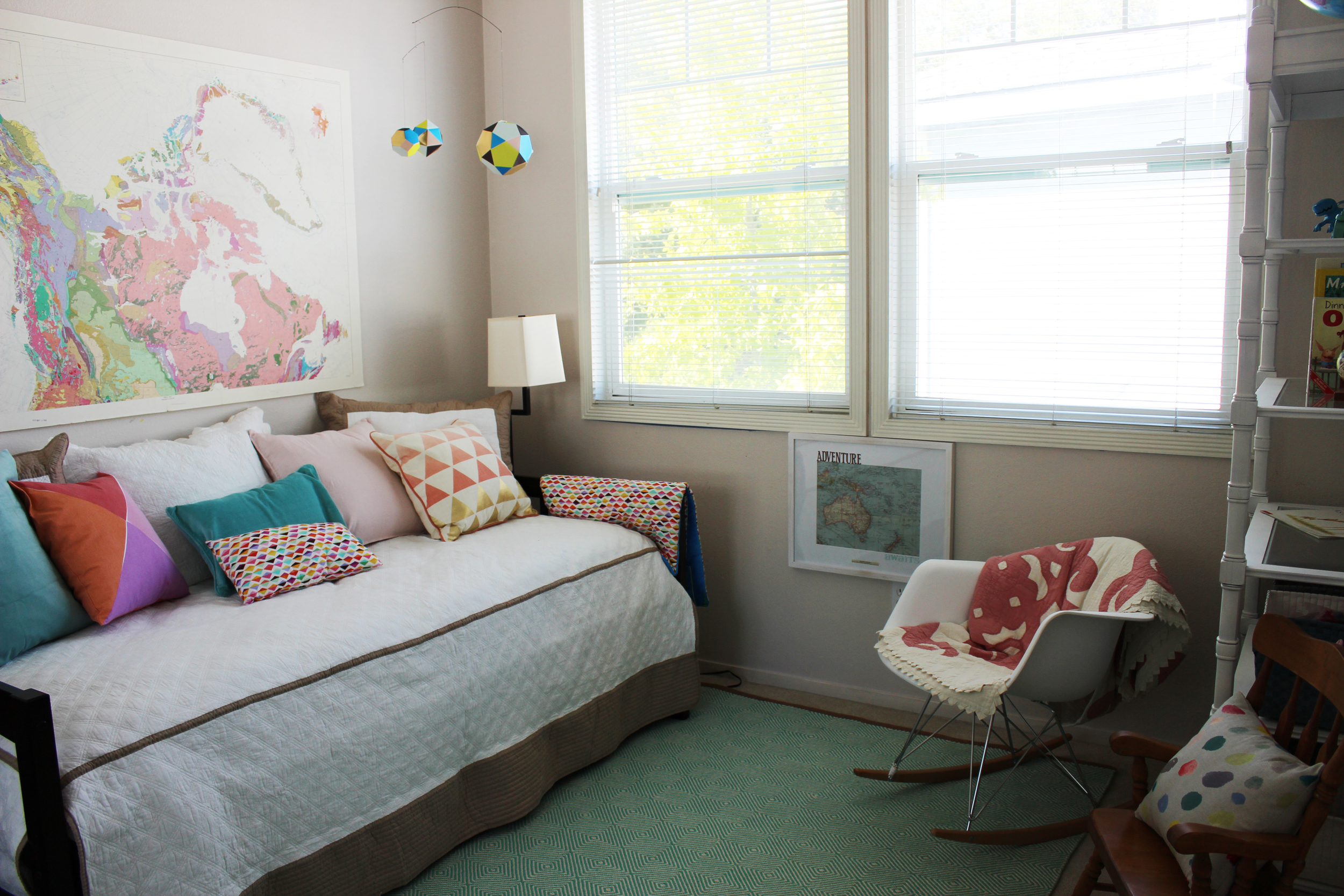
Just because it's a small room doesn't mean it can't have personality.  Take a look at the after. 

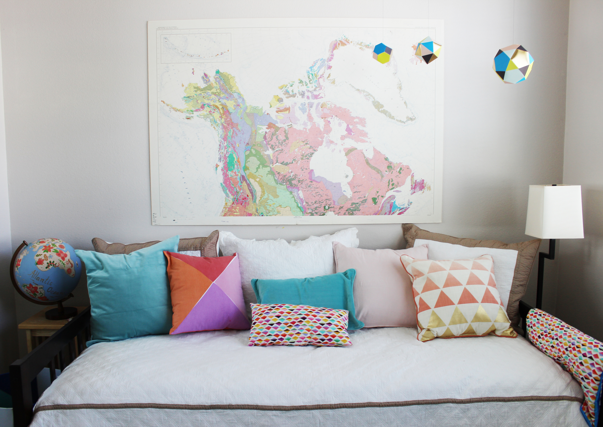
Again using the vintage map as inspiration, this time we used this map of Canada to serve as the centerpiece.  This room was designed for the clients' granddaughter when she comes to visit but can also be used as a guest room in a pinch.  The mostly pink map was apt for such a space. 

BW's Room.jpg

The bolder punches of color and the geometric accents bring modernity into the room and are a great contrast against the softer pink hues. My clients completed this room with some handmade accessories, including this hand painted globe.  

We're not quite done yet, one more guest room for this installment.  Here is the before. 

At the top of the list was painting over the yellow walls, which unquestionably dated the space, See below for the amazing after. 

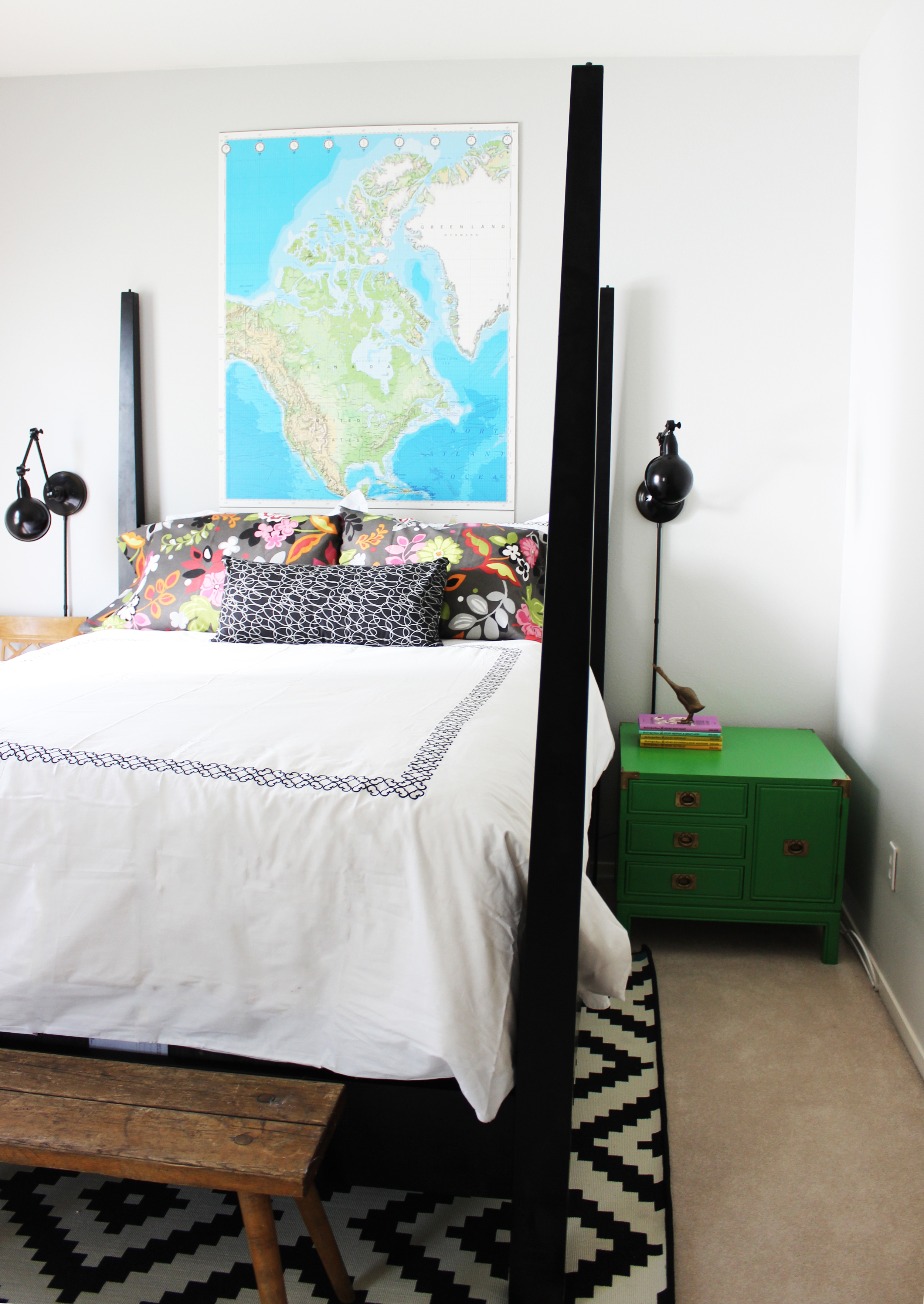
Another vintage map serves as the ideal artwork for this wonderful guest room. The kelly green campaign dresser is fantastic and adds that nice pop of color to the predominately black and white decor. The vintage wooden bench at the foot of the bed brings in the warmth and texture. We created a little office area in the corner as well - see below. 

I will never get tired of vintage chairs. They just don't make them like they used to. The detail on that back is its own accessory. The collection of sister vases I picked up on one of my shopping excursions. I was hoarding them in my inventory closet for the longest time until the perfect space came along. This little corner was it! This guest room will have a waiting list, I'm sure of it. 

That's it for this post, please come back for the second installment where I'll you show you the magic we performed on the kitchen, dining room, master bedroom and bathrooms. Thanks for reading! 

An Utterly Fantastic Holiday Surprise (Part 3)

The conclusion to this amazing journey.  If you've missed my previous posts, you can check out Part 1 and Part 2 first.  Needless to say I lived all of my HGTV dreams with this project.  And after completing this Goliath project with all the added fun challenges (distance, secrecy, time constraints, etc.) I'm confident I can do almost anything, so bring it on!

This post focuses on all the bedrooms in the home.  Adhering to my philosophy and aesthetic sensibilities, I kept all the bedrooms serene and clutter-free.  Some may think that these bedrooms are almost too sparse, but I disagree.  Bedrooms should be a place for rest, and with all our modern distractions, keeping the bedroom bright, clean and clutter-free is essential. 

As I mentioned in the previous posts, the clients just had a very handsome new baby boy. Although he is still sleeping with his parents, I wanted to furnish the nursery so when he is ready to move into his own room the clients wouldn't have to do any work.   Here is the before, a perfectly nice room. 

Nursery Before

For the first couple of years, the nursery is primarily for sleep and storage.  As such, I wanted to make sure there was enough storage for all the items necessary to keep a baby happy and a serene environment conducive to naps and sleeping at night. 

Nursery After

Lovely.  The knitted wool rug should soften any footsteps that may awaken the baby.  The open shelving is a piece of furniture that the baby should be able to use and grow into as a toddler, a place to store his books, toys, etc.  I do love themed nurseries, but there is something to be said for just keeping things neutral and classic.  

And for such tiny beings, it's amazing how many things babies require.  The parents plan on installing custom closet shelving, but I speculated that may be several months in the making.  For a temporary solution, I inserted storage furniture in the closet.  

Nursery Storage

Adorable, right?  Tiny hangers for tiny clothes. If the parents don't get to the custom closet project for a while, this inexpensive storage bookcase will suffice for a time.  It will help them keep things organized so they can immediately inventory their supplies and see what is necessary for purchase. 

Moving downstairs to the guest room! I very inconveniently forgot to take a photo of the room before, but if you can use your imagination like every other room in this house, it was an empty box. 

guestroom

Serene? Calm? Pretty? I would say "yes" to all three.  I knew this guest room would get a lot of use from visiting relatives and friends.  So I chose a classic white bedroom set which I believed would not only appeal to most people but, just as important, would also appeal to my clients' style sensibilities.  The gray bedding balances out the brown and beige hues in the rest of the room.  And my favorite?  The mercury glass table lamps.  I know mercury glass everything has been trending for the past couple of years, but I think they are classic and are a great way to add some sparkle in a very subtle way.  

Some ways to make your guests feel extra welcome? Provide some reading materials, fresh flowers, and travel toiletries just in case they forgot something at home. 

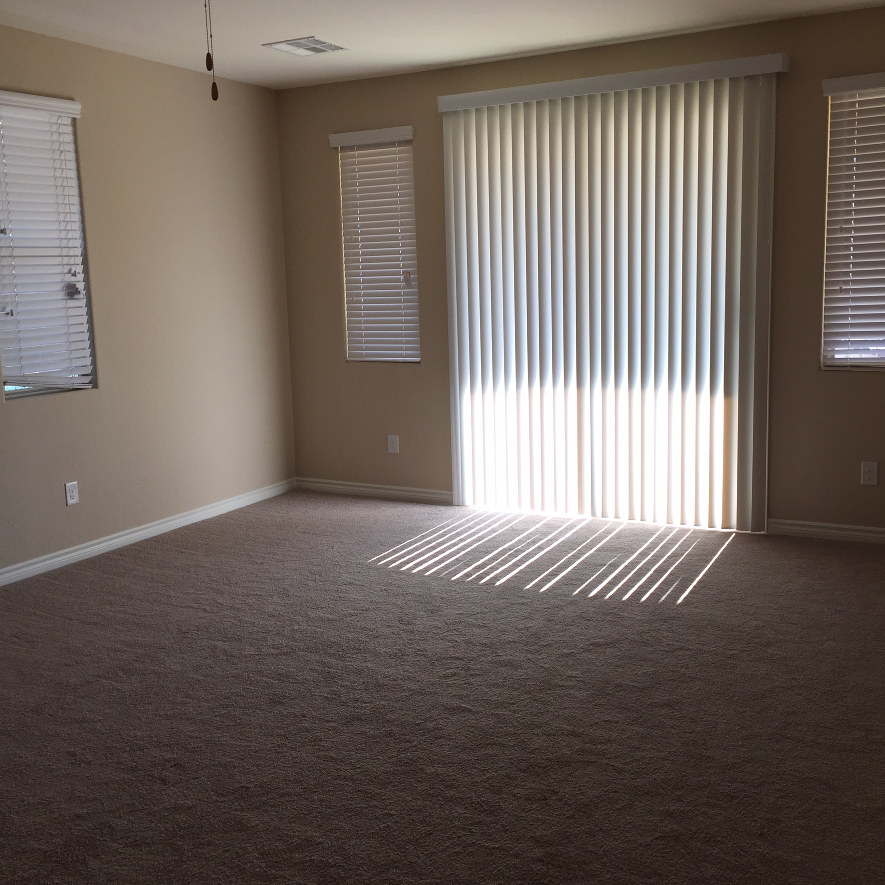
And last but certainly not least, the master bedroom.  Here is the before. Calling out to be filled up. 

Master bedroom before

And here is the after, the oh so pretty master bedroom. 

Master bedroom after

I actually can't take any credit for the furniture in the master bedroom.  The master bedroom furniture is the one thing my clients ordered ahead of time. However, I will take credit for the wonderful acrylic nightstand lamps and for having clients with great taste.  The lamps are difficult to see in the above photo but they are the perfect combination of glamorous and classic. The visual lightness of them also offsets the heaviness of the rest of the furniture in the room. The upholstered bed is grand, and the dresser nightstands are nice landing spaces that also provide great storage. The glider in the corner also fits in well with the rest of the room, although it will eventually be moved to the nursery. 

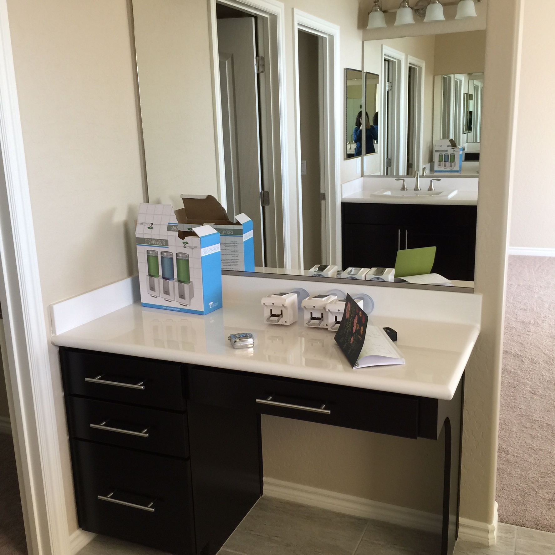
And only because sit down vanities definitely don't exist in any homes I know, I was really, really, excited to style this space.  Here is the before, excuse the mess, it was taken during my initial site visit. 

And here is every girl's dream. 

Vanity after

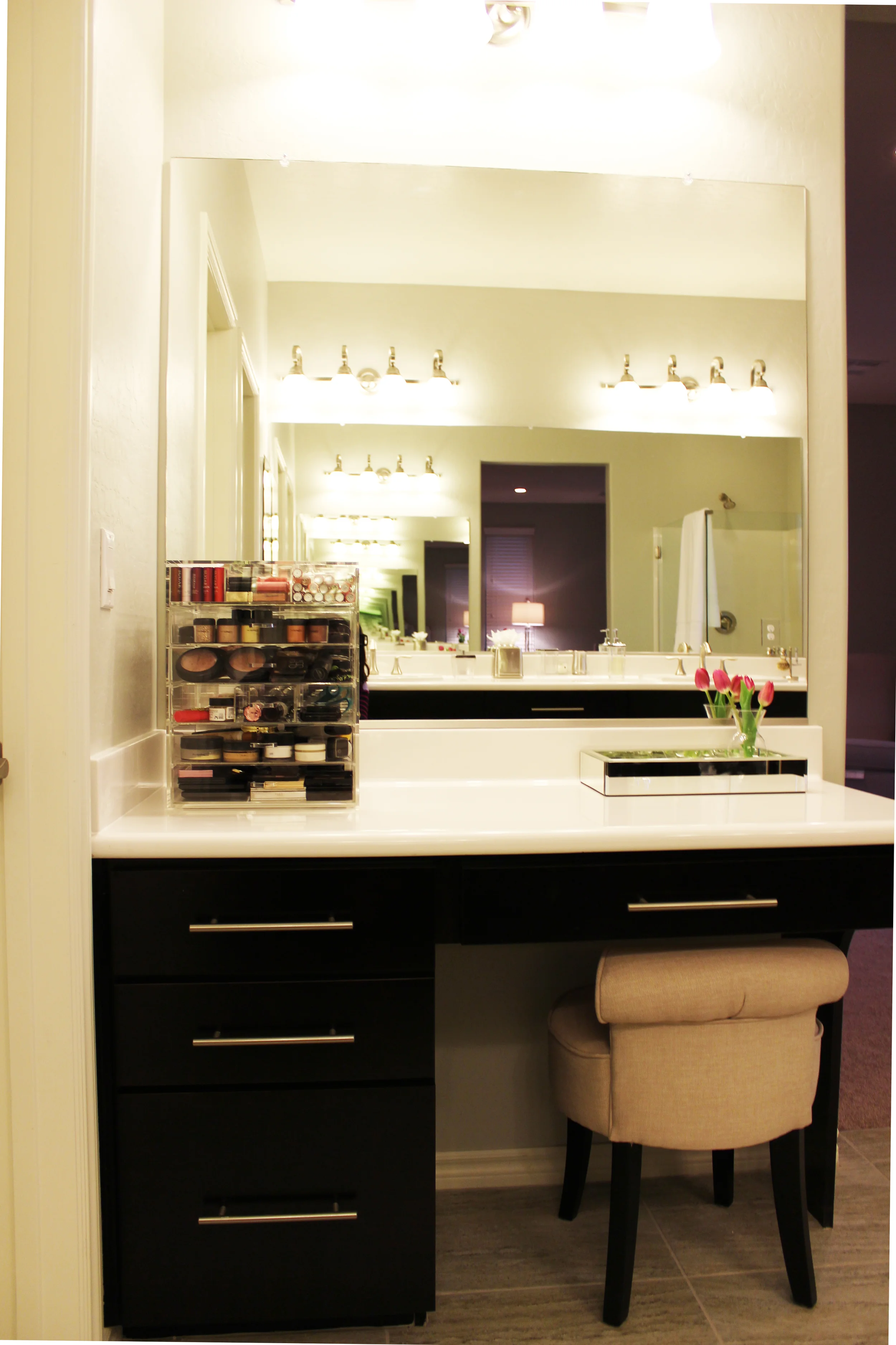
Sigh. I heart this space. Every vanity should have fresh flowers.  Although this bathroom is covered in mirrors, I thought why not take advantage of the bouncing light by placing the small mirrored tray for perfumes and lotions, plus, it adds that touch of girly glam. 

I'm not much of a makeup girl, but this acrylic beauty cube quite possibly could make me a convert. It's pretty enough to have it atop your countertop so that you don't have to tuck away your makeup everyday.  It also has numerous configurations for drawer dividers so you can adjust according to your needs. I think it deserves a closer look, don't you?  See below. 

Whew.  And I'm done! I've said it before and I will never stop saying it, I'm so, so lucky to have clients who not only believe in me but who also trust me to help them with their homes.  For this project, this is especially true. This is probably one of the hardest things I've ever had to do and I'm beyond thrilled that it turned out so well.  So calling all husbands out there, do you want to secretly surprise your wife by redecorating a room or maybe even a house?! You know who to call. 

Observing client confidentiality I can't reveal my clients' identities, but I would like to say I may have furnished your house, but it is you guys and your adorable baby boy who have made it into home.  

Till next time!