A Modern San Francisco Haven

When clients expand the scope of a project, I'm happy to oblige. If you recall, I finished reading rooms for Mom and her Mini-me a couple of months ago. After we completed the reading rooms, Mom thought it high time the rest of her house got a makeover. 

The client is a fan of Scandinavian furniture and clean lines, and a lover of whimsy and color. Basically, I love what she loves. Although we were starting with a couple of existing pieces, we we needed to find some new classic foundation pieces for both the living and dining rooms. Also, the key to success here was making sure to find balance in the eclectic design we were implementing in each room. Ready? Here we go. 

The living room is this family's main living area. In San Francisco, space is expensive and runs at a premium so there are no separate play rooms or family rooms. This room has to be multipurpose and remain "adult" enough to entertain guests. Below is the before. 

IMG_8313.jpg

Do you spy that beautiful Finn Juhl Poet Sofa? The graceful curves are so inviting. The client had recently splurged on it. Now she just needed the rest of the room to match. We aimed for a sophisticated collected design, emphasizing the thoughtful use of color. We changed out the rug, larger brown sofa and coffee table. We needed tones to compliment the purple blue of the Poet and the brown sofa just wasn't cutting it. Also, although the artwork on the walls was interesting and captured the spirit of the room, I felt that a couple of larger pieces would be more well suited. We made all of these changes and you can see the transformation below. 

Undeniably stunning. Go bold or go home. And we made this work. We matched the jewel tone of the Poet with this dark canary yellow sofa. To balance the vibrancy of these colors, I accessorized with monochromatic hues elsewhere. The cabled wool rug and the warmness of the wood tray tops bring in different textures and interest. 

Not a fan of yellow? If this room doesn't convert you, I don't know what will. Just the warmest and coziest of rooms. I've never been to any of the Scandinavian countries that produce the furniture that inspired this room but I'm thinking they would approve. Let's move on to the adjacent dining room. Below is the before. 

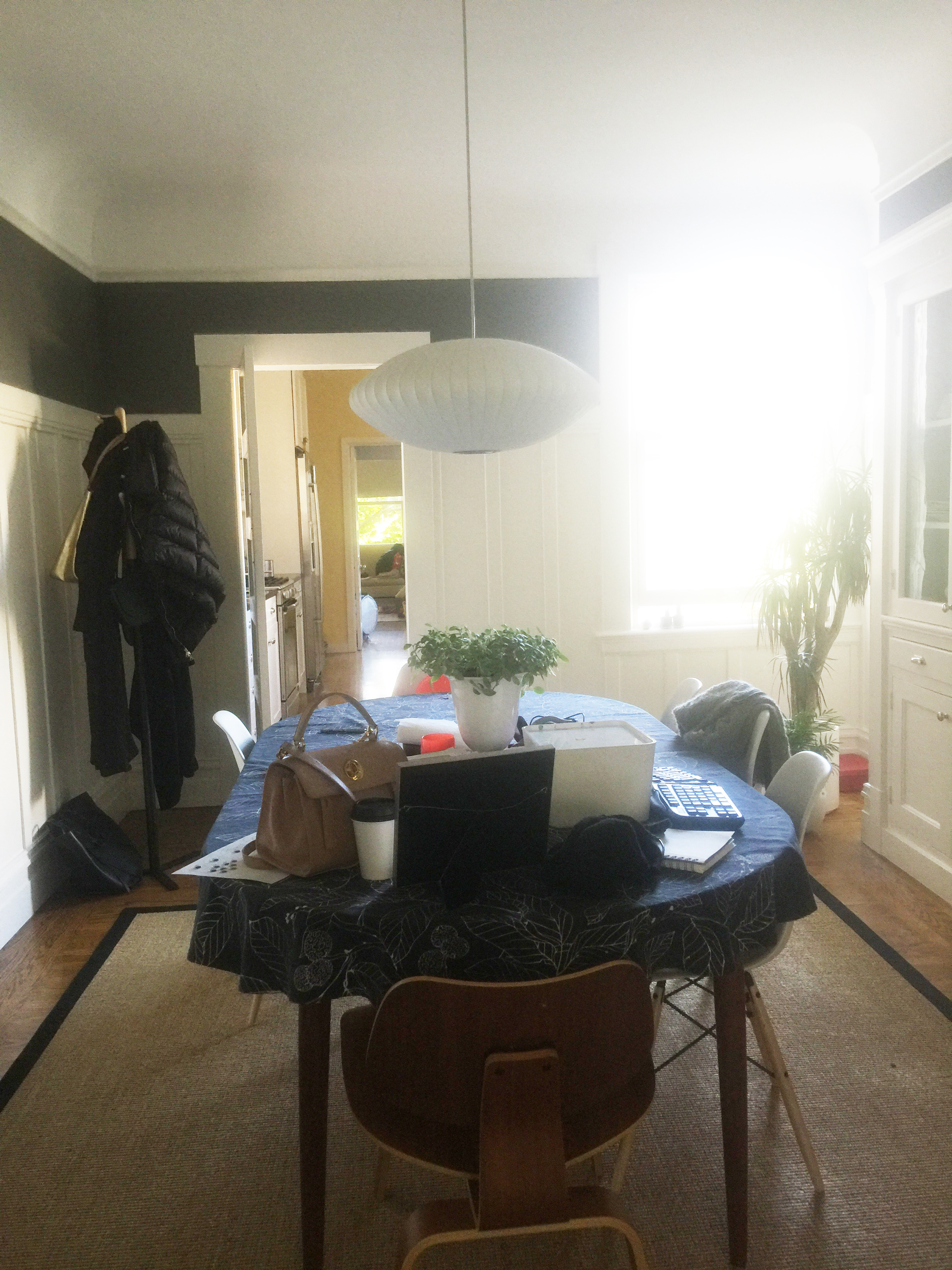
If you scroll back up to the living room, we moved the Nelson pendant light to the living room.  I thought we needed a light with more impact for the dining room. The rug and table were going. We were keeping and adding to the Eames chairs. With beautiful original built-ins for storage staying, the transformation for this room was easy and swift. See below. 

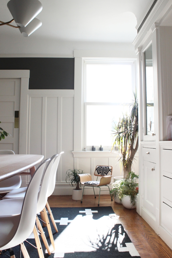
Yes, you may recognize this rug. I've used it before and in a nursery. But it was just too perfect not to use it again here. To balance the strong colors in the adjacent living room, we kept things here really simple and neutral. Yet we carried over the same principles, clean lines and adherence to Scandinavian design. 

One last space. For the life of me I can't find a before photo of the foyer sadly. But we did do a mini makeover for the space. We cleared out the clutter, hung a large mirror and created an ideal landing space for this busy family. Take a peek below. 

Wrapping up this project felt so good. Everything just gelled together which doesn't happen for every project. This home has magic in the air and if you're ever lucky enough to visit, you would agree. 

As we prepare for Thanksgiving festivities, I hope you're taking pleasure in the enjoyment of your own home. Thanks for reading. 

Decorating an Open-Concept Space

I'm often asked to help bring cohesiveness to common spaces in all kinds of homes, from those with small footprints to those with more room. Room Assembly asked me for some tips you can implement in your own home to make sure your open-concept space feels natural and beautiful. I've also included an design inspiration board with some looks that are trending now so you have some building blocks if you happen to be furnishing your home. Come read more about it here!

A Polished Feminine Nob Hill Flat

This project has no red and green in it nor is it filled with holiday decor. But its glamour and sparkle embodies the holiday spirit for me, and that's why I've saved this reveal to share it with you in the midst of the holiday season. 

I love San Francisco apartments. The bay windows, molding and coved ceilings provide the ideal canvas for any home decor. This client had just moved into an adorable Nob Hill flat. She had some amazing pieces to begin with, but needed help with edits and new additions. She also had a combined dining and living area, which can be a bit tricky. You have to make sure there are two distinct areas but keep them cohesive. This challenge is made harder when the space you're working with has a smaller footprint. By integrating the existing furniture and bringing in some new pieces we've turned a fine San Francisco flat into a fabulous haven.

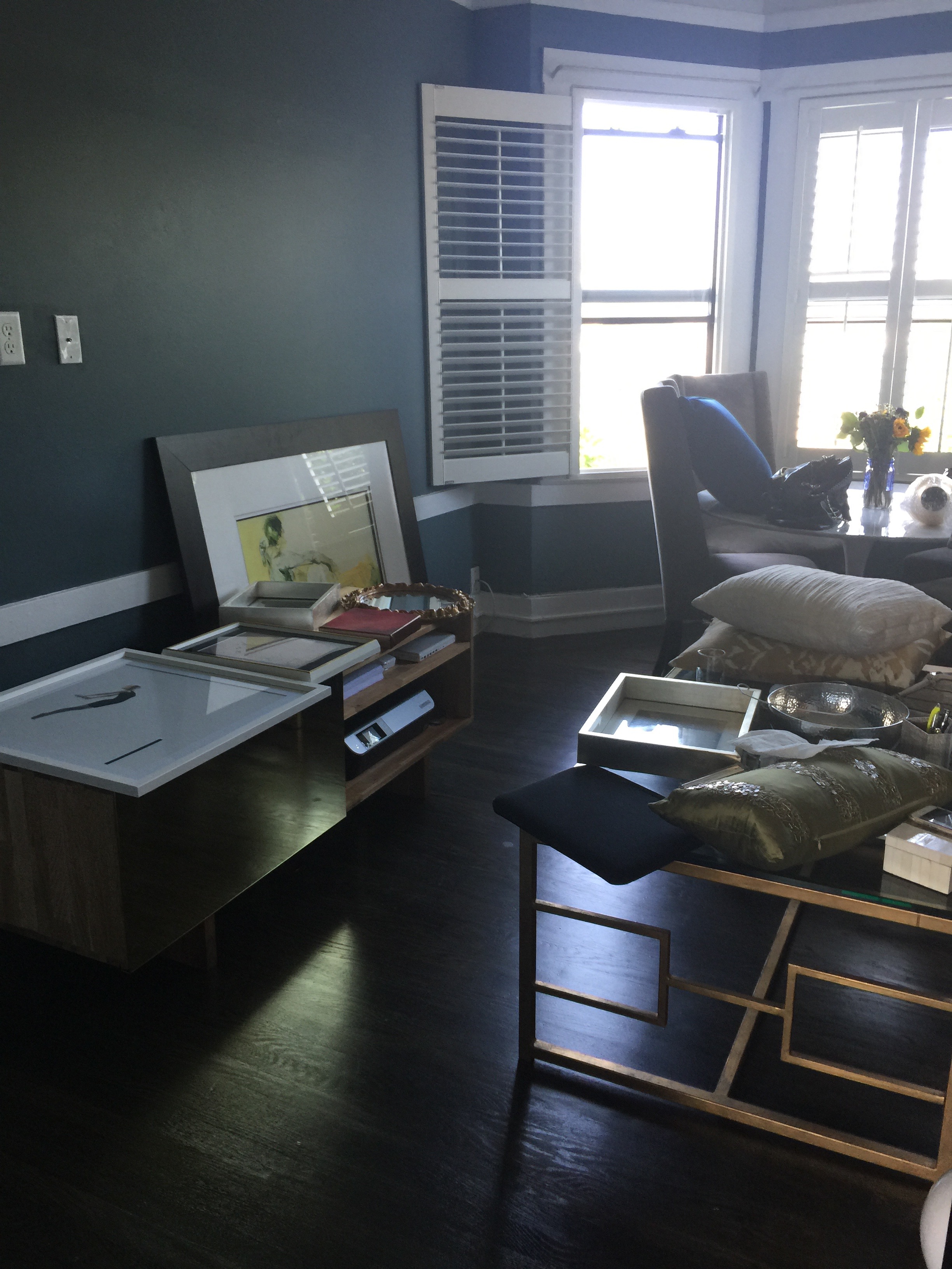
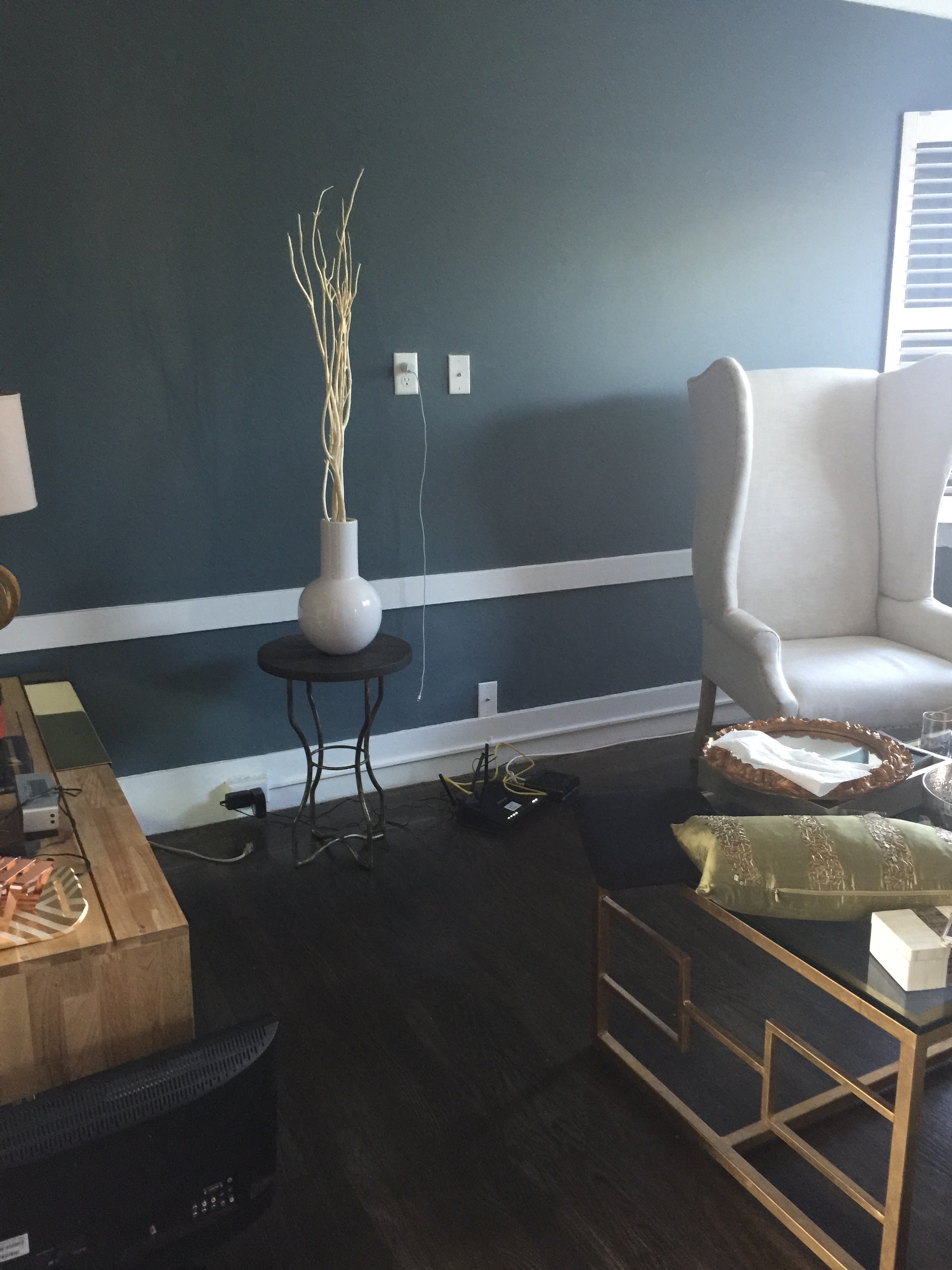
Below is the before right after move in. As you can see, she has a beautiful brass media console along with great coffee table.

The foundation we were starting with was very strong. The client's existing pieces revealed some detail about her personal style voice, and it was immediately clear to me her what kind of pieces we needed to bring in to make sure that style was amplified and elevated.

Here we go. Seating was a priority. The client's previous couch was too large for the narrow staircase so that was the first order of business. See below! 

Polished and perfect. The sofa had to be petite to not only fit up the narrow stairway but also to make sure it was to scale with the rest of the room. This sofa is ideal for this space. It is small but very deep, making sure it's a great place to curl up for TV or reading. And in a pinch, it can squeeze in three people.

The client confessed she had a difficult time bringing color into any room. I eased color in with the coral throw pillow and a similarly colored print.. These are minor elements in the room but they bring in warmth and the necessary pops of color. Opposite the couch is the media console, see below. 

If you look carefully, although the living area is small, the pieces in the room are large and functional. When I come into a smaller space, people often have many small pieces throughout the room. The thinking goes that a smaller space needs smaller furniture. That may sometimes be true, but too many small items can actually make a room feel more cluttered and chaotic. Larger foundational pieces grounding a small room can create a more tranquil and cohesive atmosphere as exemplified above. 

My own pet peeve is to walk into a room and it feels too much like a paint by numbers. It comes off a bit cheesy and obvious. But I do think that to make a room feel polished and complete, repeating patterns, textures or colors help. The key is to do it subtly and with a touch of sophistication. To echo the geometric design of the coffee table,  I chose a rug with similar lines and pattern. Take a look below. 

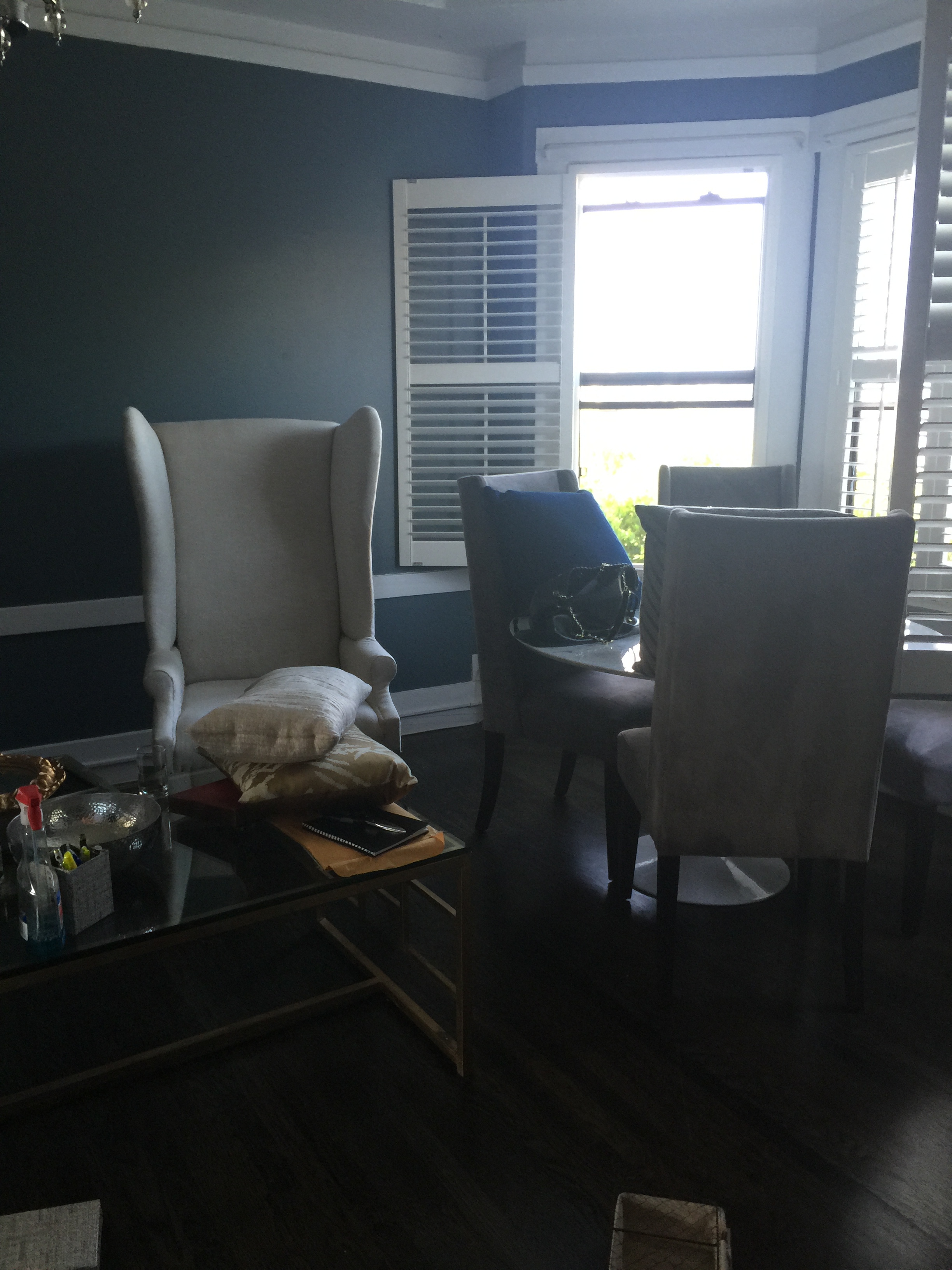
On to the dining room! Here is a closer look of the before. The client owned a classic Saarinen style marble table and taller upholstered dining chairs.

As I mentioned above, the Saarinen table is any design enthusiast's dream, we were definitely not replacing that. But the chairs, though in good condition and beautiful, were ill suited for this space. They were much too tall for the bay window alcove. We switched out the chairs, installing ones that were more appropriate in scale to the space and the rest of the room. 

The nailhead detail on the chairs are the icing on the cake. And the curve of the chair is so inviting that you can immediately imagine long dinners spent around this table. 

A mirror next to the dining area will provide additional shimmer and light into the rest of the room. 

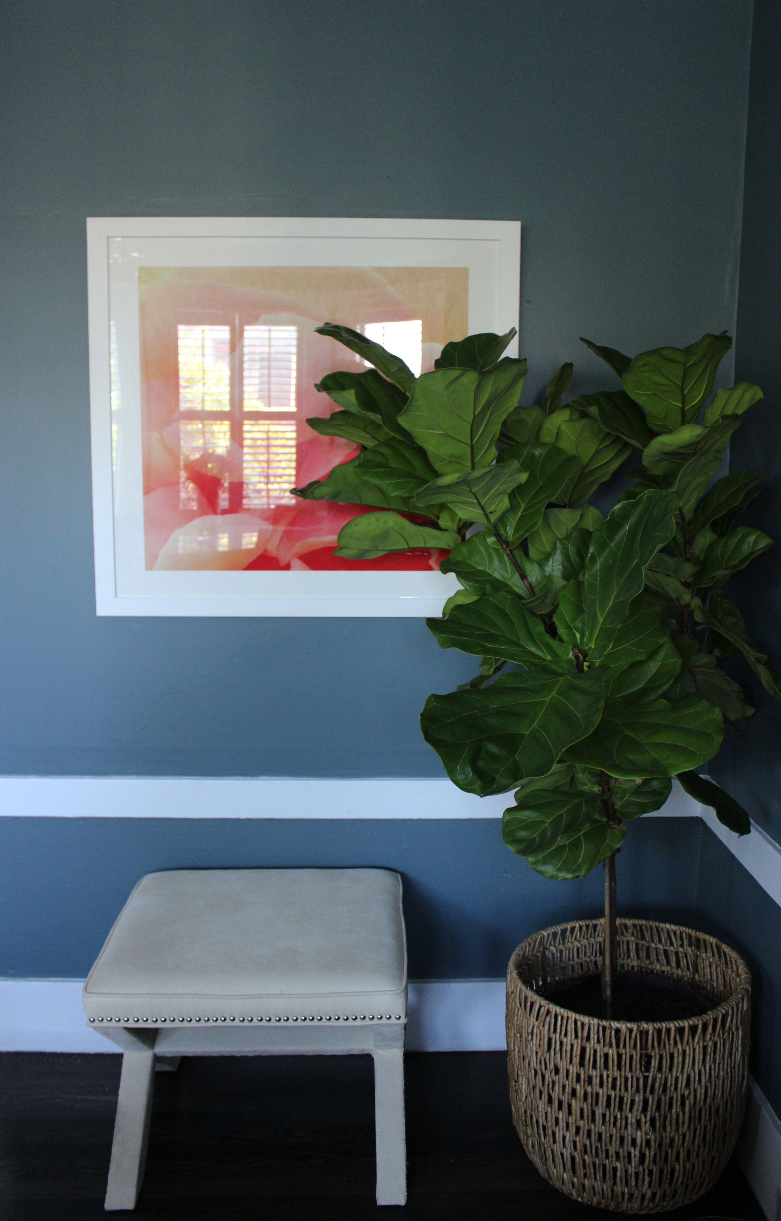
And although the client always has fresh flowers in her home, it's nice to have a plant or two to bring life into a room so we added a fiddle leaf fig. To give additional flexible seating, the x-bench is the ideal solution. 

Blue, coral and gold is not a palette that you see often in design. I hope you agree that not only does it work here, it works beautifully. This flat is sophisticated with a dose of feminine charm. I'm so excited for this client and the many good things to come. Thanks for reading!