A Dreamy Denver Project. A Progress Report

It's been a bit quiet on the blog, but that doesn't mean that I haven't been busy, it's more of a sign that I've been too busy. But I'm happy to be busy when it's with things like the Dreamy Denver Project. 

I'm so unbelievably excited to share this project with you. The lowdown, these clients bought their new home last fall. Prior to purchasing this home, they made do with furniture that was past its prime. These clients decided that moving into this new home meant it was time to invest in furniture that they loved. 

We've already ordered the majority of the furniture. And because I'm always candid here and about the process, the first four deliveries from different vendors arrived damaged! Proof that the before/after posts you see on this and many other blogs don't convey how long and stressful a redesign process can be. It looks like magic online, but trust me, it doesn't always work that way. I've been told that it must be easy to be a designer since I'm neither spending money that is mine nor designing for a space that is mine. This couldn't be further from the truth. For my own home, I'm happy to let mistakes happen, and it's actually a place where I can try out new ideas. For my clients, I know that my services are often a luxury and I try to make sure I deliver a perfect product down to the coaster. Sometimes to get there, this means a ton of phone calls, emails and negotiations with vendors/contractors, but at the end of the day I'm happy to say it's usually worth it. And I'm grateful for patient and understanding clients! 

I plan to go to Denver in late February for the final install and to apply finishing touches and styling. For now, here is a brief rundown of the design scheme for each room. Here is the exterior of the home. 

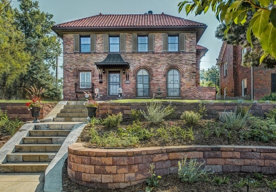
I mean talk about curb appeal. How beautiful is this home? Clearly, no improvements need to be made here. Step inside with me to the living room. 

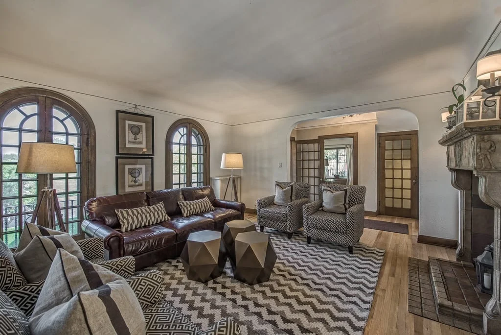
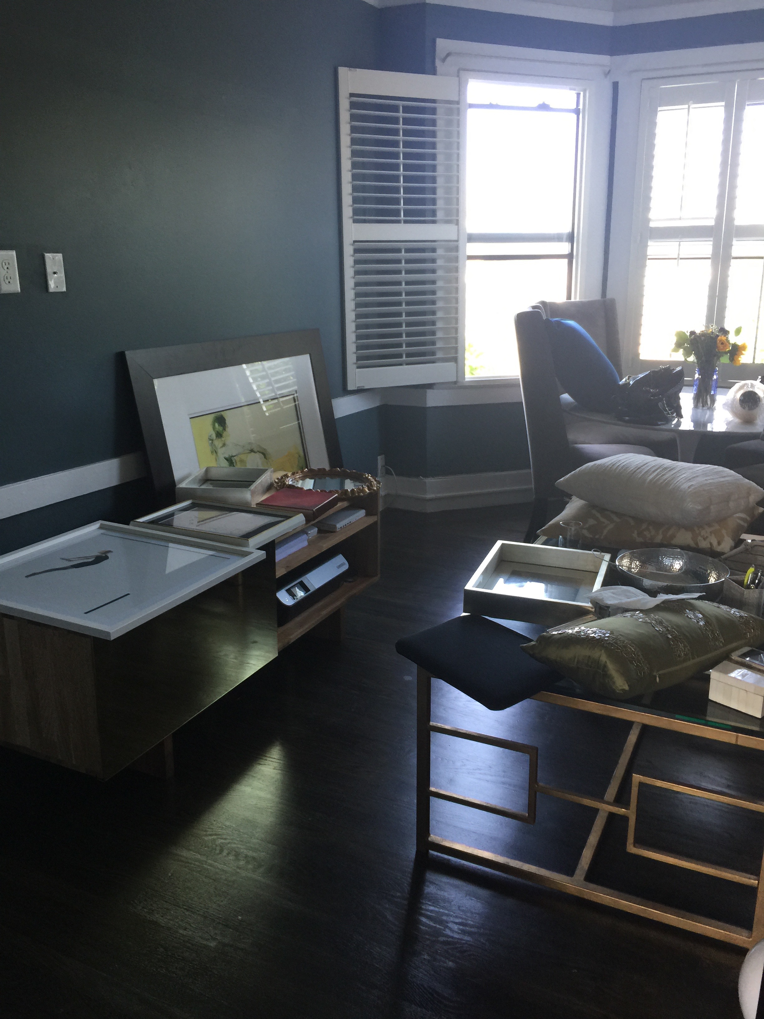
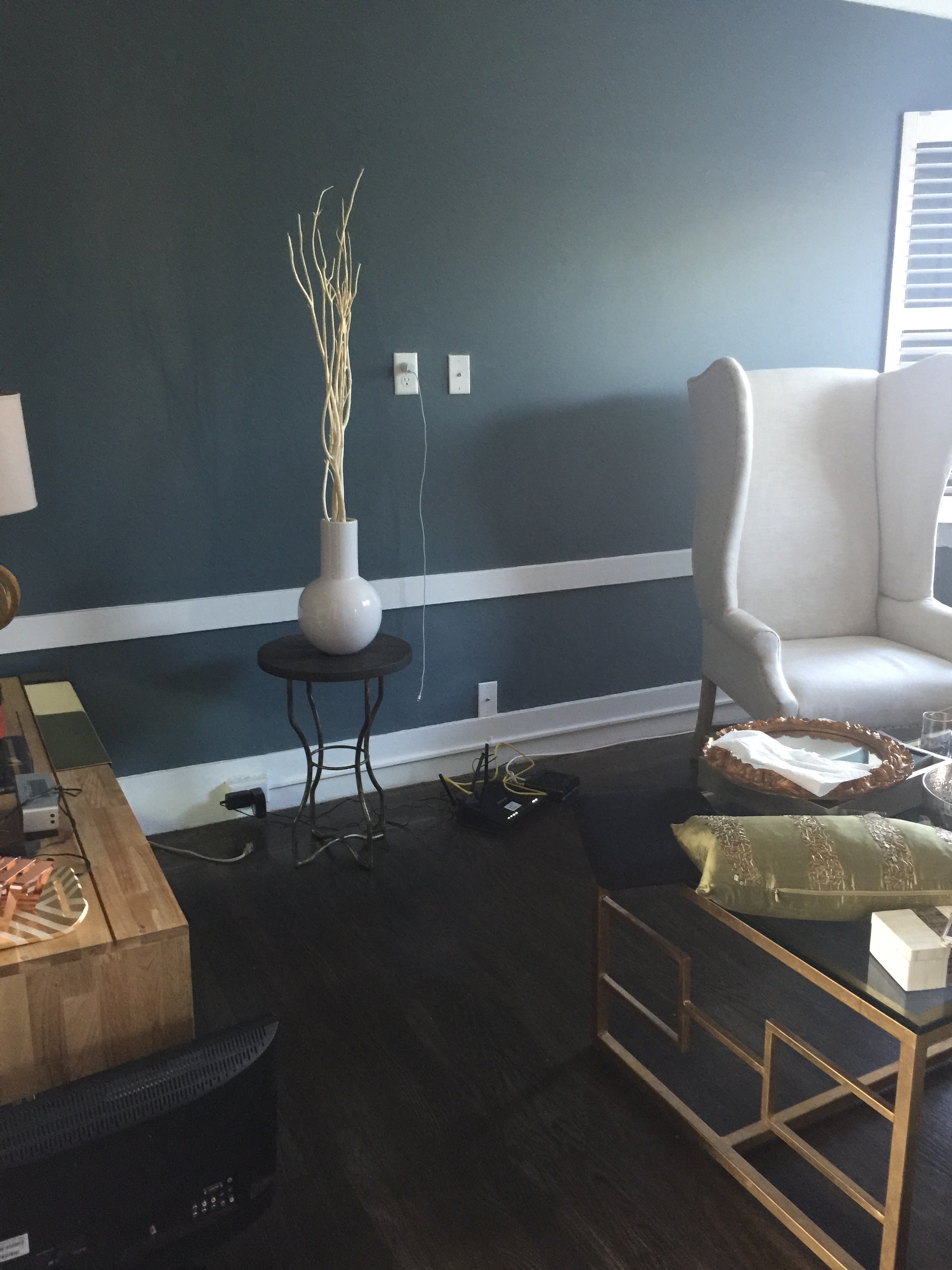
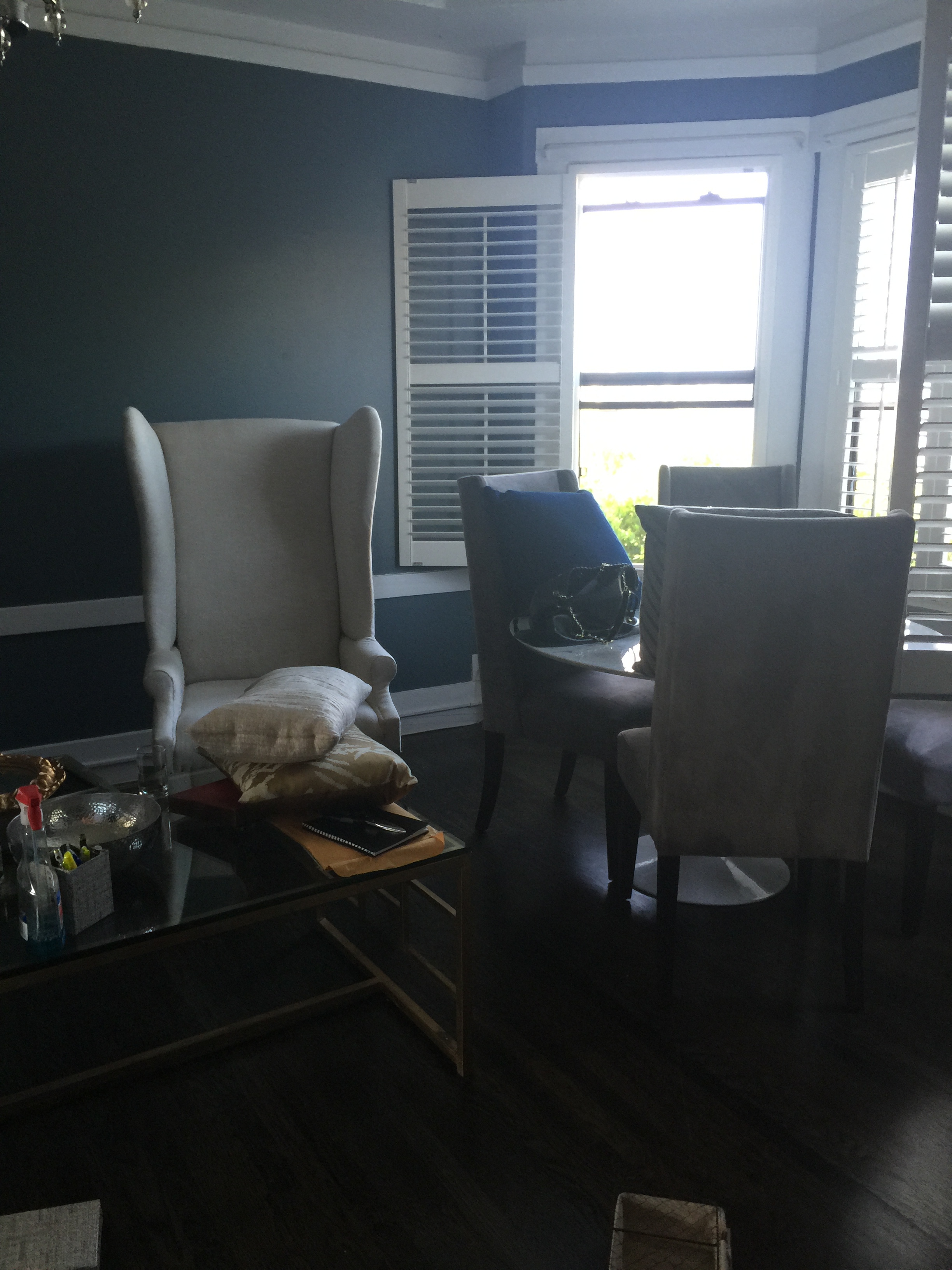
This living room is big and open. Right off the foyer, it's the first room to greet guests. The furniture pictured in this room and the other rooms were most likely done by a staging company. Staging companies have a challenging job, they need to furnish a home in a way with the broadest appeal with their own inventory. But as you can, the room suffers from too much brown and other muted tones. It definitely needs some color and life. Below is the living room board and the design plan I created for my clients. 

There have been a few edits to this board, but largely the general feel of the room feels the same, a neutral palette with saturated pops of color in navy blue and hints of yellow. I have yet to install this room, but I'm already in love. The marble coffee table offers some texture diversity. The linen colored sofa along with the gray side chairs are cohesive and collected but doesn't feel too matchy. 

On to the dining room. 

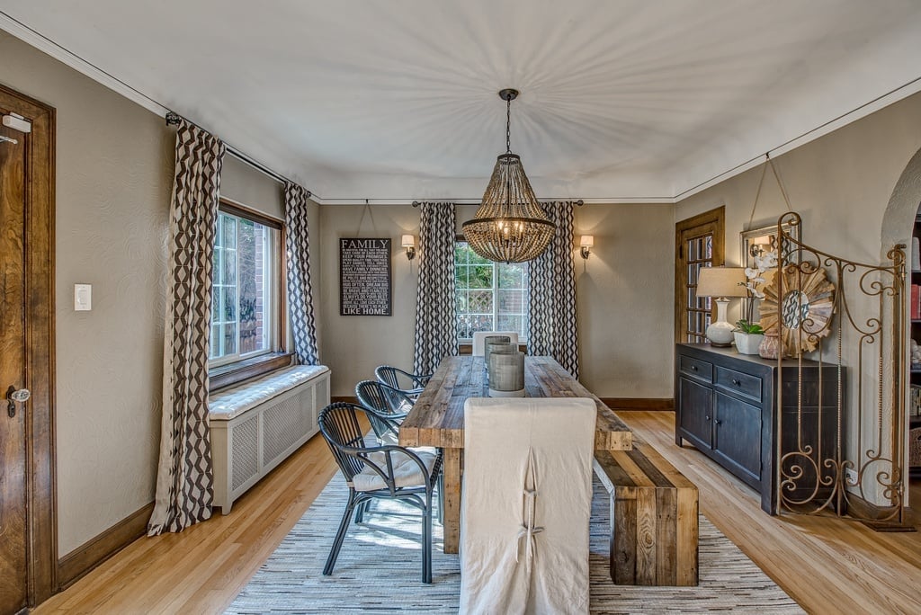
Similar to the living room, the furniture in the room pictured above brings out the wrong tones. With the greige paint, there needs to be more contrast, and the rattan chairs are far much too casual for this elegant dining room. Although the chandelier is perfectly fine, I think this room would benefit from a light fixture that would bring in more sparkle and shine. Below is the board for the new dining room! 

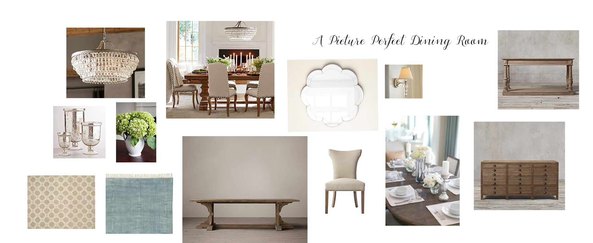
The dining room adheres to the clients' preference for an updated classic look throughout the house. However, I've updated the look a bit with a more modern chandelier, dining room chairs with a curved silhouette, and a blue rug that should help offset the dominant brown tones in the wood molding and walls. Since this room is slightly more formal, we opted to go with all chairs instead of using a dining bench. The scalloped wall mirror adds a touch of whimsy and will help the light bounce off the new chandelier. 

Last but certainly not least, the master bedroom. 

Again, like the living and dining rooms, this room also suffers from furniture that is a bit dreary. The furniture also feels a bit dated. With such a large wonderful space, I'm excited to see the final outcome. 

So serene right? Like the furniture pictured in the master bedroom photo, the board shows a design scheme that relies on a neutral palette, but you can see/feel the difference between the two right? The furniture I have chosen although neutral utilizes more whites, especially in the rug, allowing for some brightness to seep in. Also, the gray and blue throw pillows will help change the look and feel of the room, providing great contrast between the walls and the furniture. 

Fingers crossed that the rest of the deliveries arrive safe and sound. I love that this house looks and feels so different from the homes I usually do and although long distance projects are often challenging, they are often the most rewarding. I can't wait to install this project in person!

Thanks for reading!

A Holiday Punch Party!

I'm perhaps a bit late with the plethora of holiday decor suggestions and party ideas already out there. But I propose that this post is a bit different than what is already out there - some quick tips below on how to update your existing holiday decor with a few inexpensive additions and how to throw a mostly make ahead holiday party. 

Although I love decorating for the holidays, I try not to purchase new items unless it's for something meaningful and timeless. The holidays come only once a year, and I don't have the storage space to accumulate a ton of things. And frankly, I would prefer to save money for gifts!  

I have a good foundation of ornaments and table decor that are mostly white, gold and silver, a base of neutral metallics that I've accumulated over the years. See below! 

Everything on the tree and the stockings are things I've collected gradually through the years. The $5 garland allows me to create a mantle on our mantleless fireplace. Thanks to Morgan for taking a break from her nap, sort of, to pose for this photo. 

A creative way to update your existing holiday inventory? Add some colored ribbon! Seriously. I love all our holiday items, but I like to change it up a bit each year and I've found a $12 investment in some ribbon spools can help make your things feel fresh and new. This year, I chose black ribbon accents. I wanted something a bit more modern and unexpected.  I love how it turned out, especially on our staircase.  

All I did was get a wider black grosgrain ribbon and tied it with a striped black/white ribbon atop a green garland, creating this beautiful yet simple bannister decor. If you scroll below, I also carried accents of black onto to the tablescape using slate serving platters. I'm already thinking about what accent colors I will be bringing in next year.  

We also hosted a holiday party this year which was incredibly fun. Hosting 40 people is no easy feat. I'm the first to acknowledge that I often get caught up in making sure that everything is perfect that I don't talk to my guests as much as I would like. So this time, I tried to make almost everything beforehand, which worked out so well! This allowed me to catch up with friends instead of tending to the table and bar, well most of the time at least.  See below for photos and recipes! 

Yes, that's a huge bowl of punch. I wanted to serve a drink that was fizzy, pretty and delicious, this punch did all of that and more. It is the holidays and for the holidays, it's always nice to have something special and unexpected. 

I know, that's an enormous container of popcorn. I have to thank my sister for making it for me. It's difficult to see in the photo but the popcorn has sprinkles on it! Amazing. It also had white chocolate drizzled on it which elevated popcorn to new levels.  

We also had egg salad and curry chicken mini sandwiches. Since we weren't serving dinner, I wanted to make sure we had more substantial food items to set a good base for all that punch! The egg salad and chicken salad we made the day prior, and stuffed them right before the party. Also pictured above is a pea, fava bean, and burrata spread. If you're averse to vegetables, this dish will change your mind. Promise. 

There is no party unless there is a cheese plate, charcuterie and olives in our house! And for dessert...

A tower of donuts! Those may look like normal donut holes, but they are hidden bites of sheer joy.  I'm on the fancy donut bandwagon, no doubt. We went to this donut store in Oakland at around 9 am on a Saturday morning to pick some up for the party, and they had already sold out on many of their options!  Since I do everything but bake, this was a great option to fill out the sweet end of the table. 

This was the beautiful photo of our bar, and I'm glad I took photo before it got a little crazy.  Not pictured is the keg, which I insisted on keeping outside. Yes we had a keg, my high/low philosophy doesn't stop at design although admittedly the keg was full of fancy IPA for our fancy California beer palates.

Almost everything on our table was made the day before and assembled right before the guests arrived. It was hectic just before people started arriving, but I'm so glad I did almost everything beforehand which allowed me to spend time with our guests! If you're holding a last minute holiday gathering or any party really, I highly recommend the small bites we served, so you can make everything ahead of time and enjoy your own party. 

Our home was bursting at the seams in the best way possible. Happy Holidays! 

Recipes:

Pomegranate Punch

Egg Salad

Curry Chicken

Pea, Fava Bean and Burrata Dip

Party Popcorn

A Polished Feminine Nob Hill Flat

This project has no red and green in it nor is it filled with holiday decor. But its glamour and sparkle embodies the holiday spirit for me, and that's why I've saved this reveal to share it with you in the midst of the holiday season. 

I love San Francisco apartments. The bay windows, molding and coved ceilings provide the ideal canvas for any home decor. This client had just moved into an adorable Nob Hill flat. She had some amazing pieces to begin with, but needed help with edits and new additions. She also had a combined dining and living area, which can be a bit tricky. You have to make sure there are two distinct areas but keep them cohesive. This challenge is made harder when the space you're working with has a smaller footprint. By integrating the existing furniture and bringing in some new pieces we've turned a fine San Francisco flat into a fabulous haven.

Below is the before right after move in. As you can see, she has a beautiful brass media console along with great coffee table.

The foundation we were starting with was very strong. The client's existing pieces revealed some detail about her personal style voice, and it was immediately clear to me her what kind of pieces we needed to bring in to make sure that style was amplified and elevated.

Here we go. Seating was a priority. The client's previous couch was too large for the narrow staircase so that was the first order of business. See below! 

Polished and perfect. The sofa had to be petite to not only fit up the narrow stairway but also to make sure it was to scale with the rest of the room. This sofa is ideal for this space. It is small but very deep, making sure it's a great place to curl up for TV or reading. And in a pinch, it can squeeze in three people.

The client confessed she had a difficult time bringing color into any room. I eased color in with the coral throw pillow and a similarly colored print.. These are minor elements in the room but they bring in warmth and the necessary pops of color. Opposite the couch is the media console, see below. 

If you look carefully, although the living area is small, the pieces in the room are large and functional. When I come into a smaller space, people often have many small pieces throughout the room. The thinking goes that a smaller space needs smaller furniture. That may sometimes be true, but too many small items can actually make a room feel more cluttered and chaotic. Larger foundational pieces grounding a small room can create a more tranquil and cohesive atmosphere as exemplified above. 

My own pet peeve is to walk into a room and it feels too much like a paint by numbers. It comes off a bit cheesy and obvious. But I do think that to make a room feel polished and complete, repeating patterns, textures or colors help. The key is to do it subtly and with a touch of sophistication. To echo the geometric design of the coffee table,  I chose a rug with similar lines and pattern. Take a look below. 

On to the dining room! Here is a closer look of the before. The client owned a classic Saarinen style marble table and taller upholstered dining chairs.

As I mentioned above, the Saarinen table is any design enthusiast's dream, we were definitely not replacing that. But the chairs, though in good condition and beautiful, were ill suited for this space. They were much too tall for the bay window alcove. We switched out the chairs, installing ones that were more appropriate in scale to the space and the rest of the room. 

The nailhead detail on the chairs are the icing on the cake. And the curve of the chair is so inviting that you can immediately imagine long dinners spent around this table. 

A mirror next to the dining area will provide additional shimmer and light into the rest of the room. 

And although the client always has fresh flowers in her home, it's nice to have a plant or two to bring life into a room so we added a fiddle leaf fig. To give additional flexible seating, the x-bench is the ideal solution. 

Blue, coral and gold is not a palette that you see often in design. I hope you agree that not only does it work here, it works beautifully. This flat is sophisticated with a dose of feminine charm. I'm so excited for this client and the many good things to come. Thanks for reading!